

Buyer's guide
How to choose an analytics template
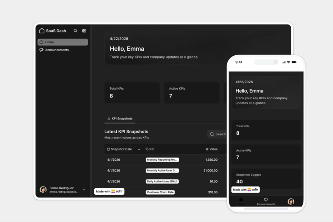
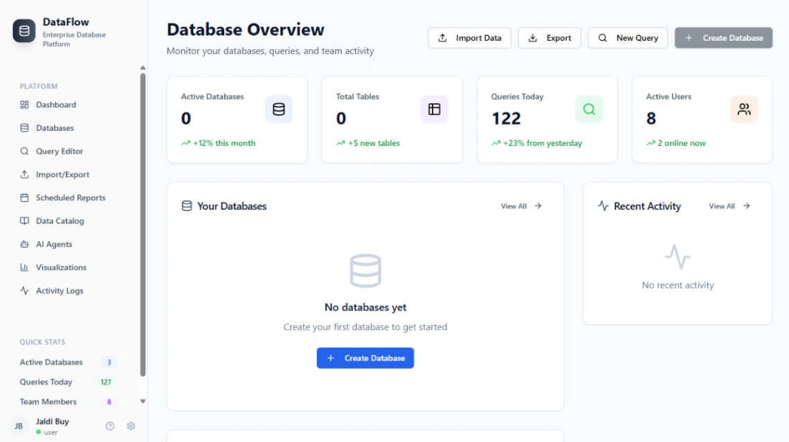
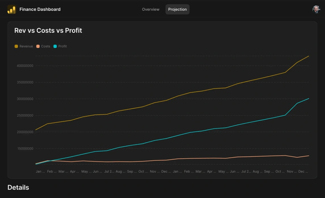
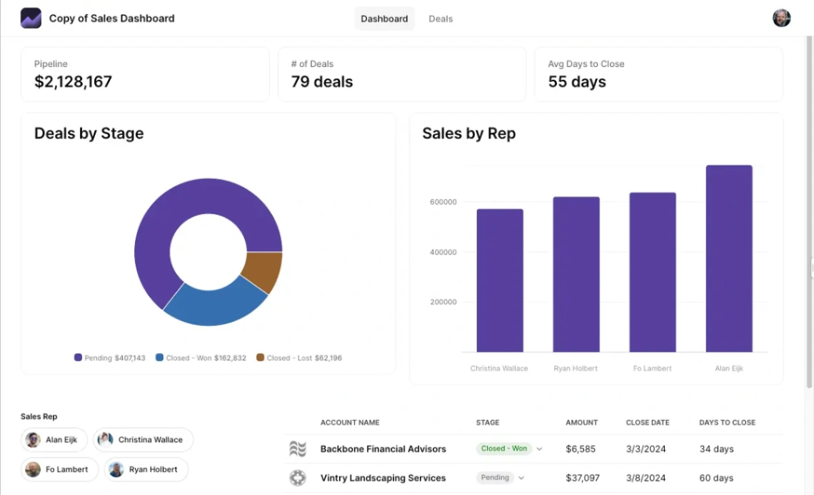
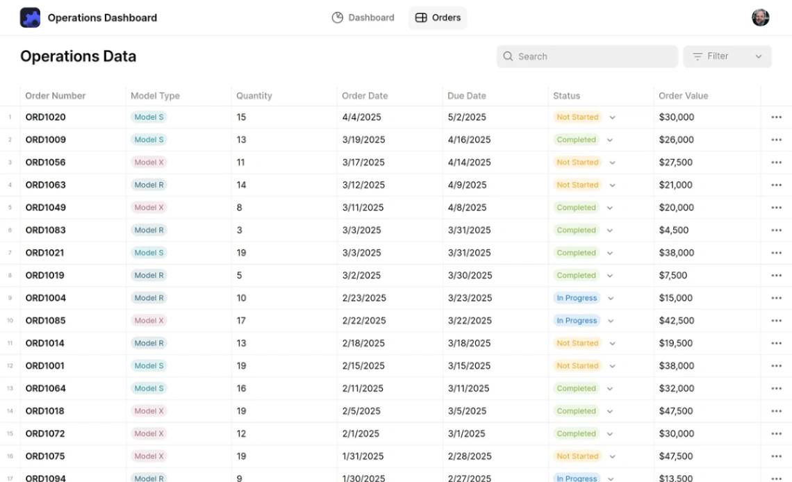
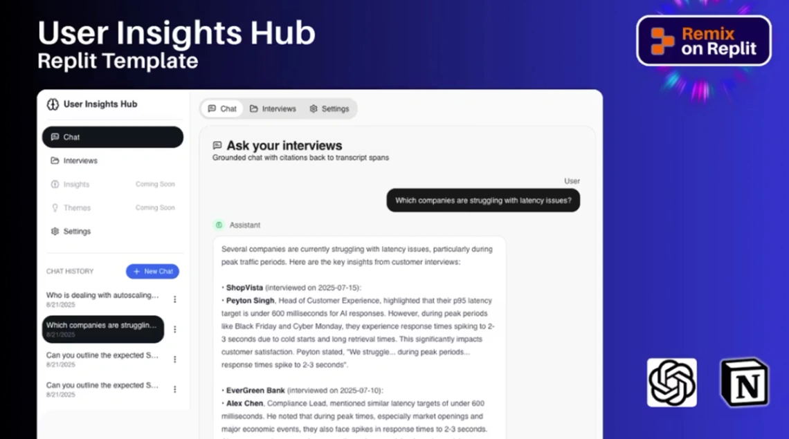
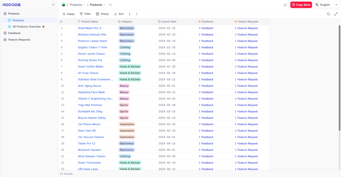
Every template in this collection assumes one thing: your numbers already live somewhere structured — a spreadsheet, a database, a tool that exports. The dashboards arrive with charts prewired, so the real work isn't building visuals; it's mapping your columns to them. Start from where your data sits, because that determines which templates can even connect.
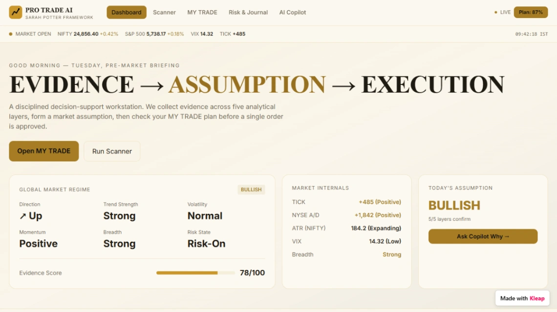
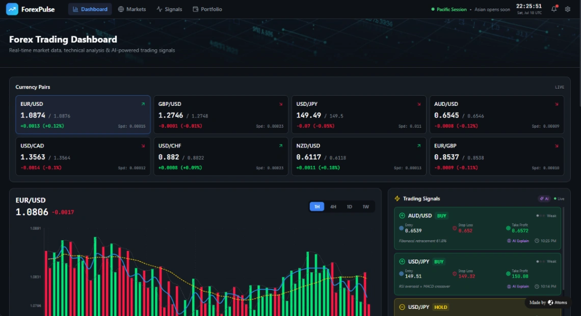
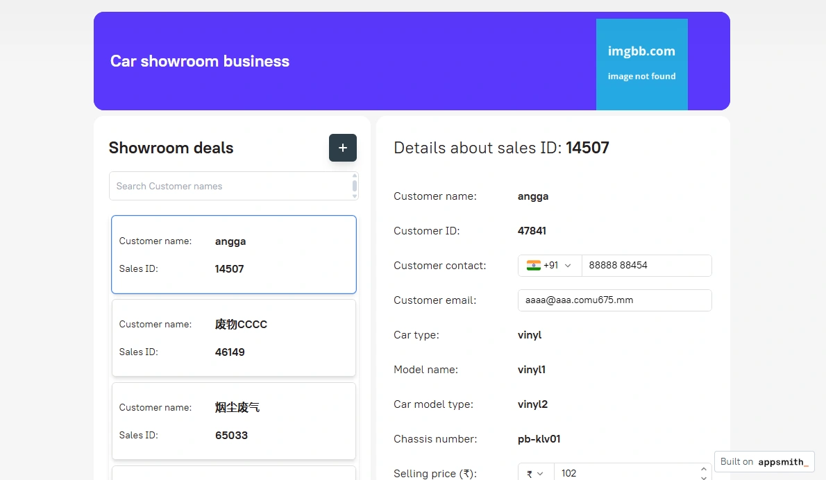
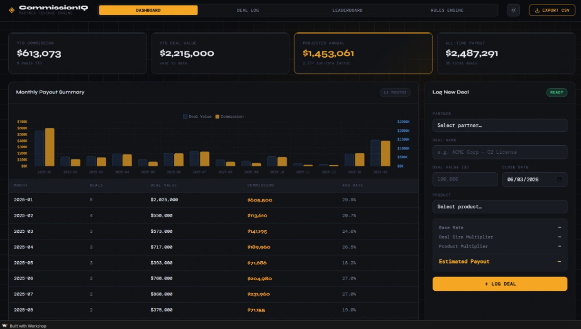
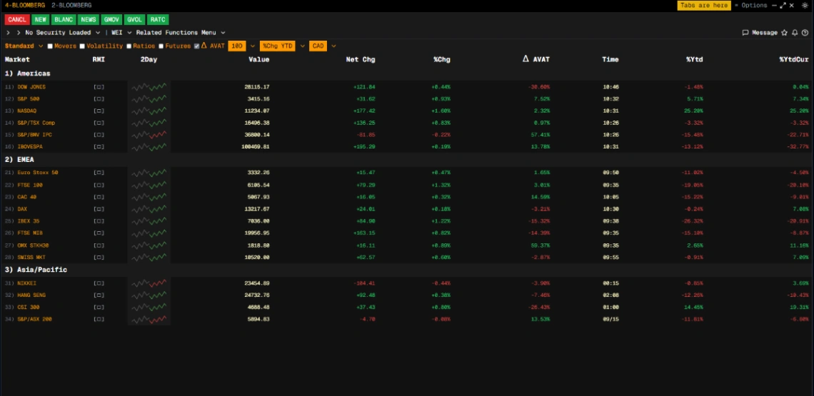
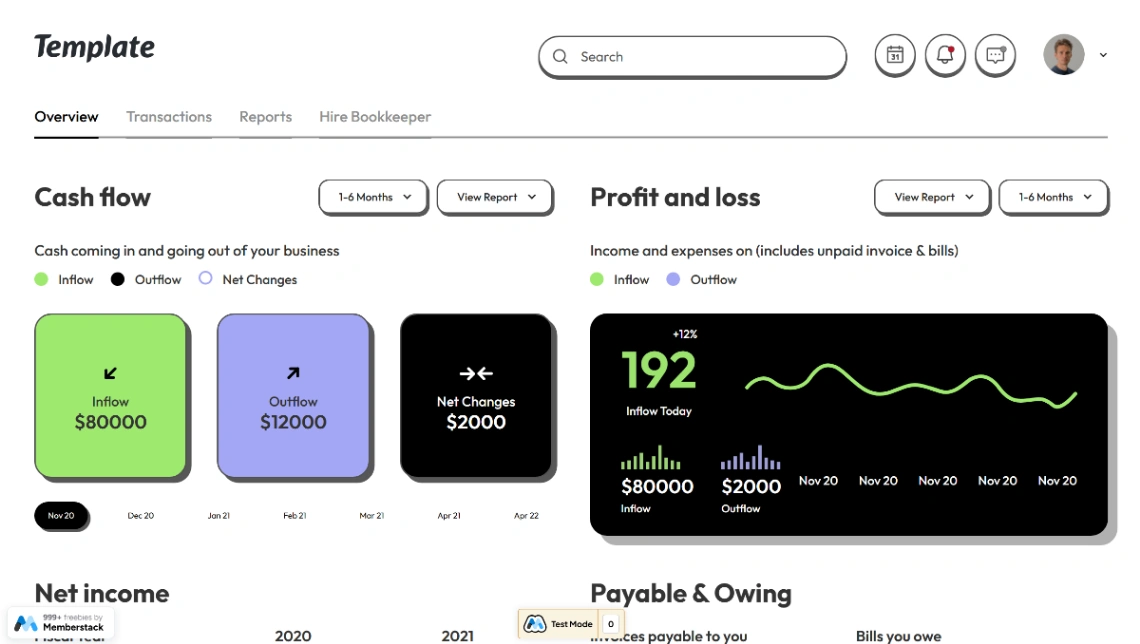
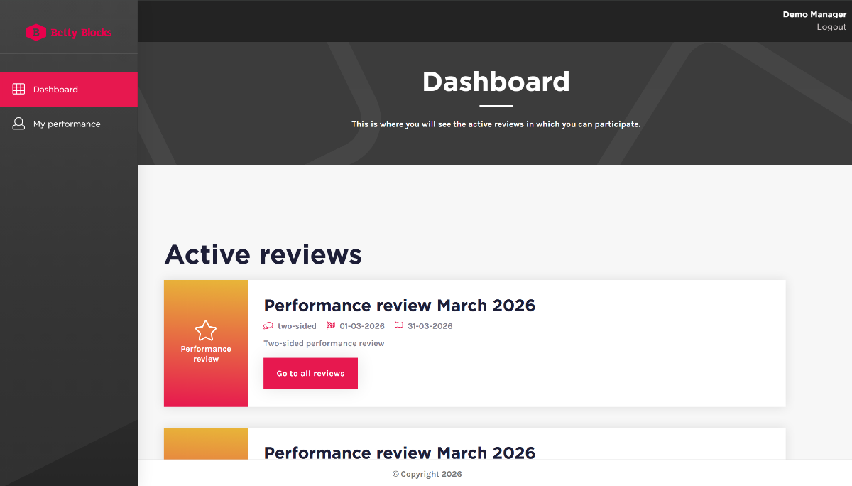
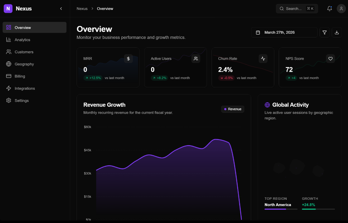
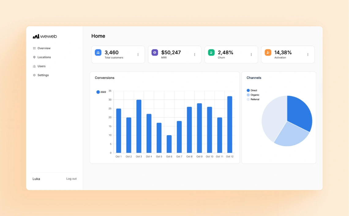
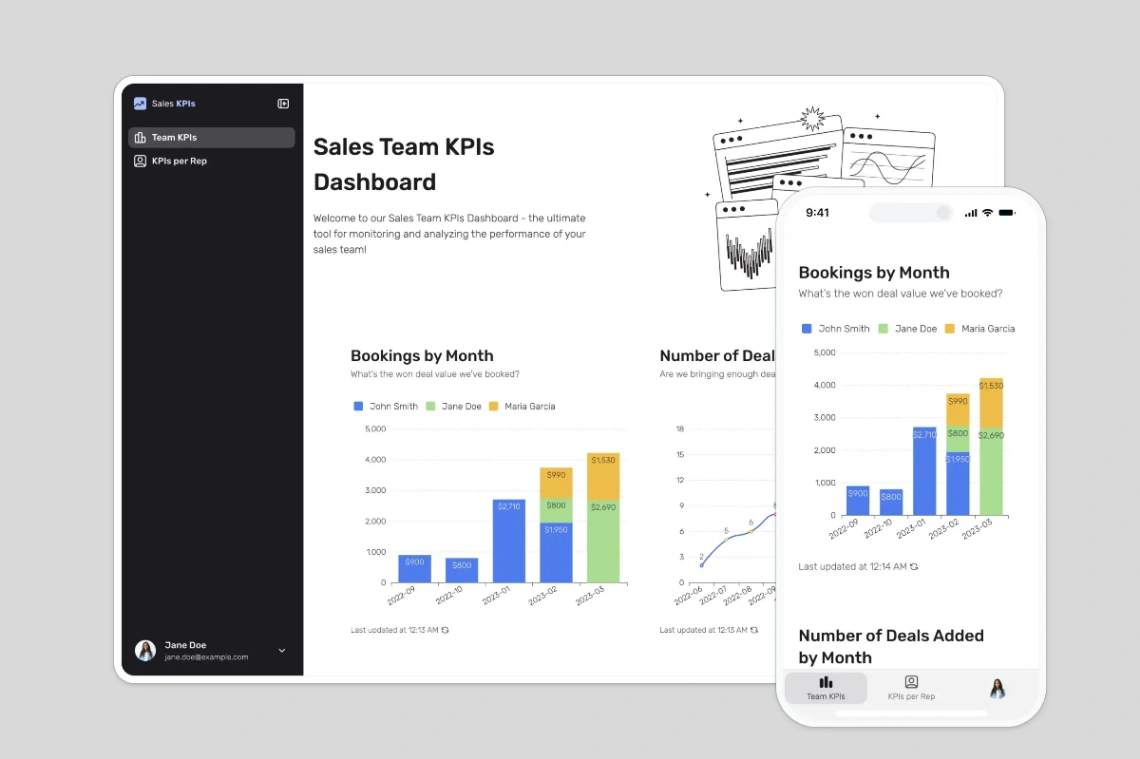
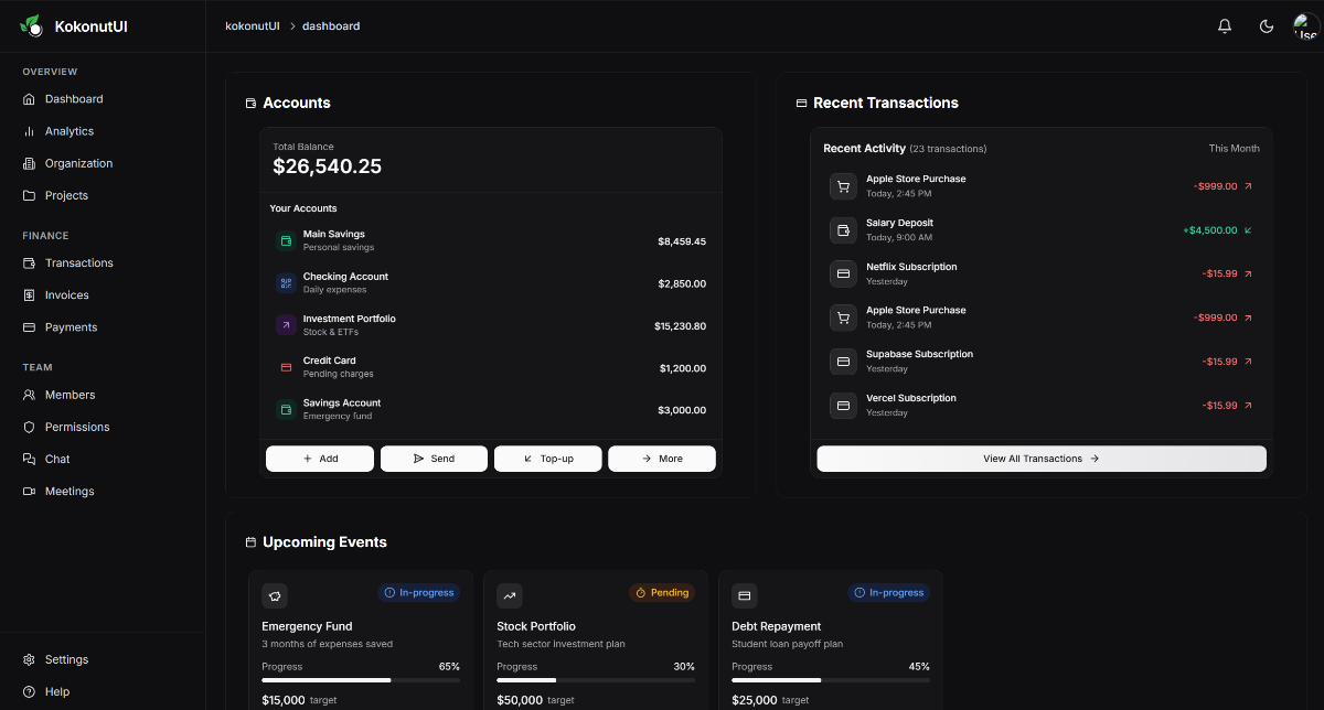
Who reads the dashboard decides its shape. Internal team boards can be dense — live figures, week-over-week deltas, the numbers you argue about on Mondays. Client-facing reports are the opposite: fewer figures with context, and per-user access so each client sees only their own rows. If you need the second kind, filter for templates with permissions wired in; client-by-client access is the hardest thing to retrofit onto a dashboard that assumed one audience.
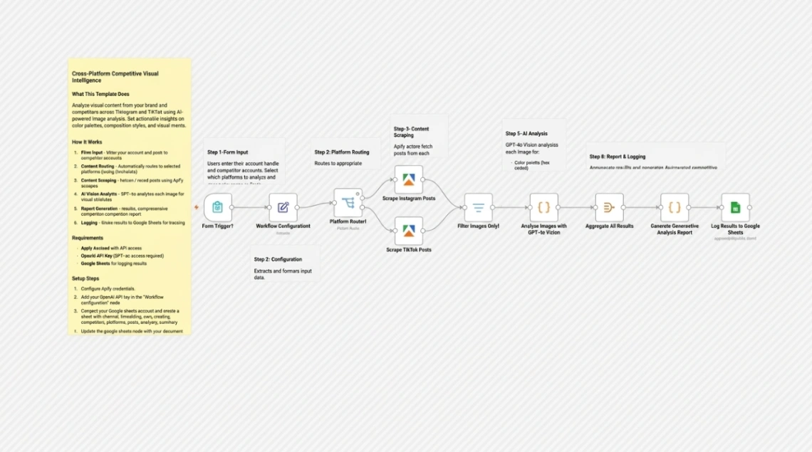
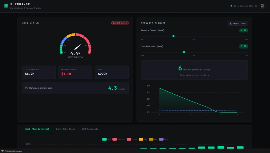
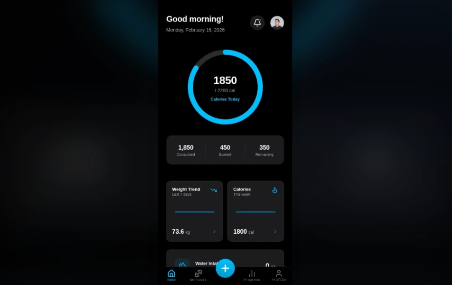
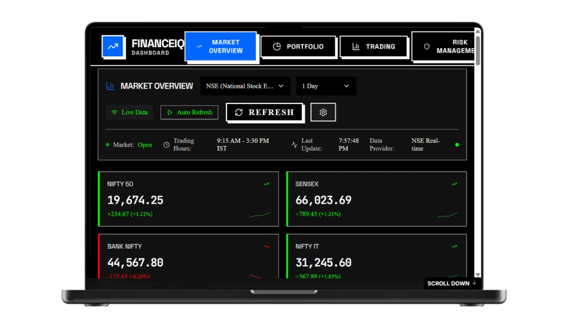
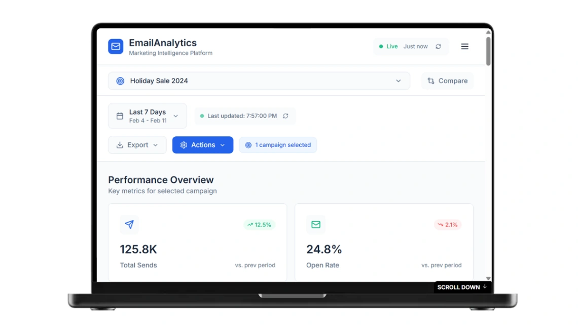
Be honest about refresh cadence. Live-syncing dashboards look impressive, but a dashboard fed by a sheet you update fortnightly is exactly as current as your habit. For many teams a scheduled report — assembled and emailed weekly by an automation — beats a live dashboard nobody opens, because it arrives instead of waiting to be visited. Both patterns exist here.
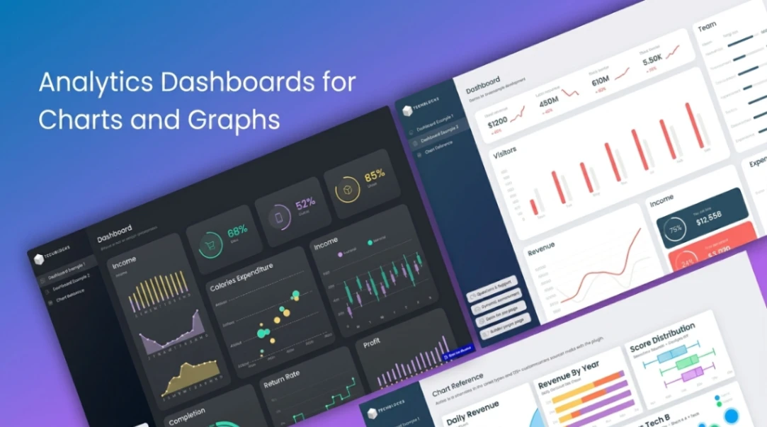
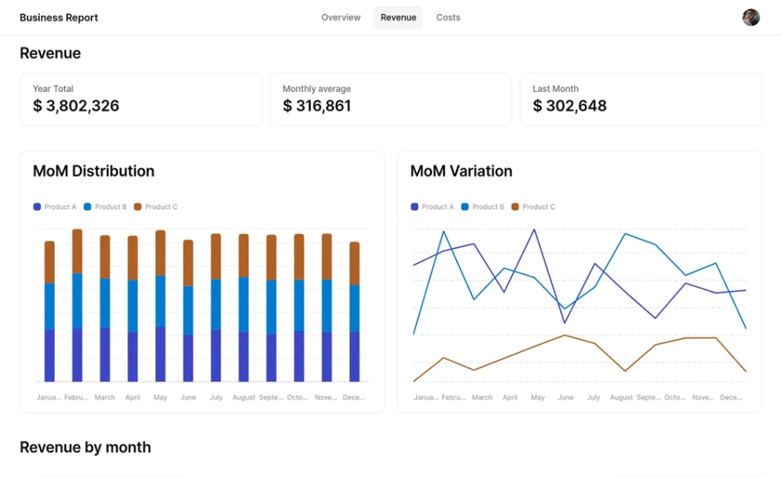
The trap this category sets: building the dashboard before the data. A twenty-widget template is seductive, and filling it means inventing metrics you don't collect — at which point the dashboard becomes fiction with a color scheme. Start from the three to five numbers you already track and already argue about, and let every additional chart earn its place. The platforms these run on are pinned at the top of the page.
FAQ