

Buyer's guide
How to choose a dashboard template
Nobody visits a dashboard; people work inside it, daily, resentfully if it's wrong. So this category rewards a different kind of shopping: ignore the color scheme, and interrogate what the template lets someone do on a Tuesday — find a record, change it, see who changed it last.
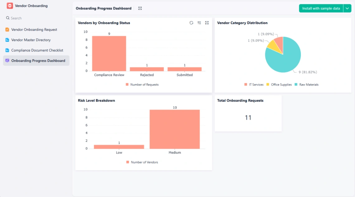
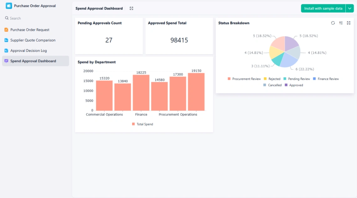
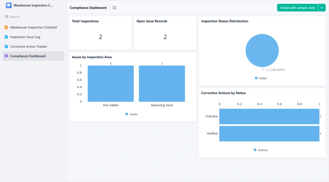
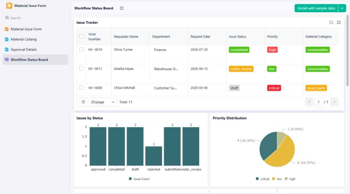
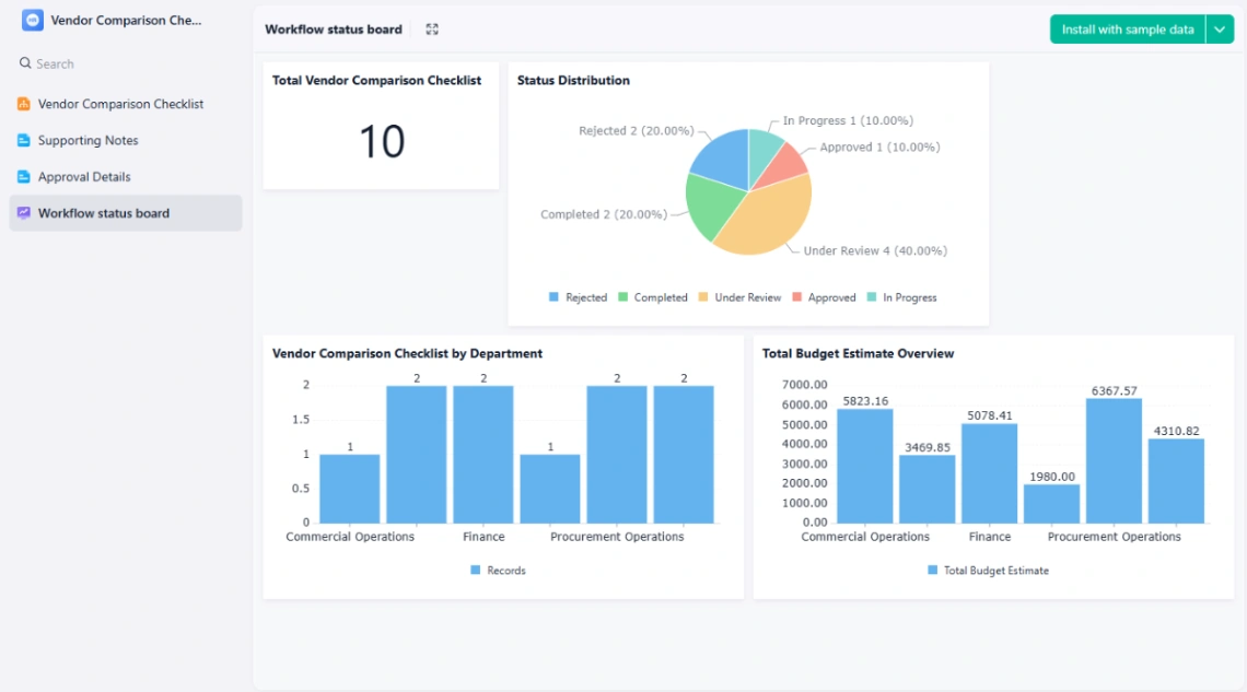
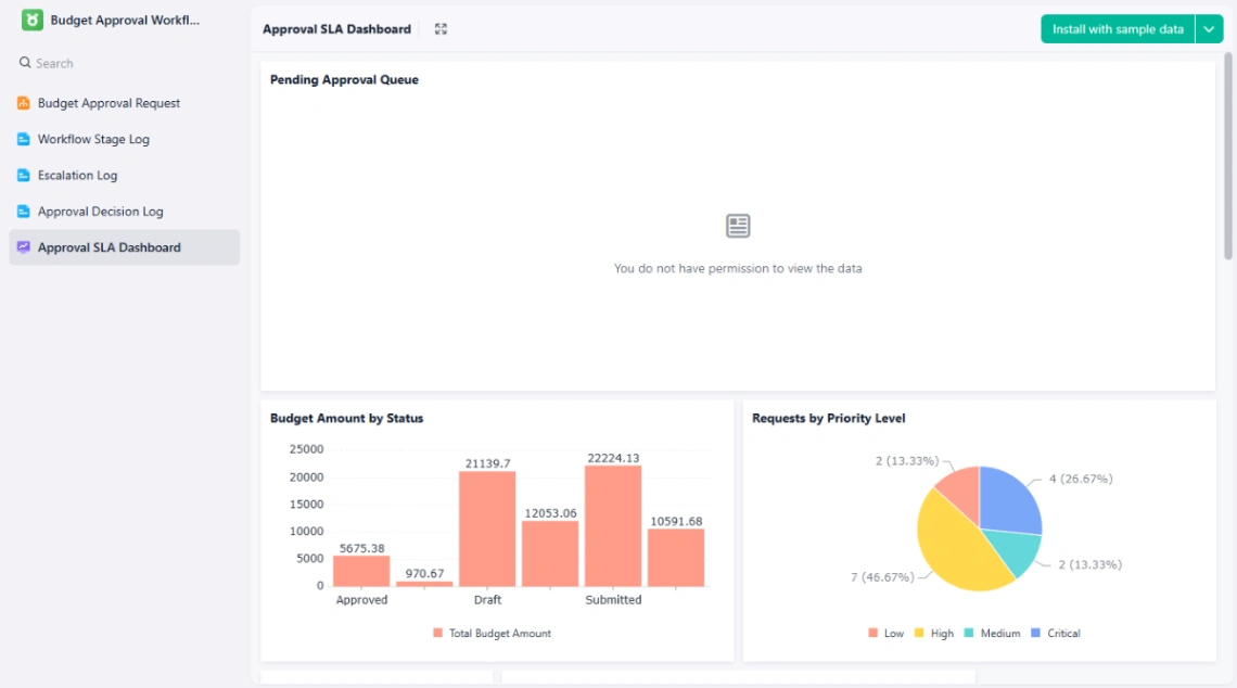
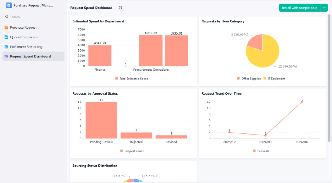
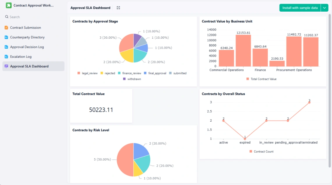
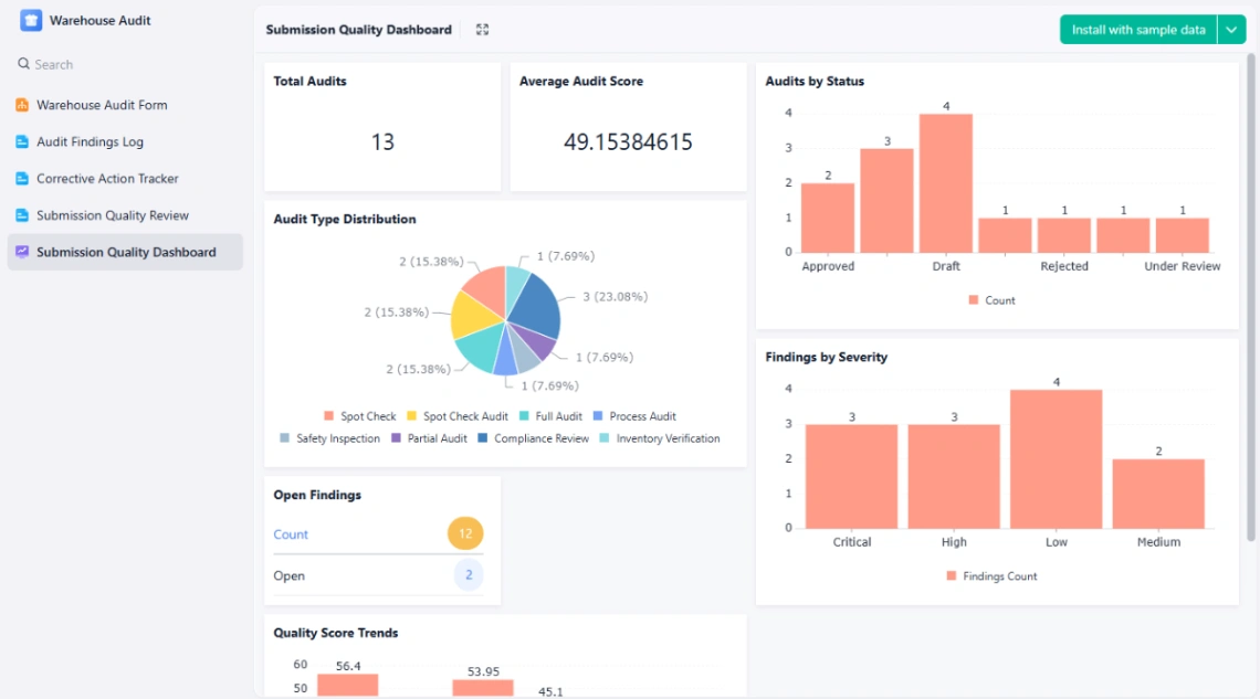
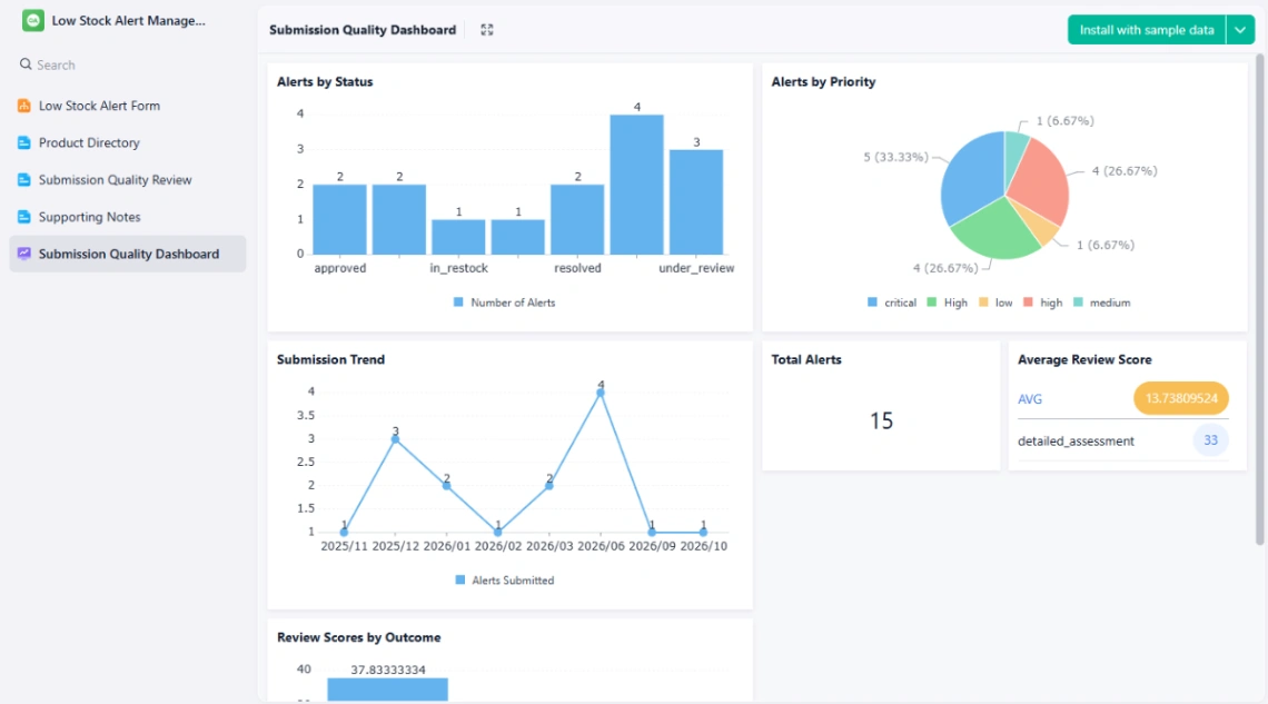
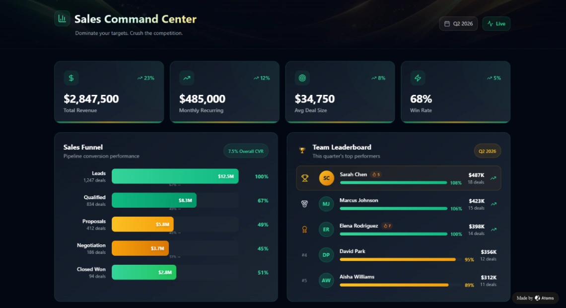
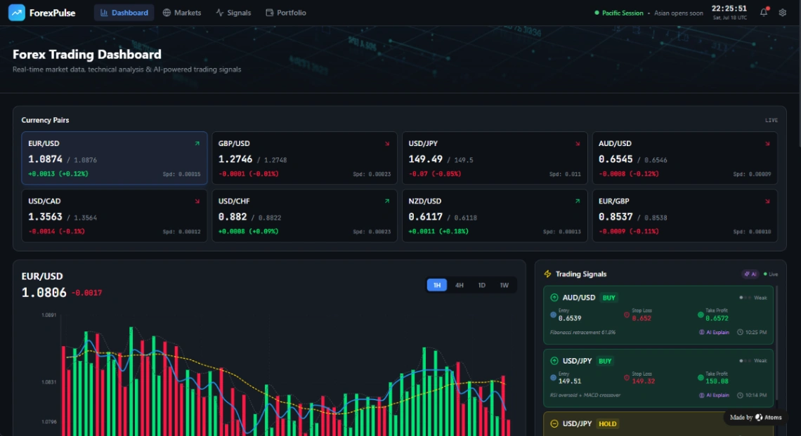
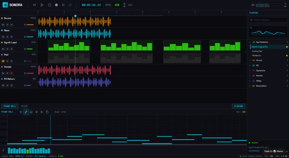
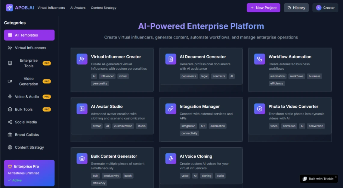
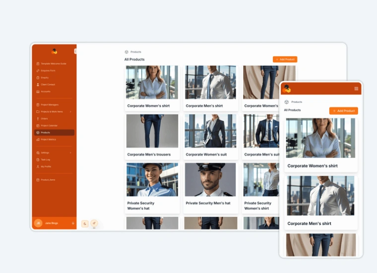
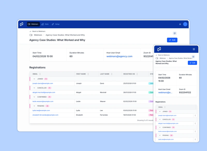
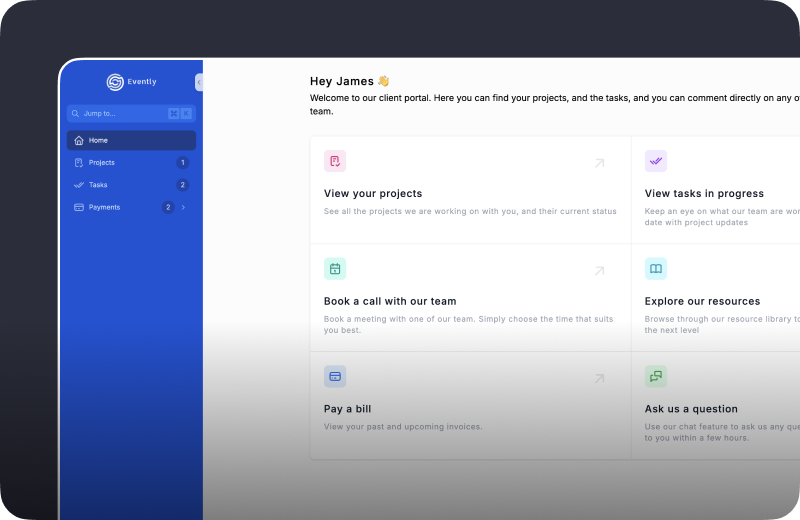
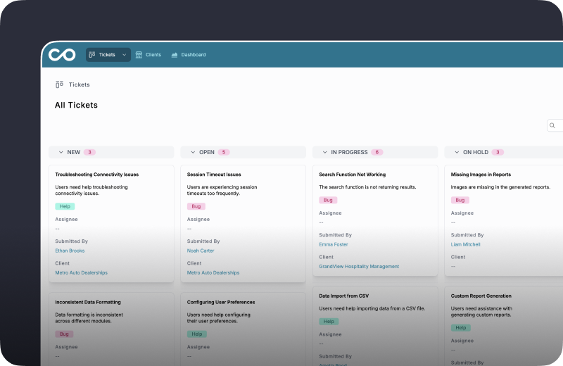
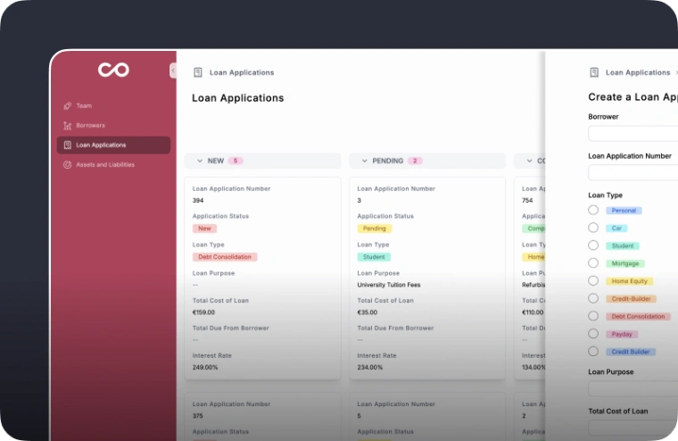
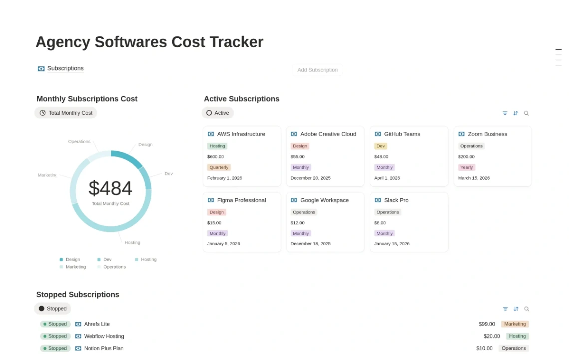
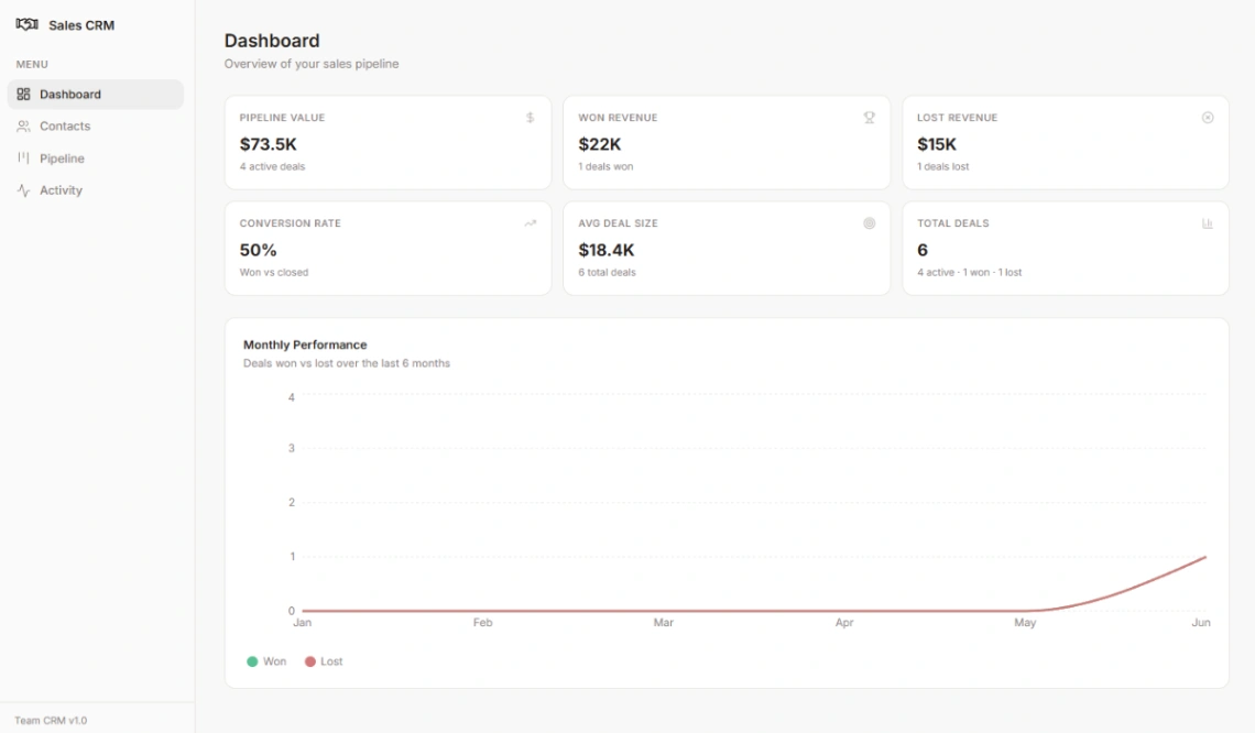
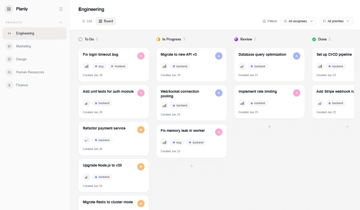
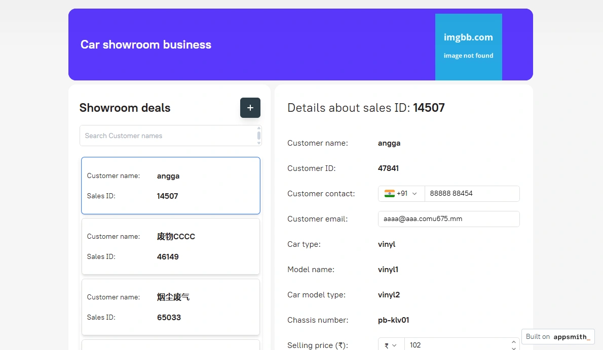
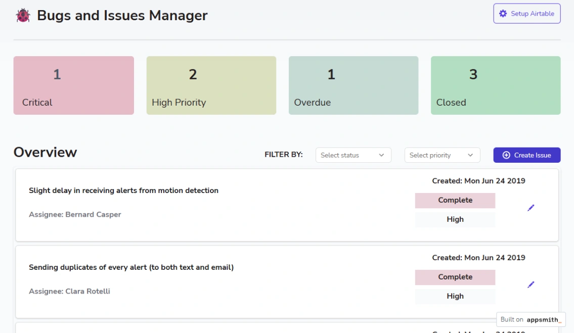
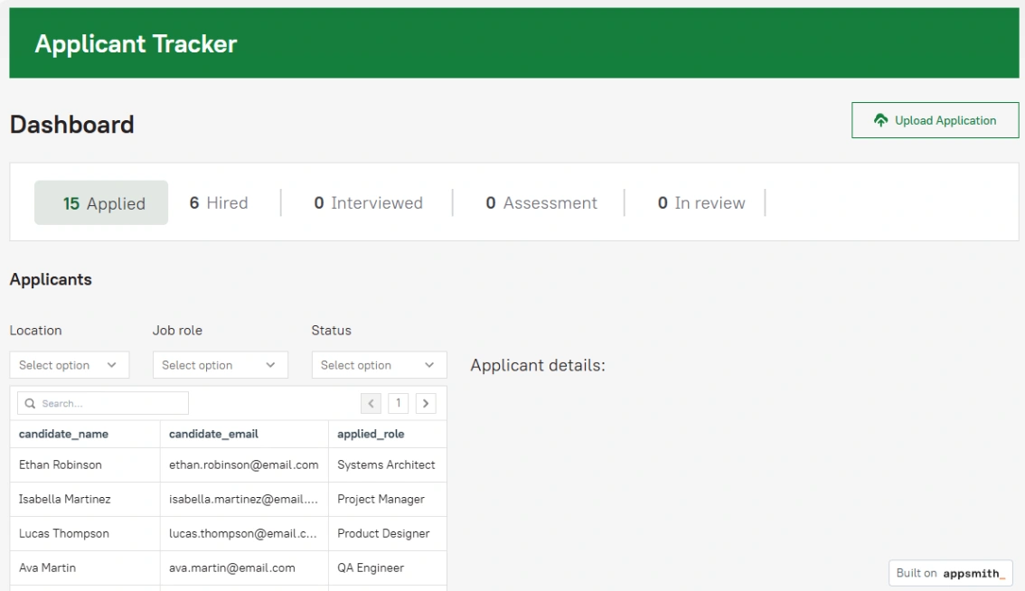
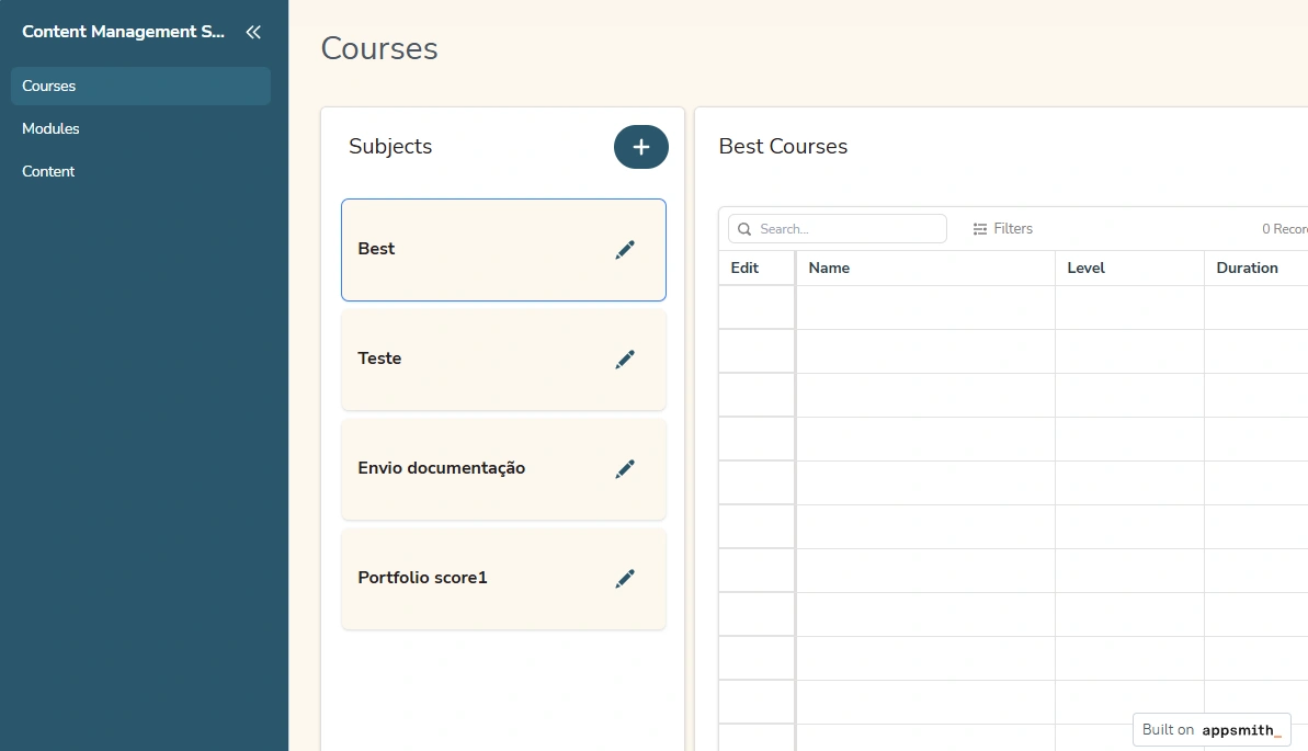
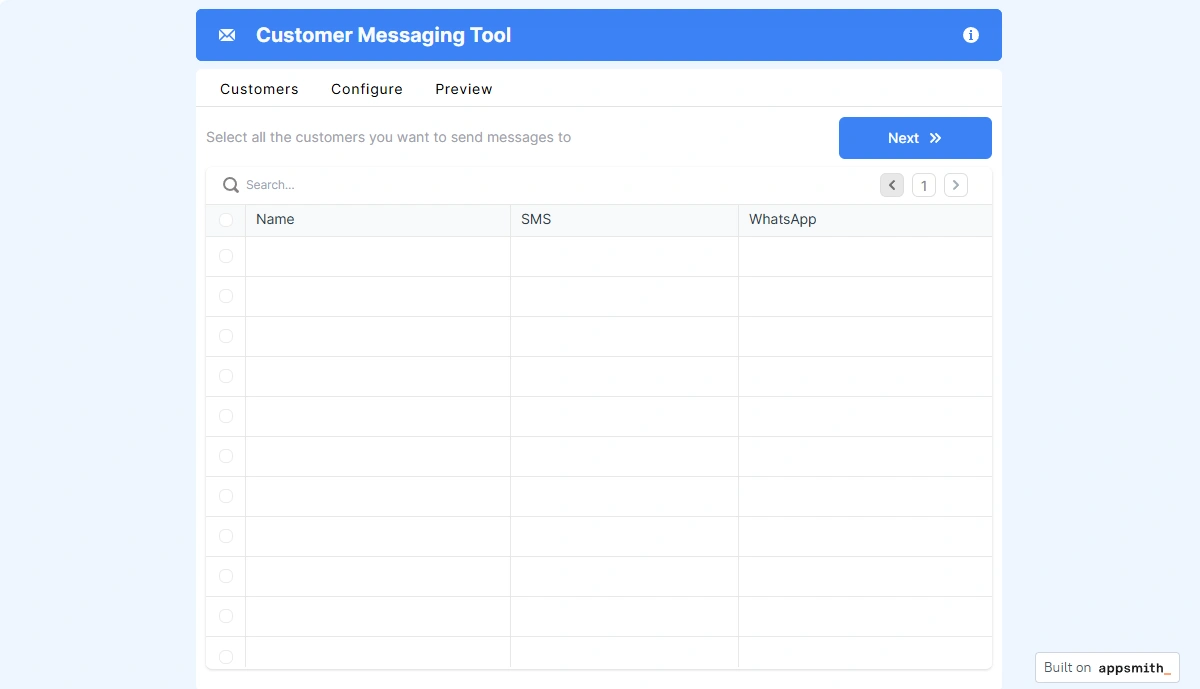
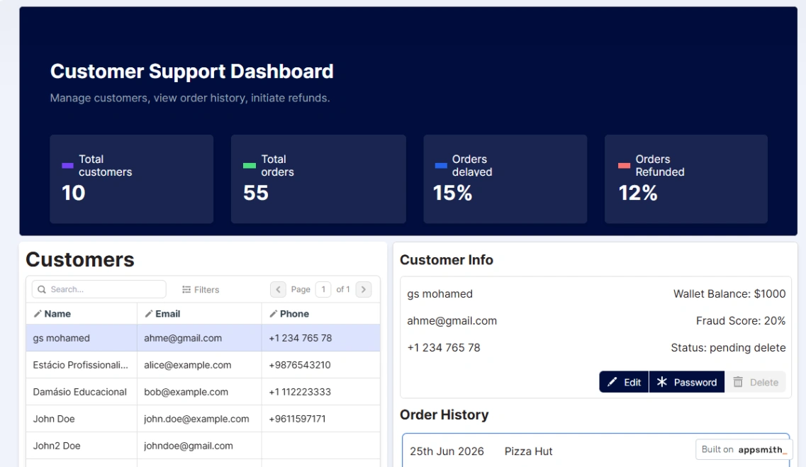
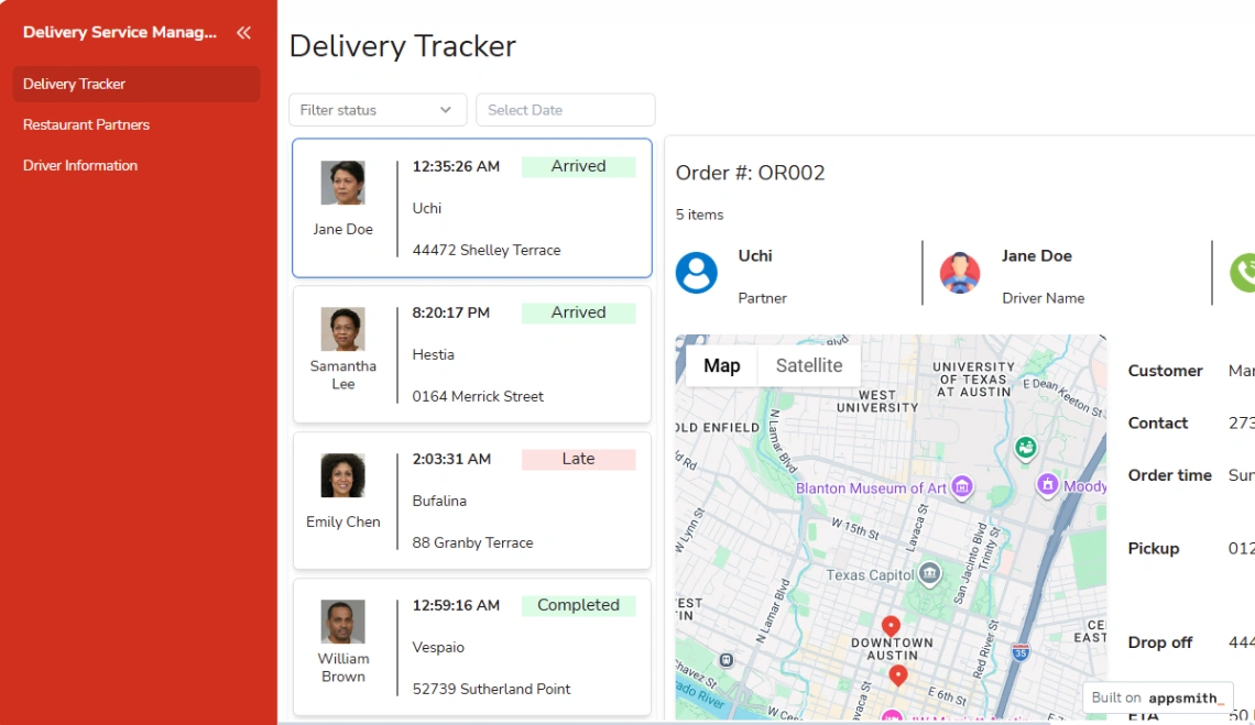
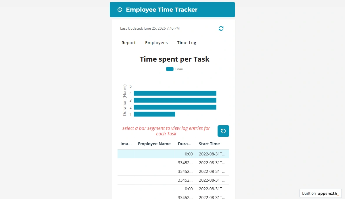
Sort the collection by who's inside. Admin panels manage your data (products, orders, users) and need full create-edit-delete on every table. Client portals expose slices of that data outward and live or die on per-user permissions. Team consoles sit between — shared views, assignments, statuses. The three look alike in screenshots and behave nothing alike; the app platforms behind each kind are pinned at the top of this page.
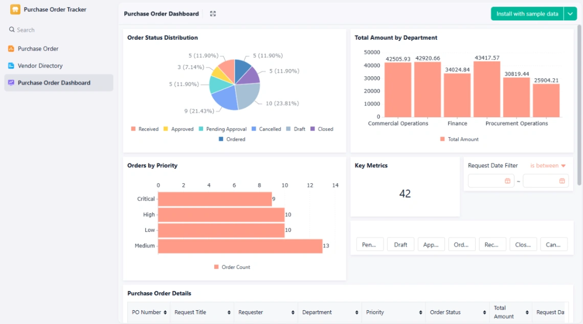
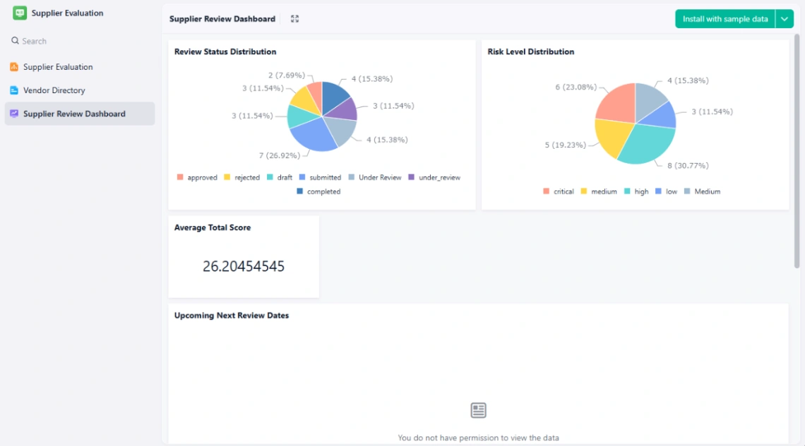
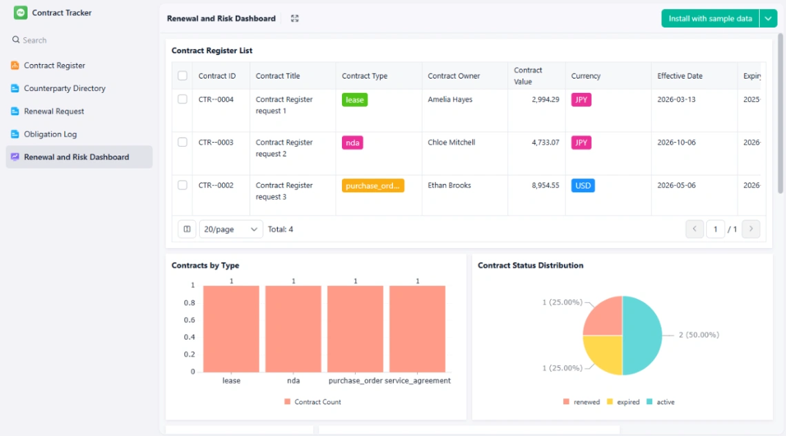
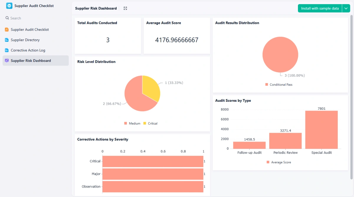
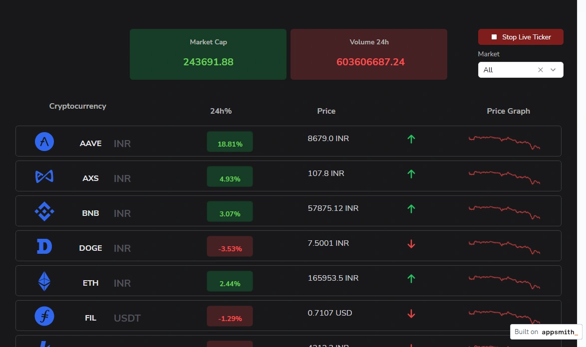
The capability that separates real templates from pretty ones is writing, not reading. Charts and tables are easy; forms that validate, edits that save, actions with an audit trail are the hard 80%. Open the preview and try to change something — if the demo is read-only, assume the writing is your work to build. The same test catches search, filters and sorting — try typing into them; static mockups stay silent.
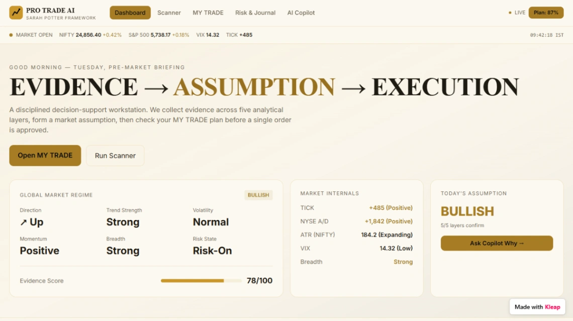
Then the rule this category earns: never judge on demo data. Fake numbers are curated to flatter the layout — always round, always plentiful, never null. Connect a real slice of your data during the trial: your too-long product names, your missing fields, your thousand-row table. A dashboard that survives your data on day one is the one that survives the year.
FAQ