


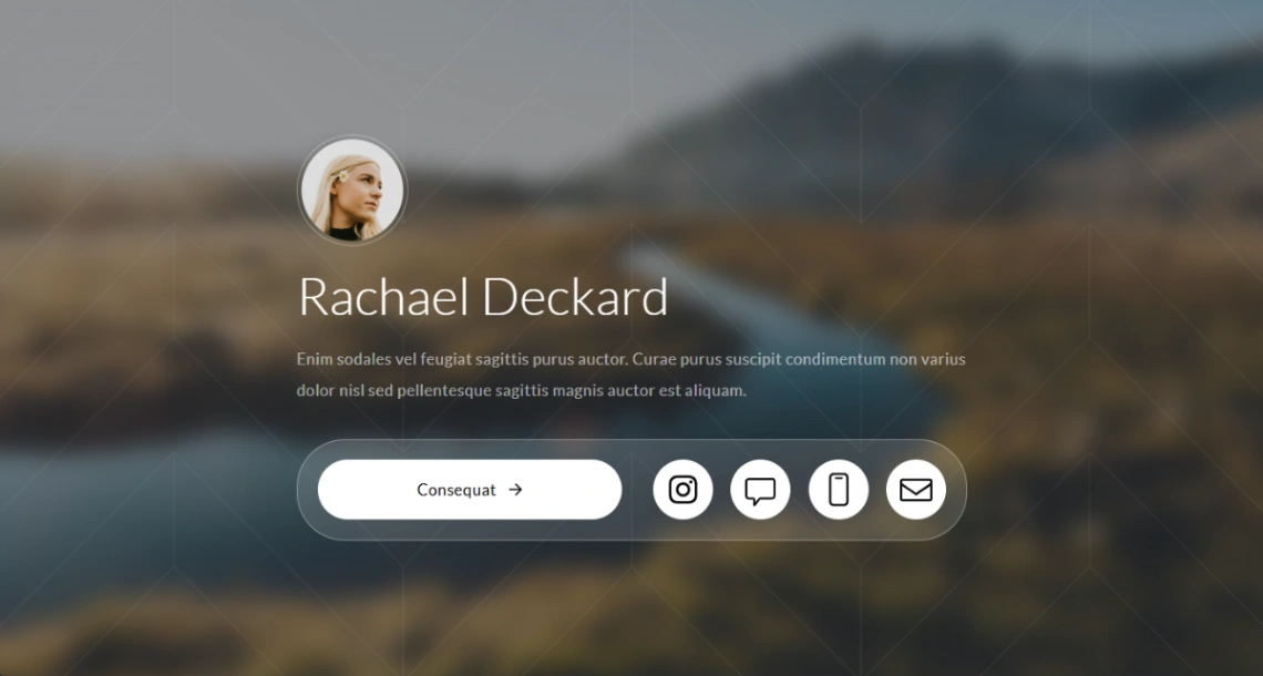

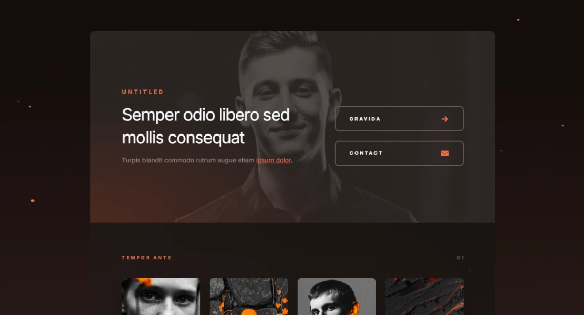
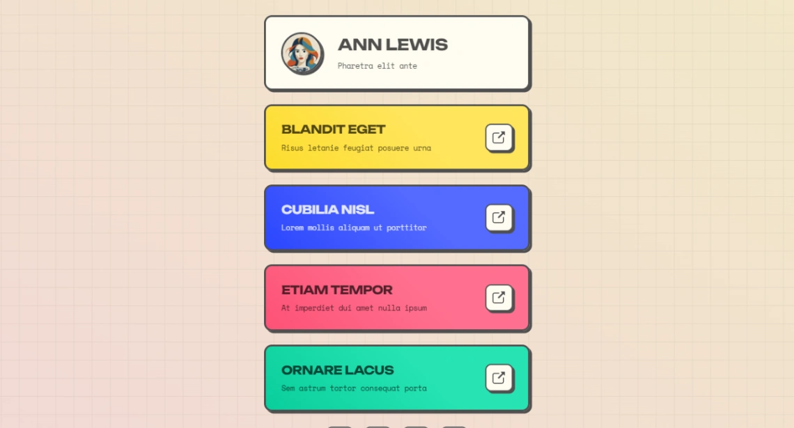
Link In Bio



Buyer's guide
How to choose a freelancer template
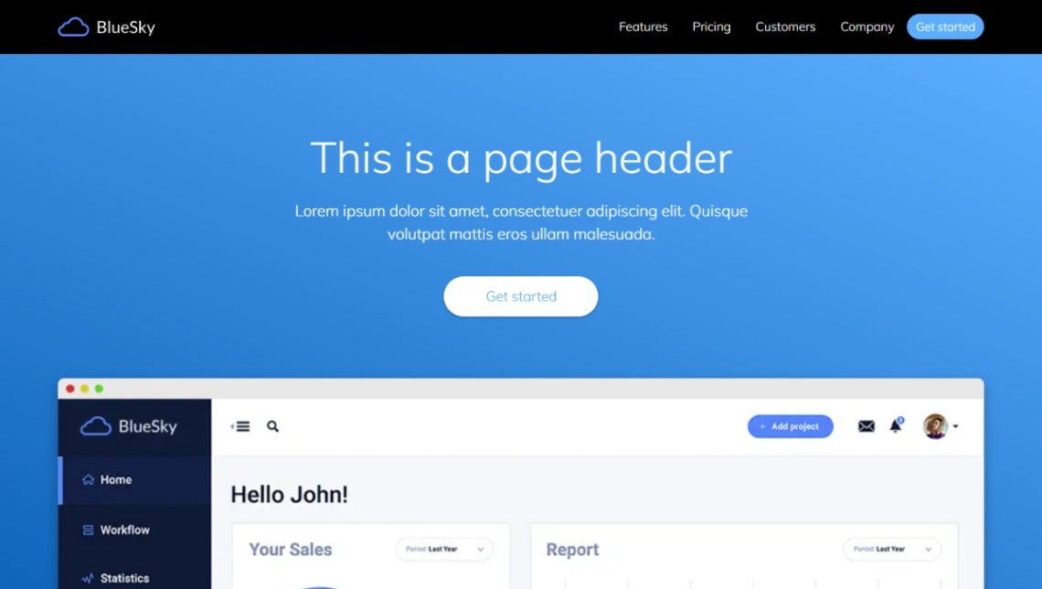
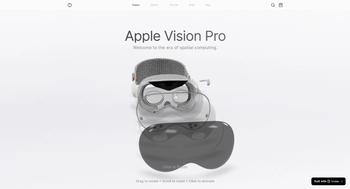
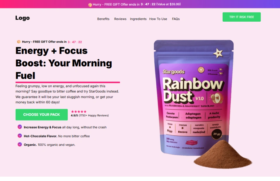
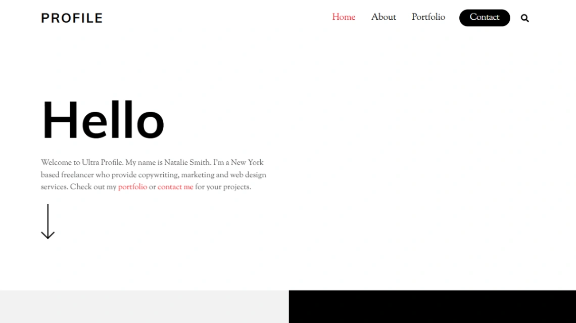
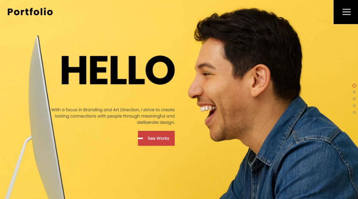
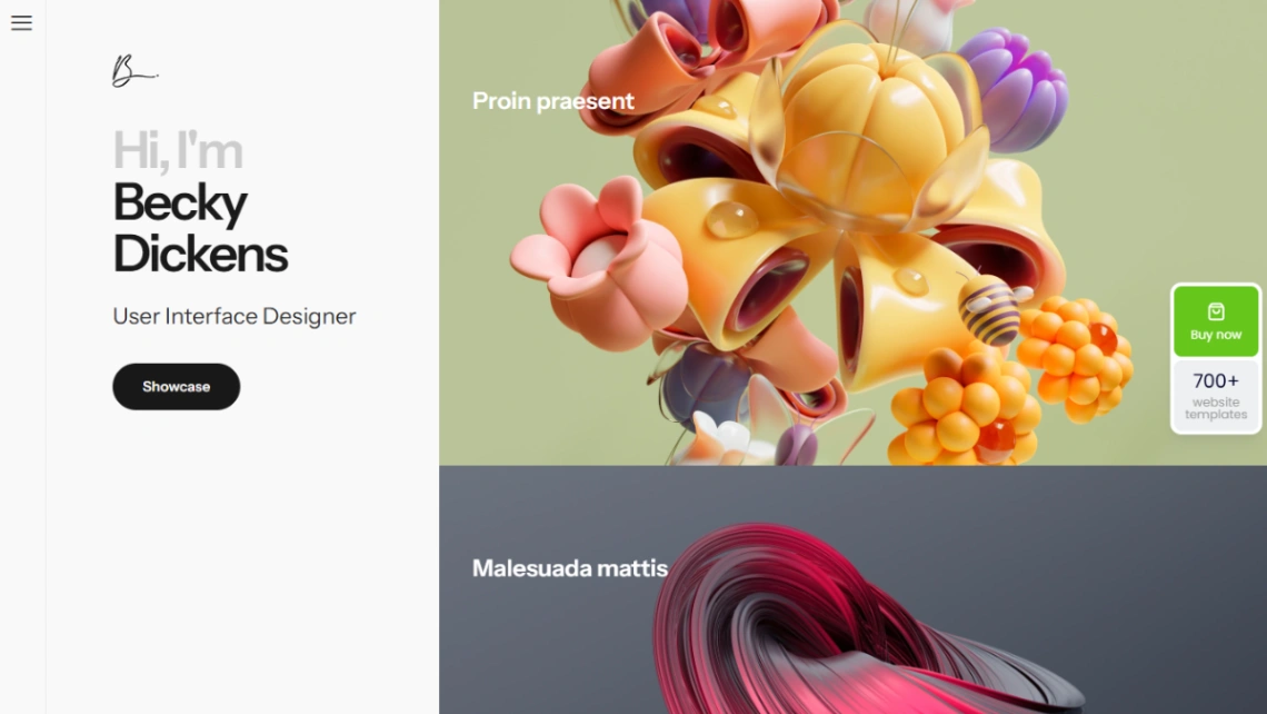
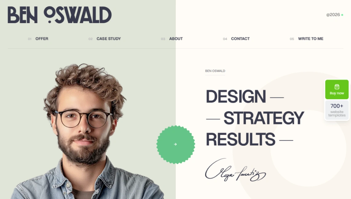
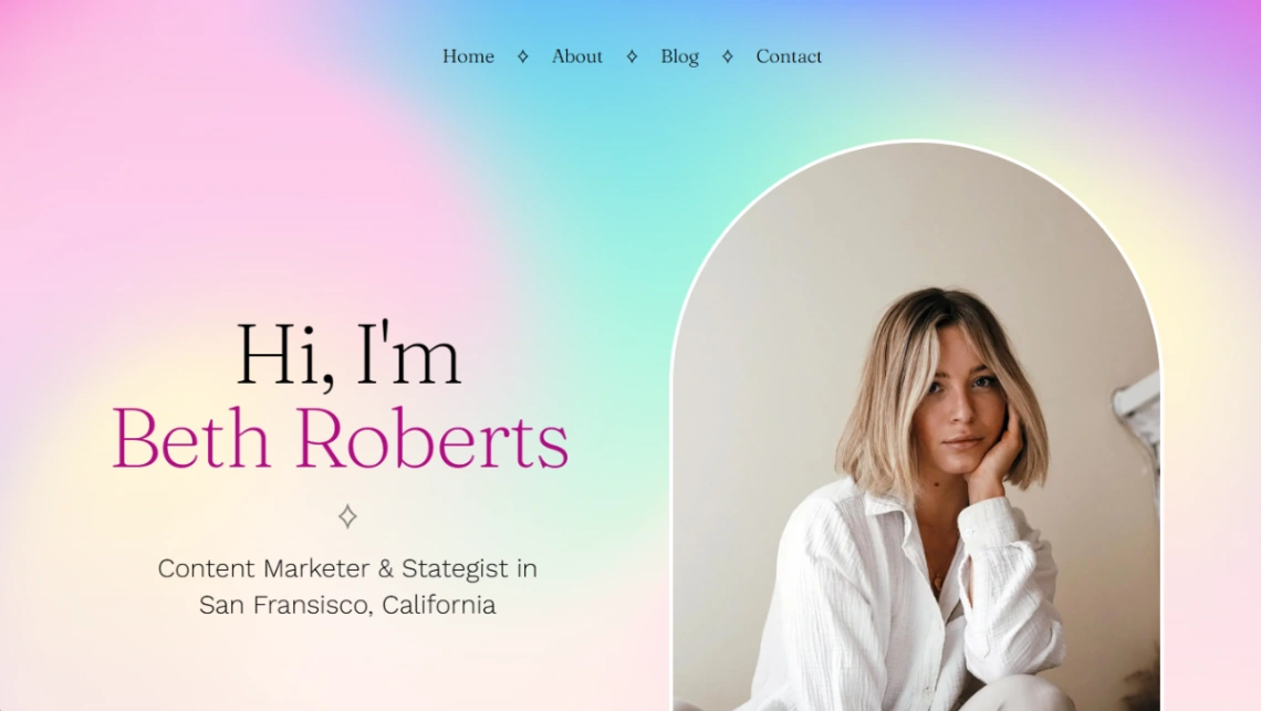
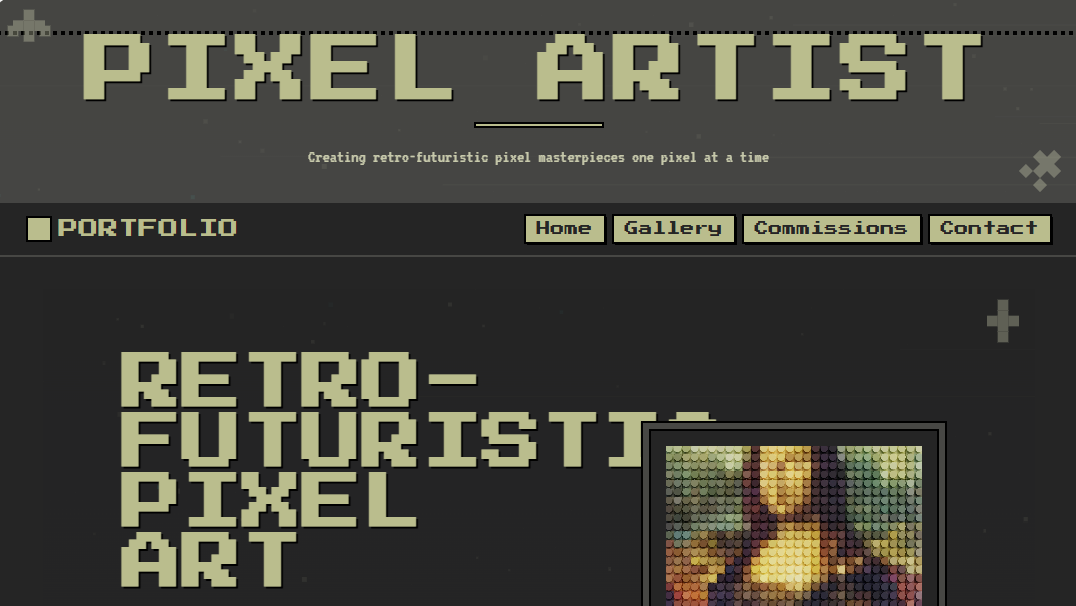
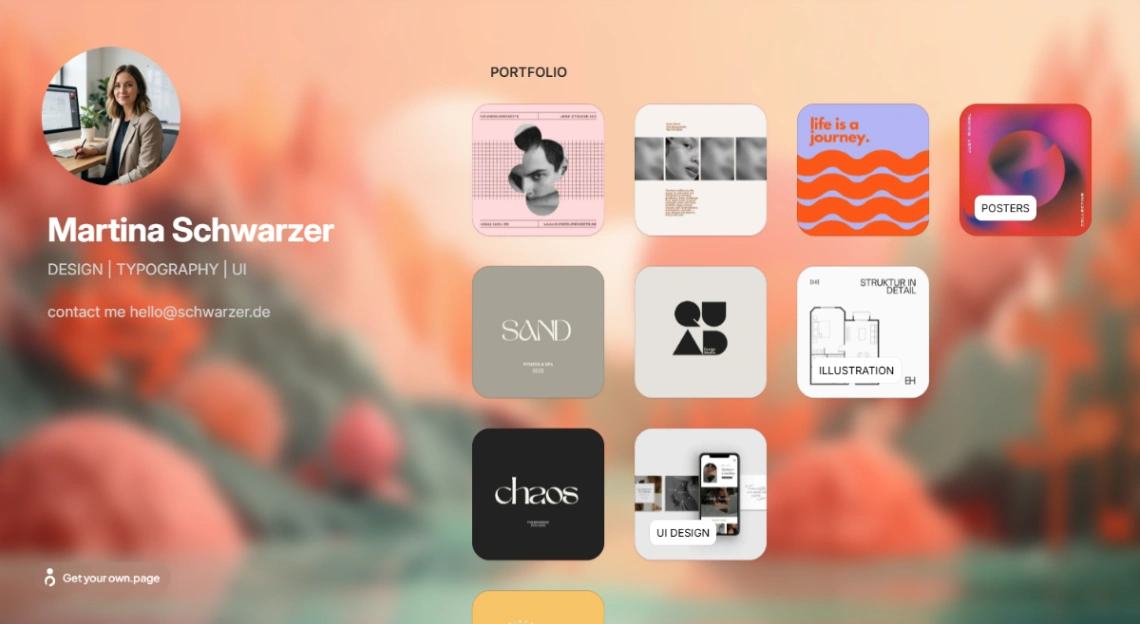
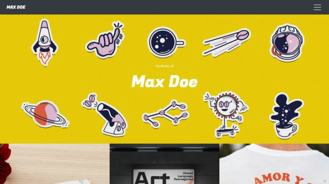
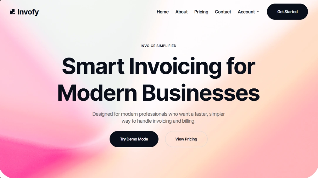
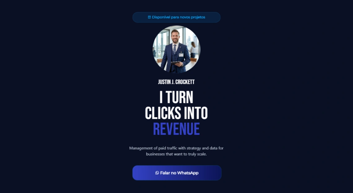
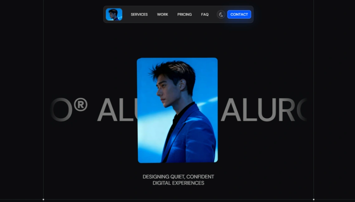
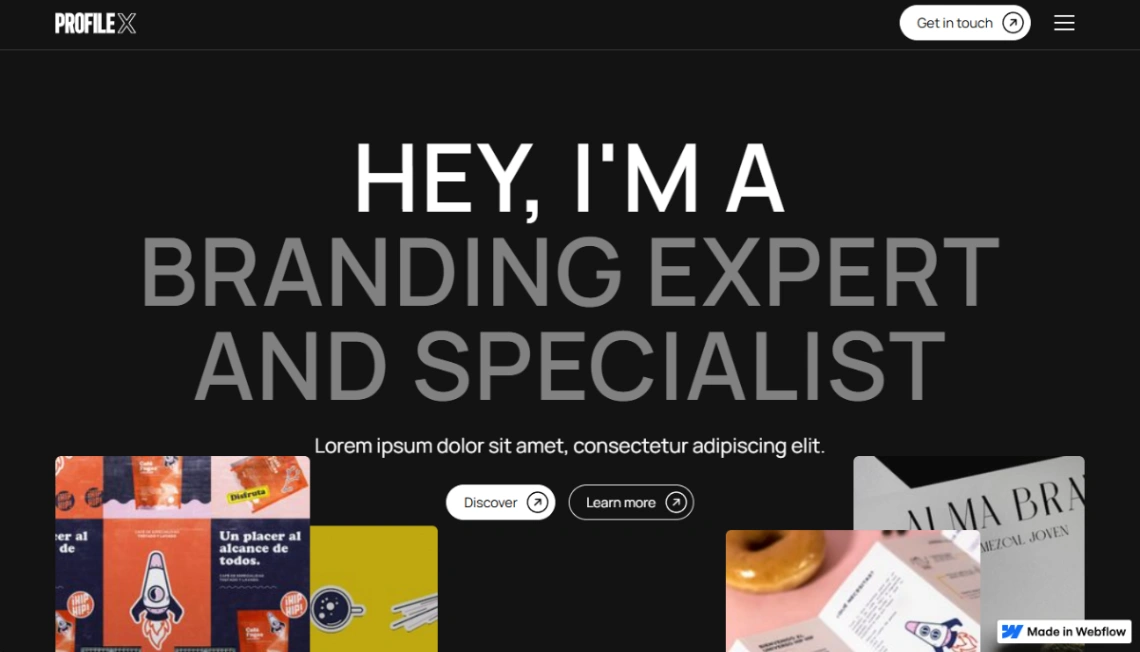
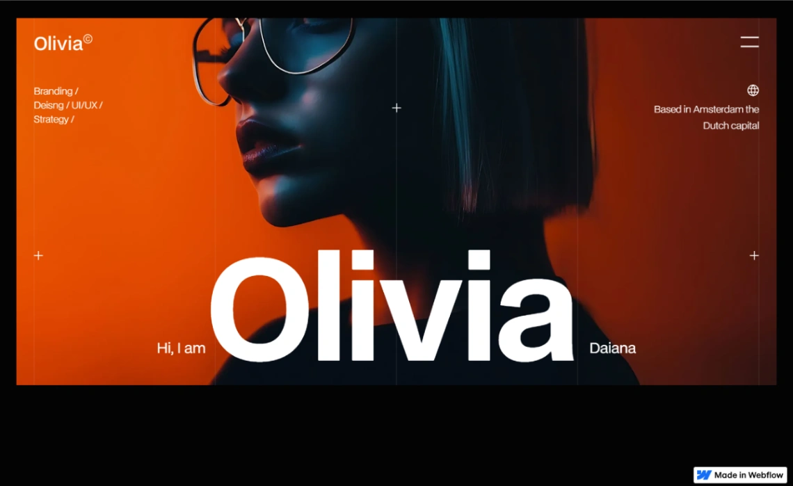
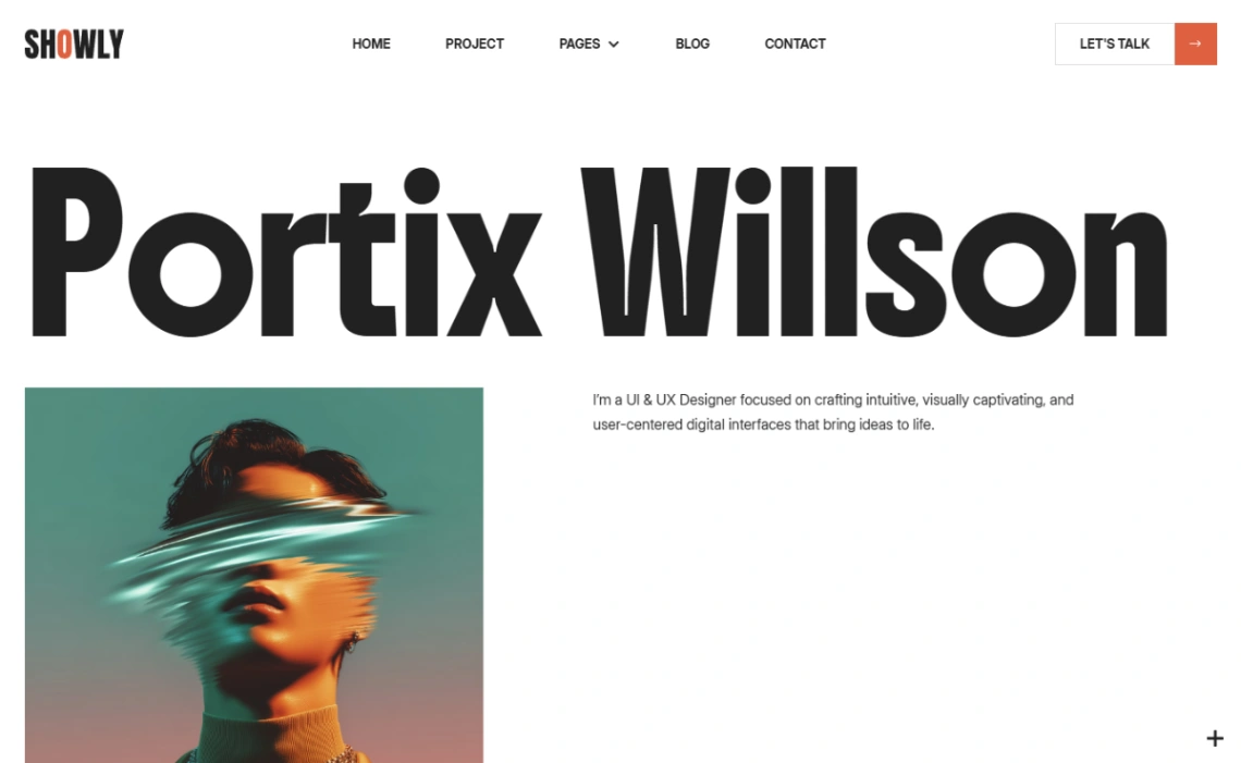
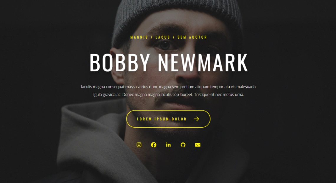
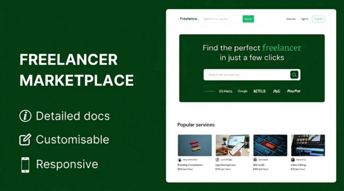
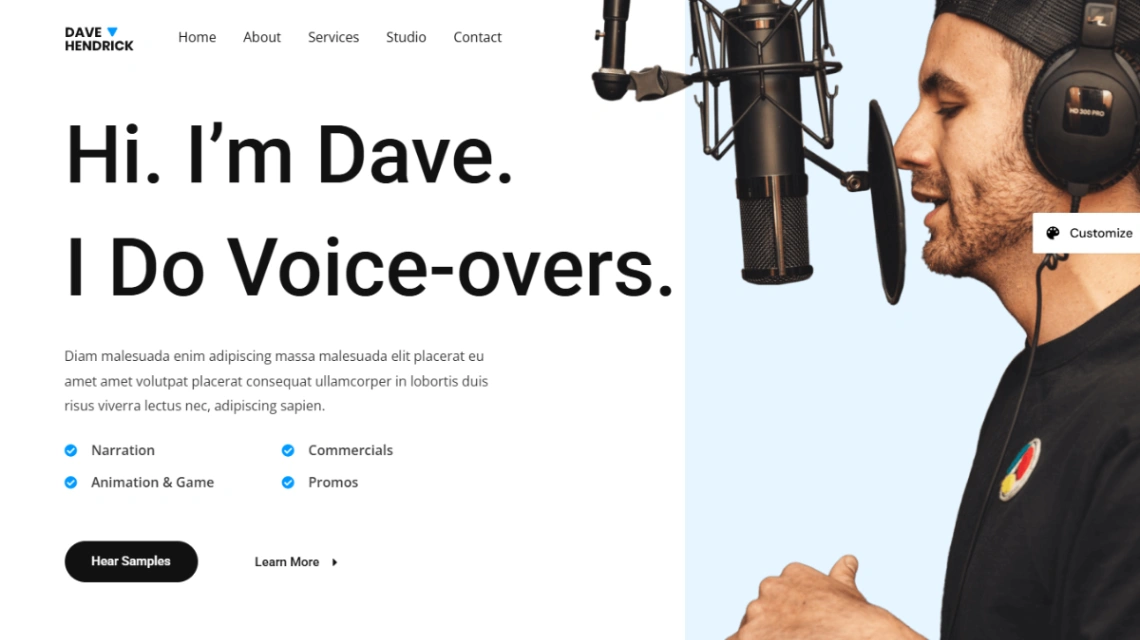
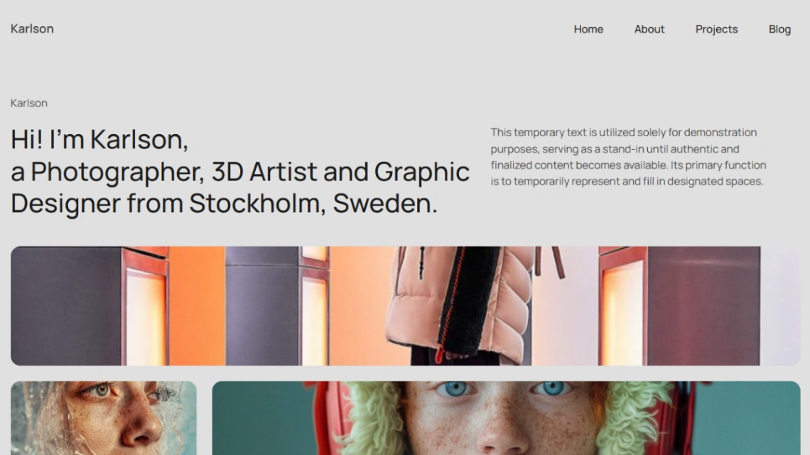
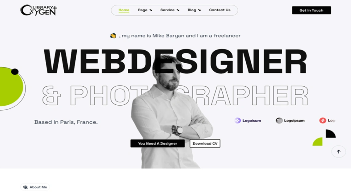
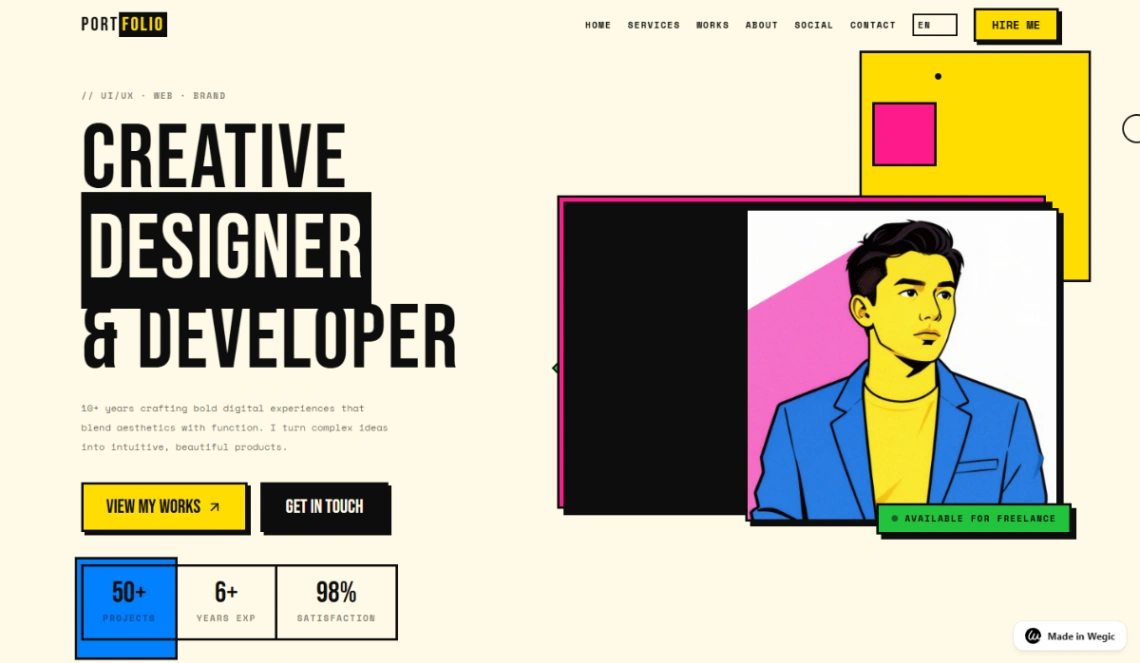
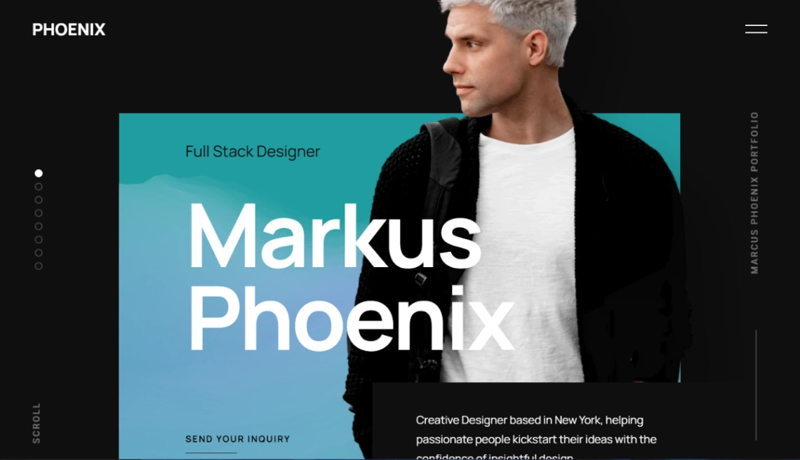
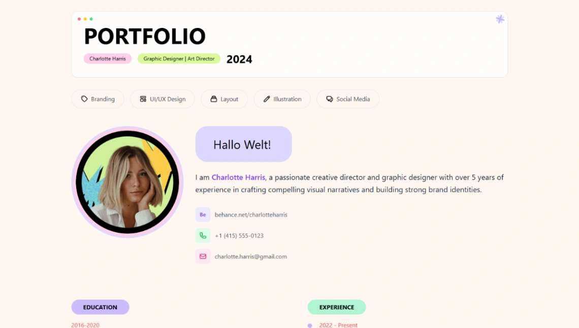
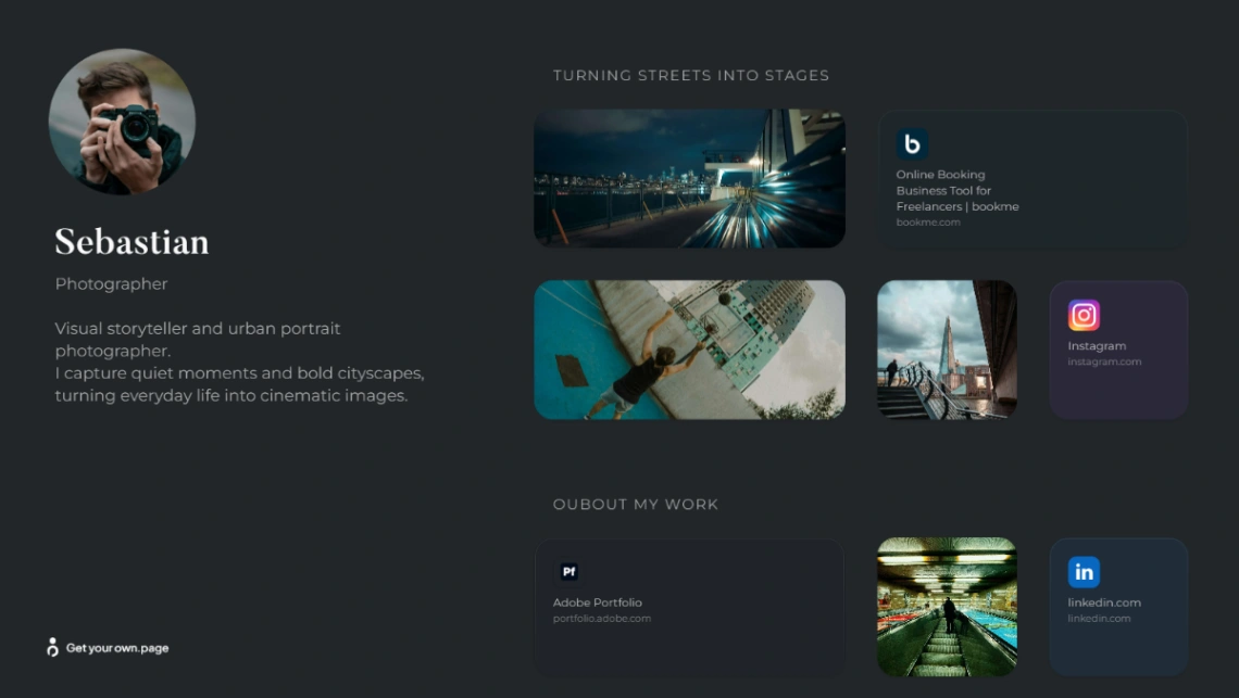
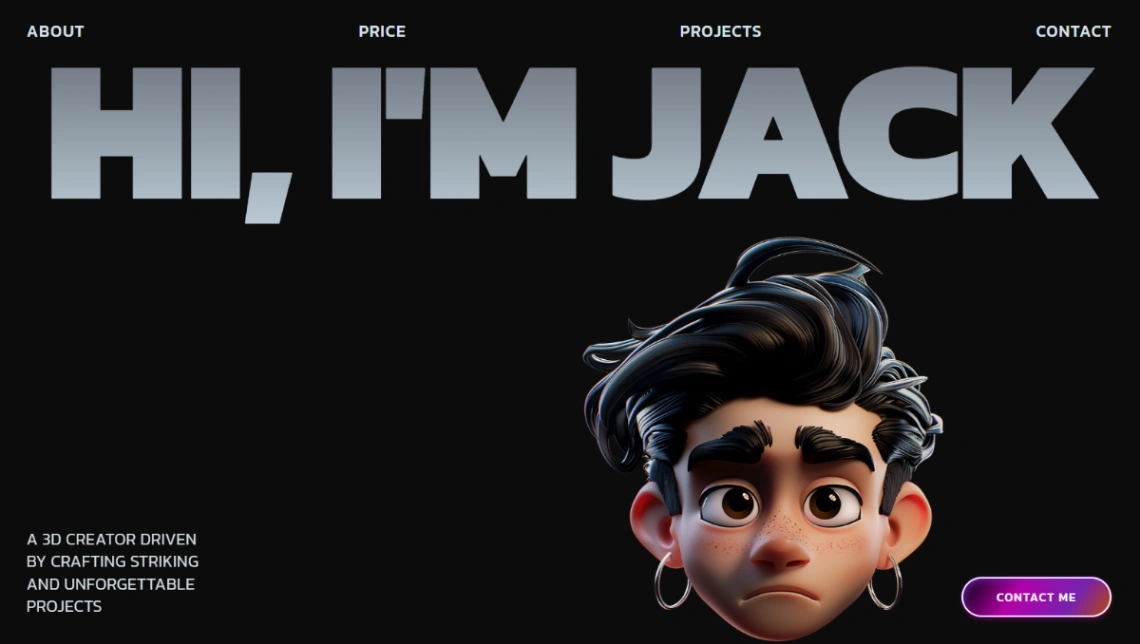
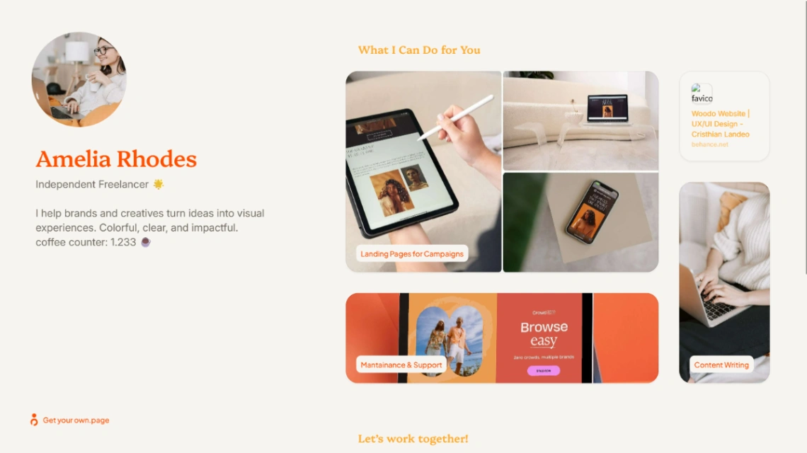
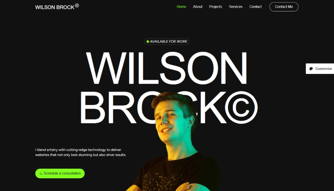
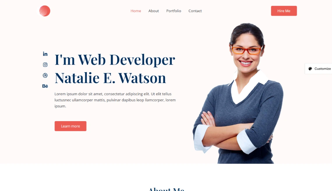
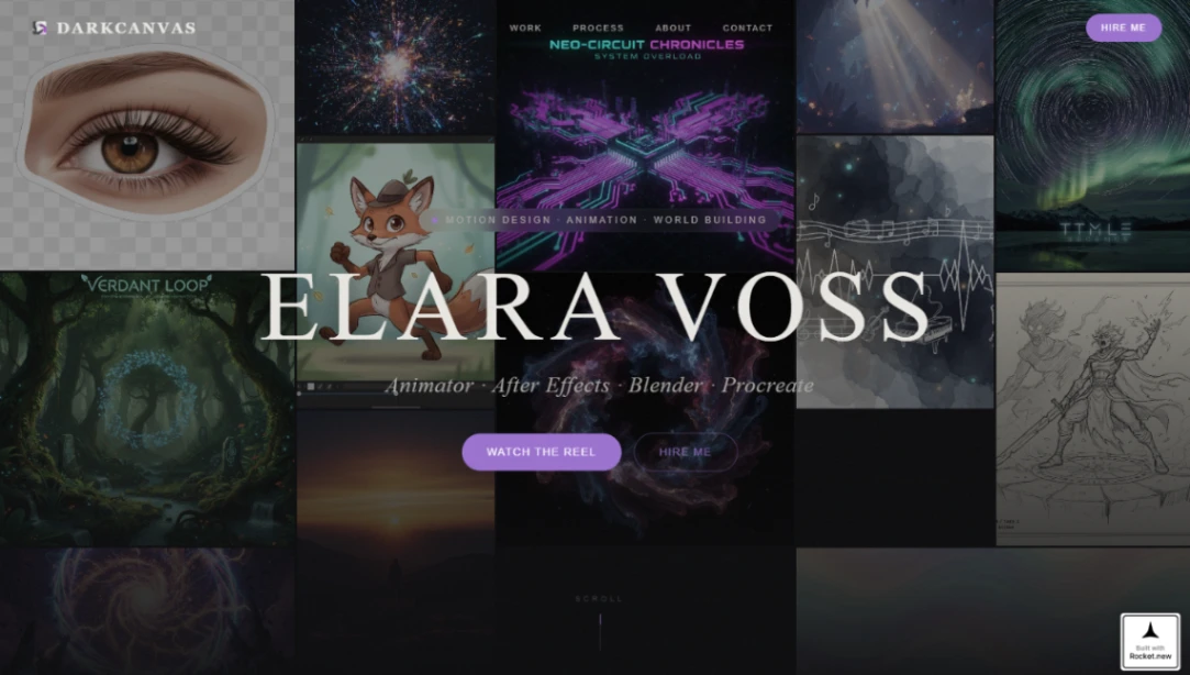
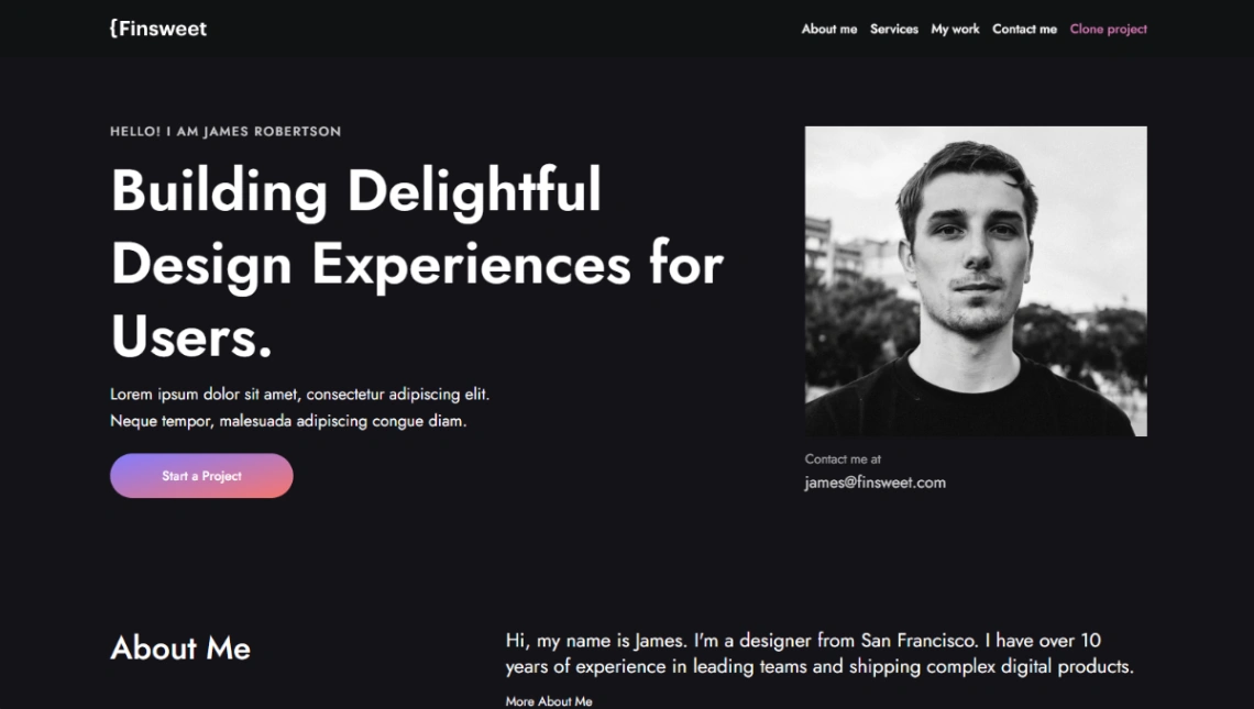
Your website has exactly one conversion: a stranger deciding to contact you. Most templates in this collection are one-pagers because that's the right default — what you do, who it's for, proof, and a single button, all reachable in one scroll. The multi-page builds with case-study depth earn their place when your rates are high enough that clients research you before calling; until then, they're weight.
Decide the contact path deliberately, because it shapes the template. A calendar embed removes email back-and-forth but invites unqualified calls; a short form — budget range, timeline, what they need — filters tire-kickers before they reach you; a plain email link is frictionless but unfiltered. Any of the three works. Offering all three at once is the mistake: pick one and repeat it down the page.
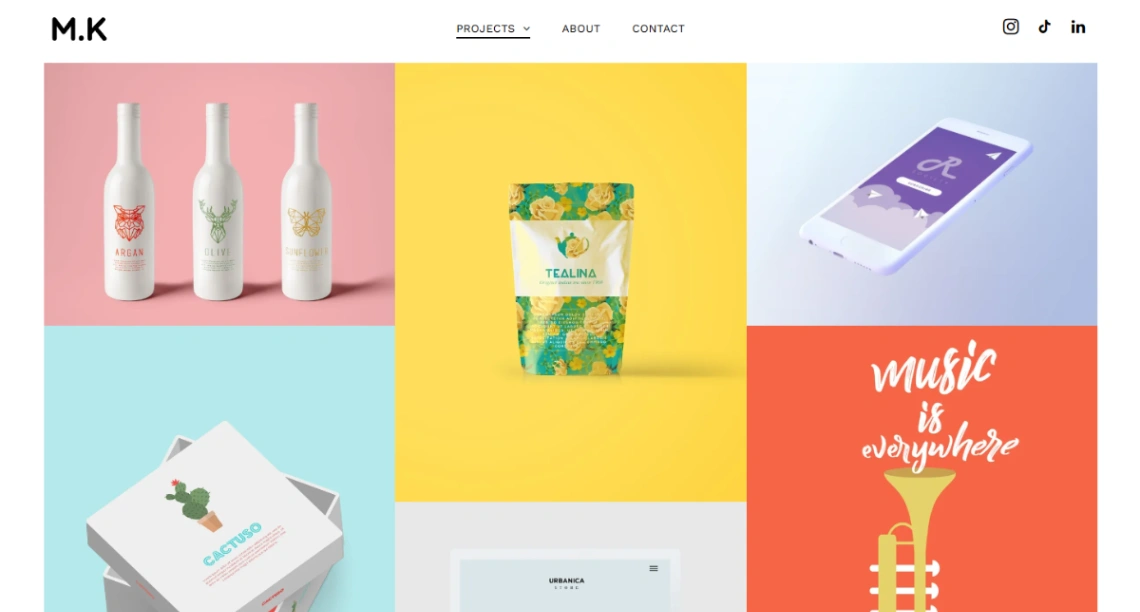
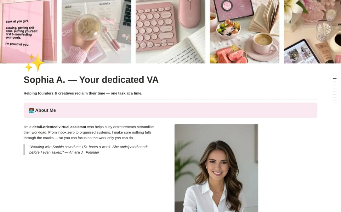
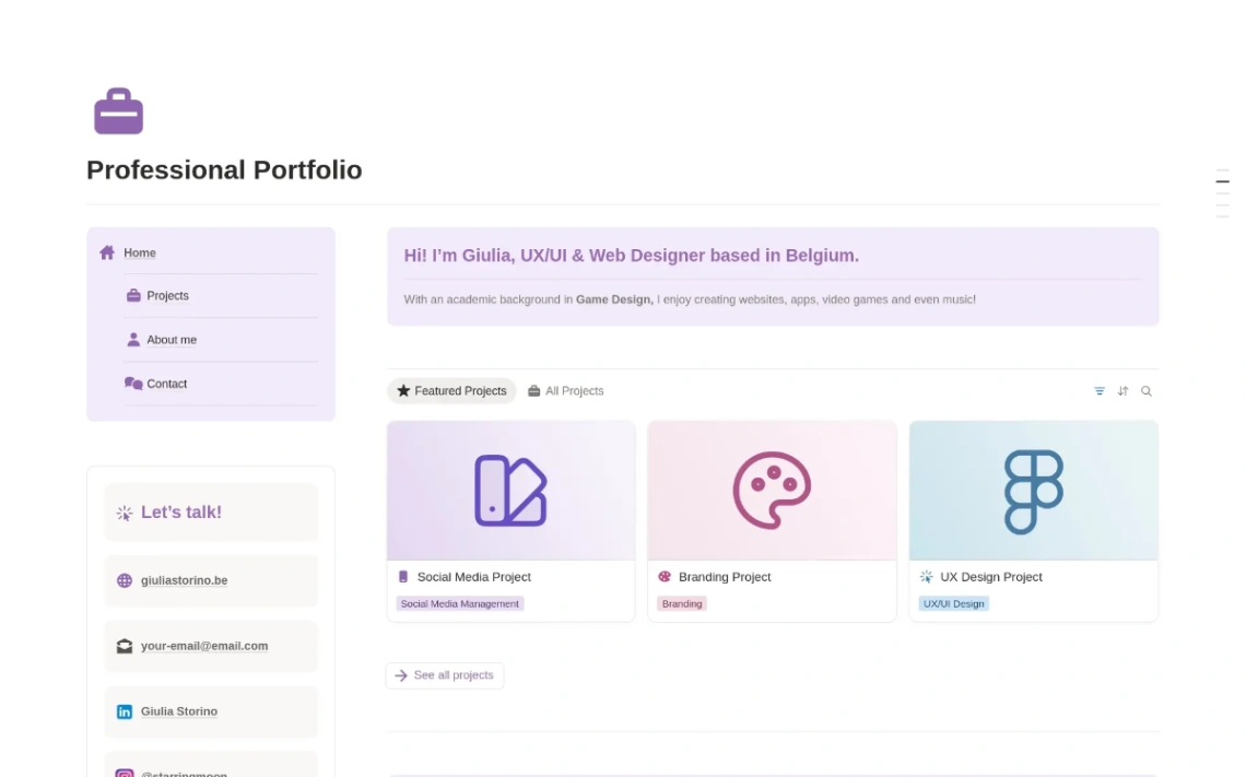
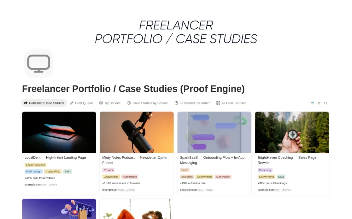
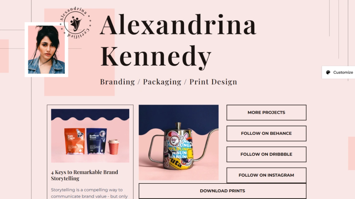
Proof should match your stage, not your ambitions. Established freelancers lead with testimonials, recognizable client names and two or three outcome-focused case studies. If you're starting out, show the work itself — spec projects, redesigns of real sites, before-and-afters — and say plainly that you're building a client base. What you must never do is pad: one real testimonial outweighs six vague ones.
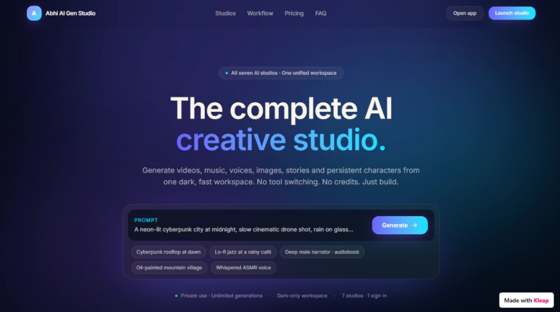
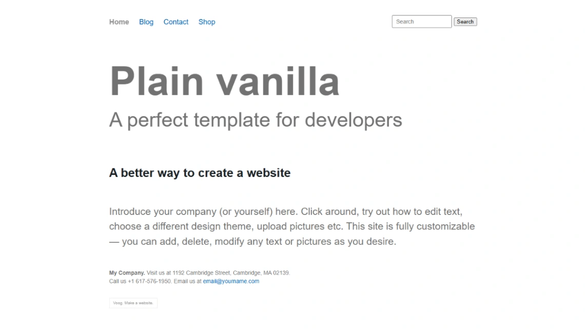
The warning this category exists for: freelancers famously spend three weeks perfecting their own site while paid work waits. The template's job is to remove that excuse. Publish tonight with what you have, add proof between projects, and let the live version earn while you improve it — an imperfect site that exists out-earns a perfect one that doesn't. Builders suited to shipping fast are pinned at the top of this page.
FAQ