
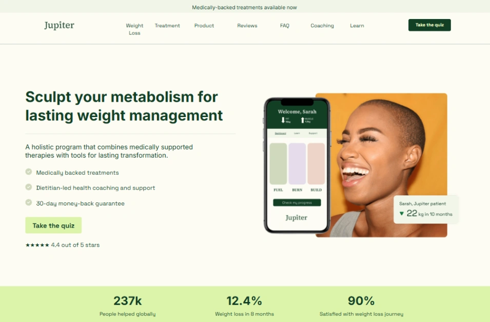

Medical Lab





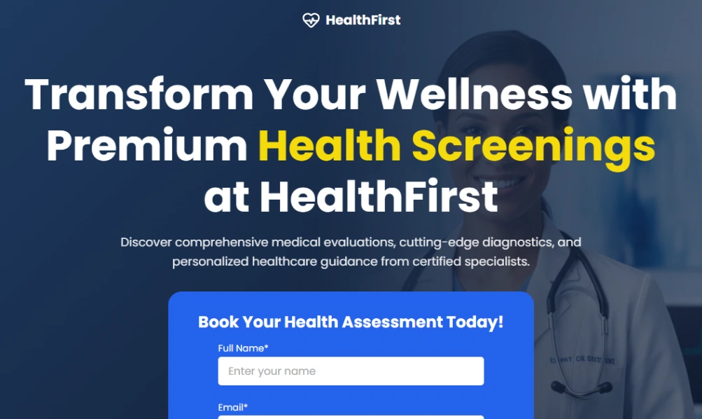





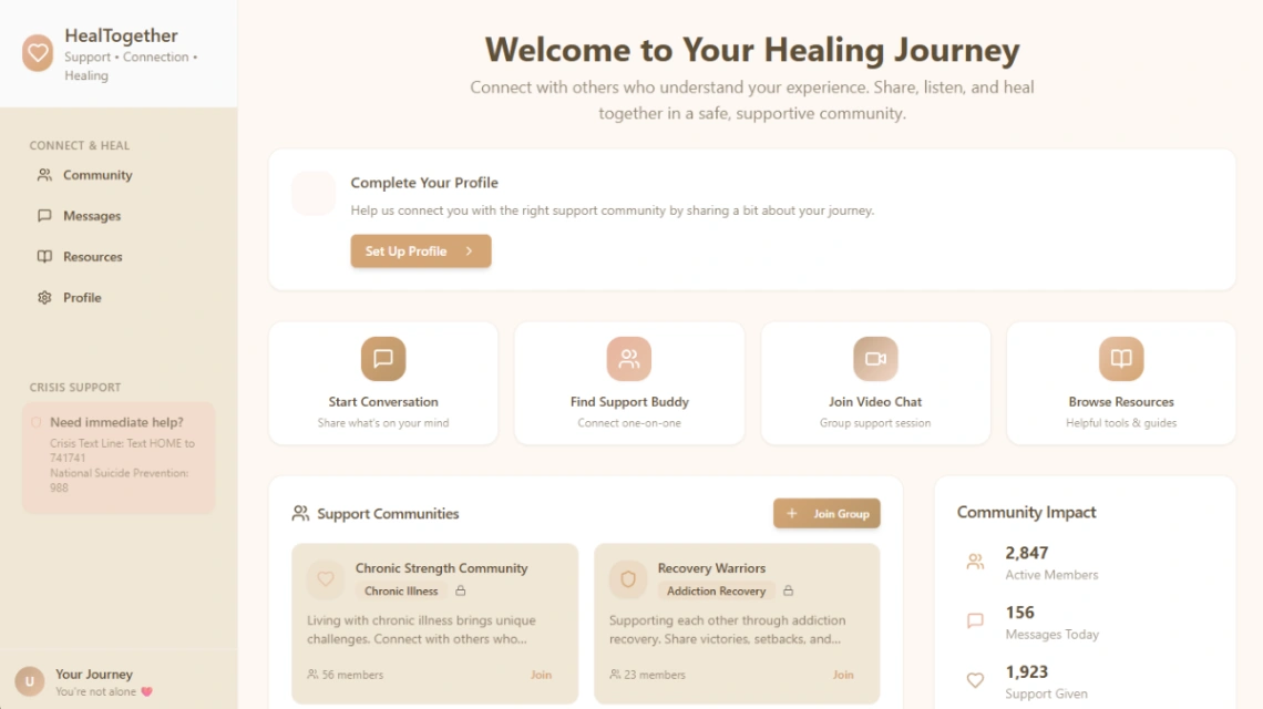


Medical Care


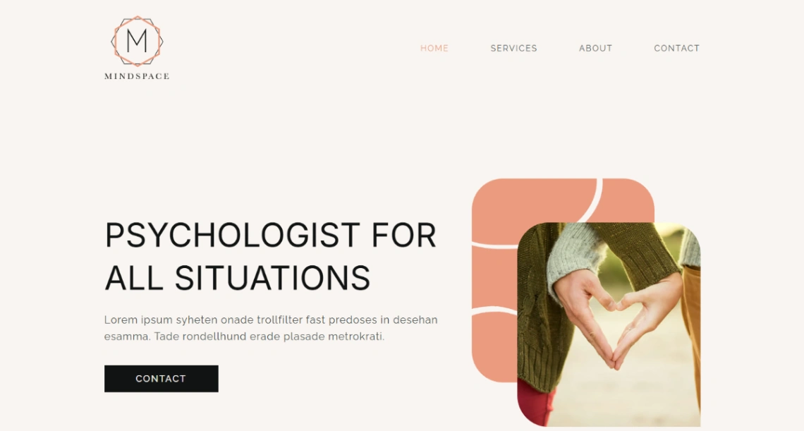
Mind coach


Buyer's guide
How to choose a medical template
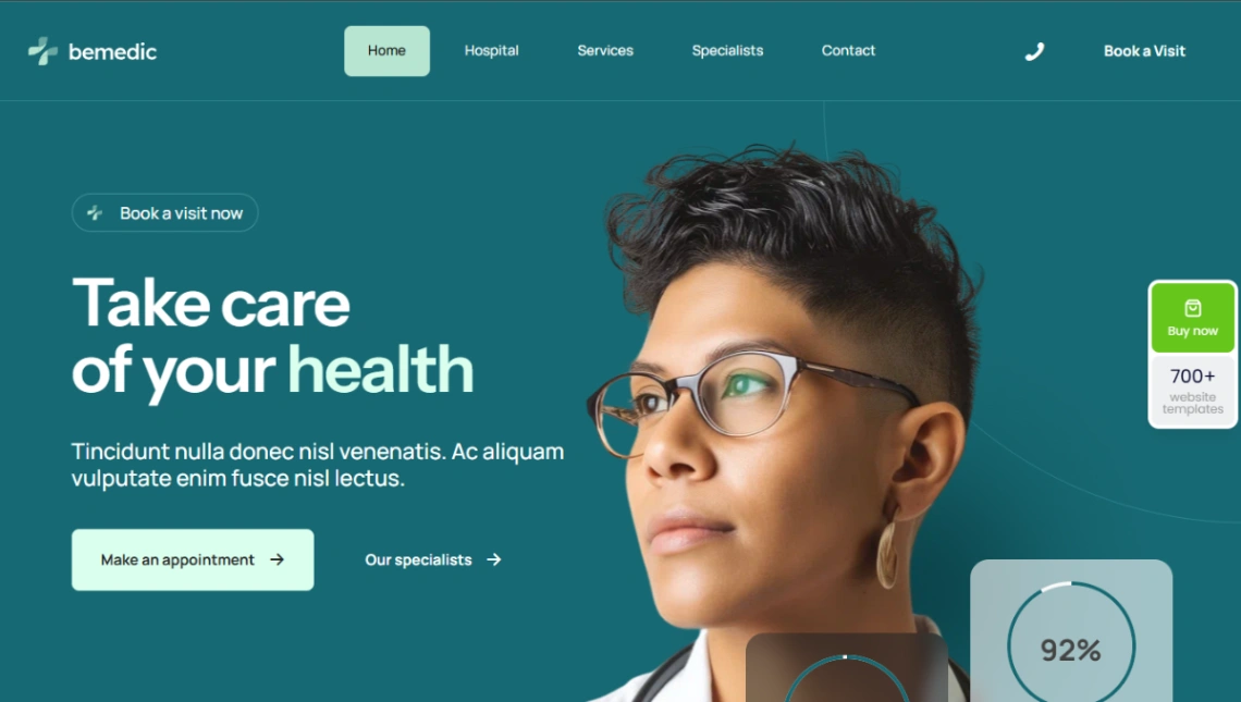
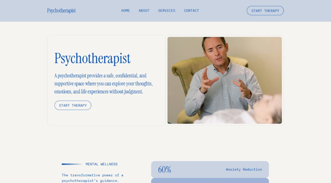
A medical website is read in a state of mild anxiety — someone hurts, someone's worried about a parent, someone needs an appointment before work. Clarity is the treatment. Services in plain words rather than clinical marketing, the booking action visible without scrolling, and the phone number tappable everywhere. Every template decision should shorten the distance between worry and appointment.
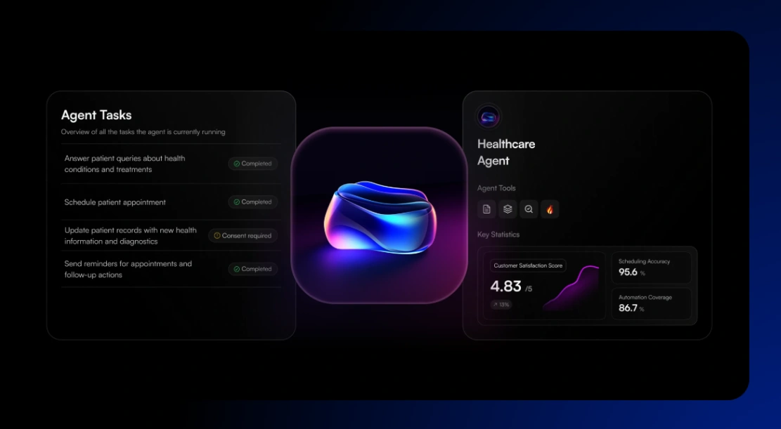
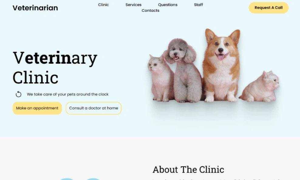
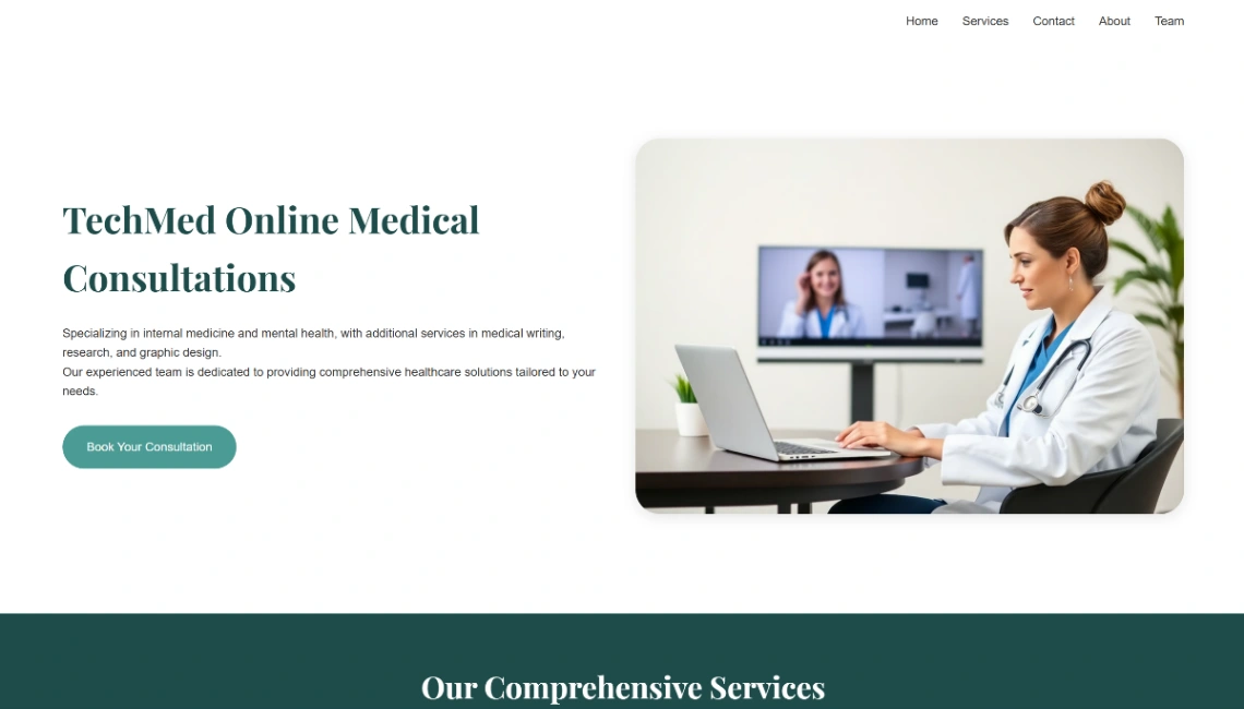
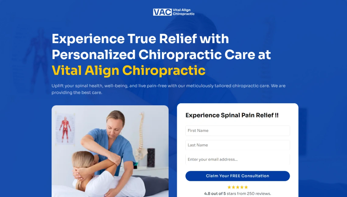
Booking is the feature to compare hardest: two clicks from any page, whether that's an embedded scheduler or a prominent call button with hours beside it. Check the after-hours story too — a clear "closed now, here's what to do" block serves the 2am visitor better than a silent contact form. Templates with real booking blocks appear throughout the pinned picks at the top of this page.
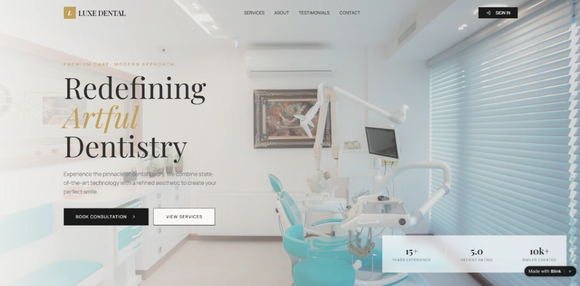
Trust here is specific, not decorative: real photos of the team and premises, credentials stated plainly, which insurance is accepted, honest pricing where it applies. Then the unglamorous blocks patients actually need — hours, parking, directions, what to bring. Practices consistently over-invest in mission statements and under-invest in the parking paragraph. A short FAQ — first visit, what to bring, cancellation policy — quietly removes half the calls your reception answers.
Two disciplines round it out. Accessibility is patient care online — readable type, strong contrast, no text trapped in images — because a meaningful share of your patients are older or visiting one-handed. And keep forms minimal: name, contact, preferred time. Symptoms and medical details don't belong in a general-purpose web form; let them wait for the call.
FAQ