Buyer's guide
How to choose a religion template
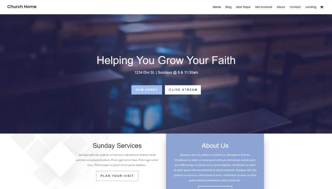
A congregation's website is its front porch: most first-time visitors arrive online, quietly, before they ever arrive in person — often on a Saturday night, deciding about tomorrow. Serve that visitor first. Service times, address and parking belong where no scrolling is needed, current to this week, because the one unforgivable failure here is someone standing outside at the wrong hour.
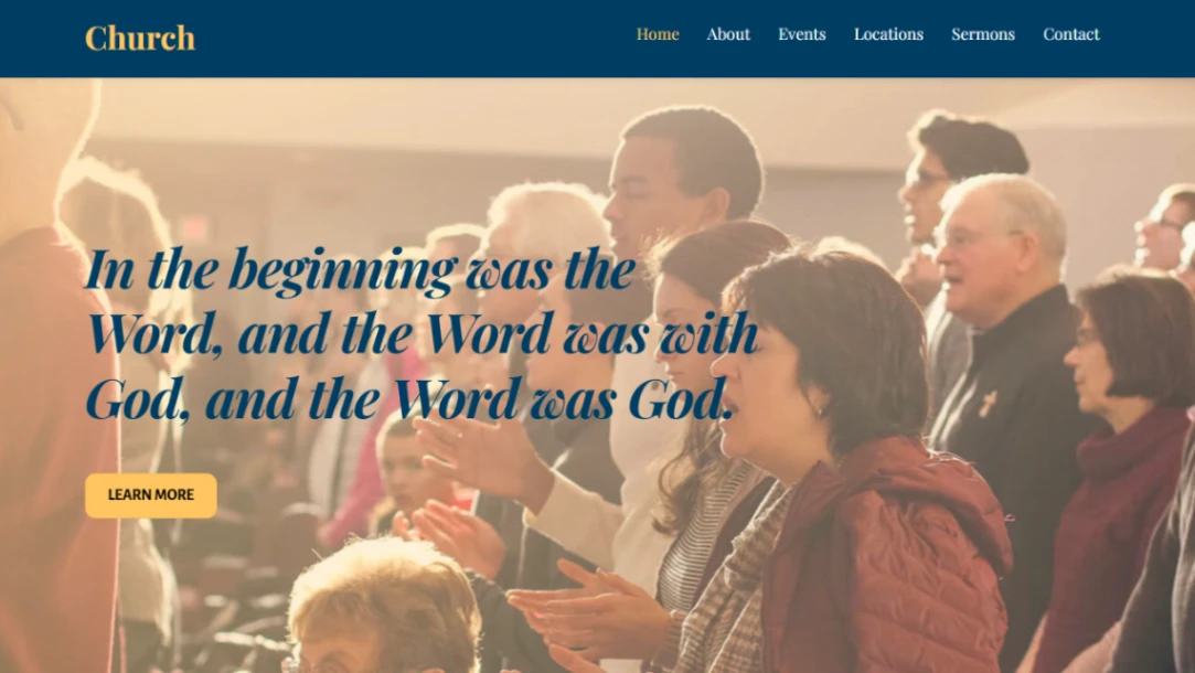
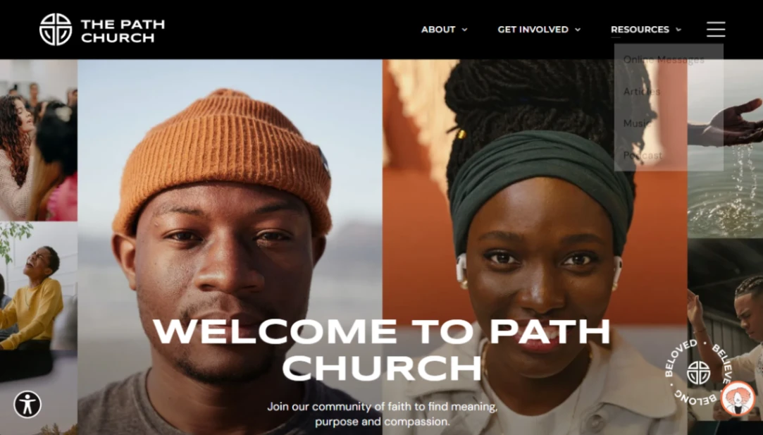
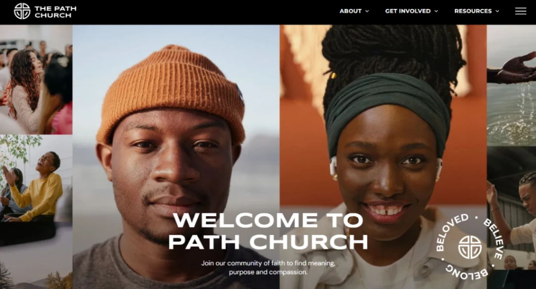
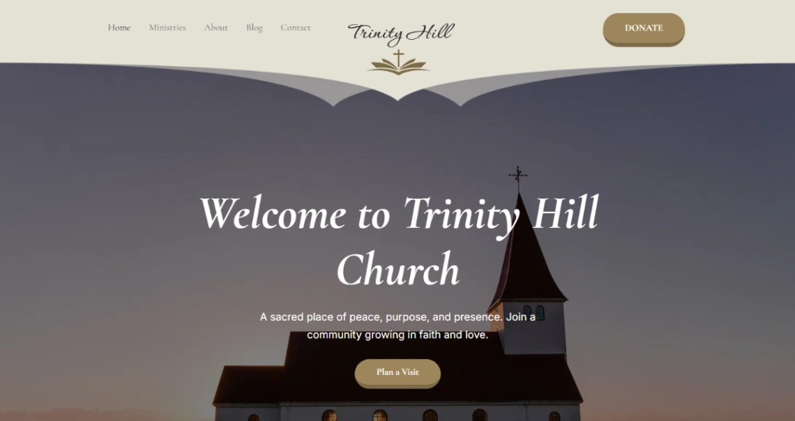
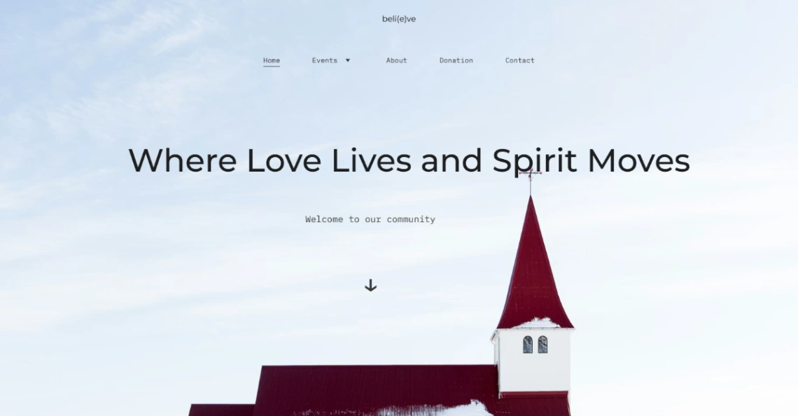
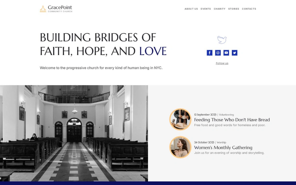
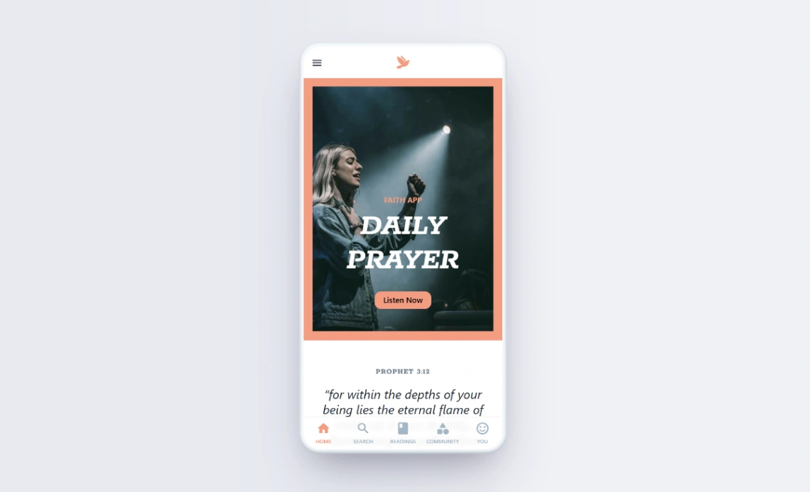
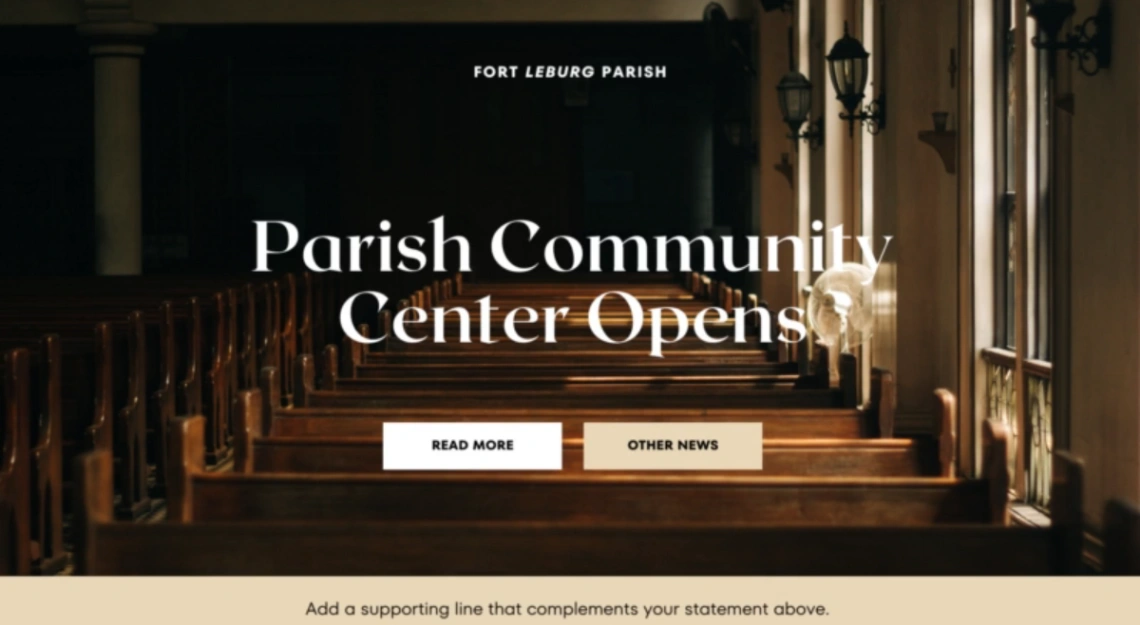
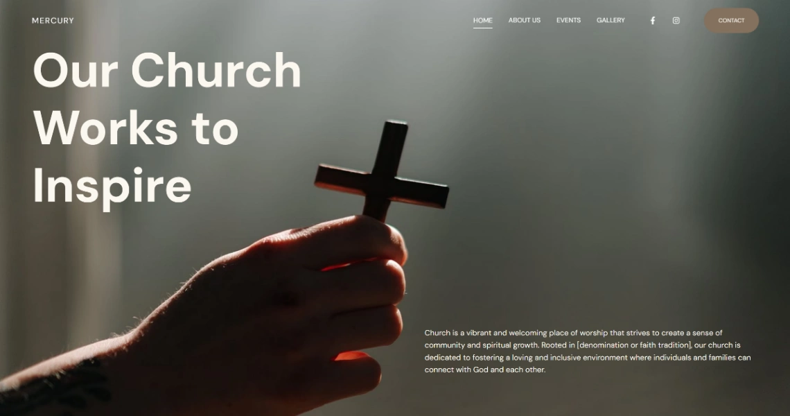
Then walk the newcomer in before they come: what a service is actually like, how long it runs, what to wear, where kids go, whether they'll be singled out (say plainly if not — it's the unasked question). Write it in plain words, because insider language is this category's silent gatekeeper: a site fluent only in its own vocabulary welcomes only the already welcome. The templates here carry warm design; the welcome is in the writing. Photos help too: real people, real room, no stage lighting.
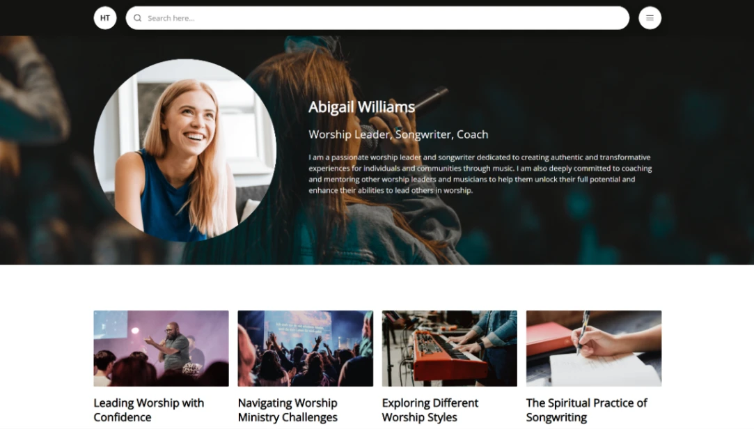
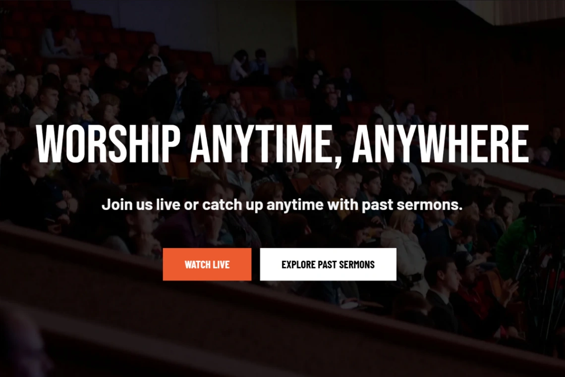
For the congregation itself, the site is infrastructure: a calendar that's actually current, groups with real contacts, and the sermon archive — the media-capable platforms in the pinned picks publish audio and video week after week without heroics, and the archive quietly serves members traveling, homebound, or halfway to visiting.
Giving deserves careful, unembarrassed design: online giving with recurring options, one tap from the places people naturally look, stated with the transparency that builds trust in any institution. It funds the mission, and the recurring option in particular steadies what plate offerings never could. Handle it plainly and gratefully — the same register as everything else on the porch.
FAQ