Visual Store
Buyer's guide
How to choose a brand template
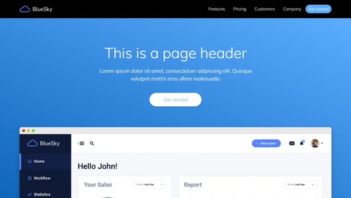
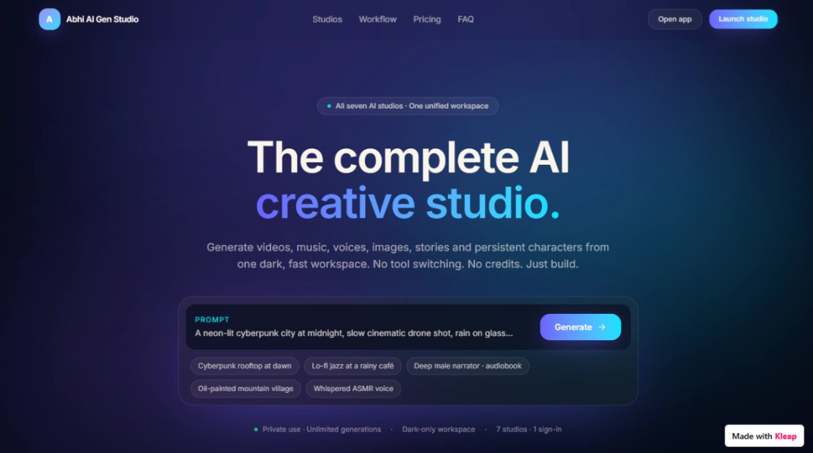
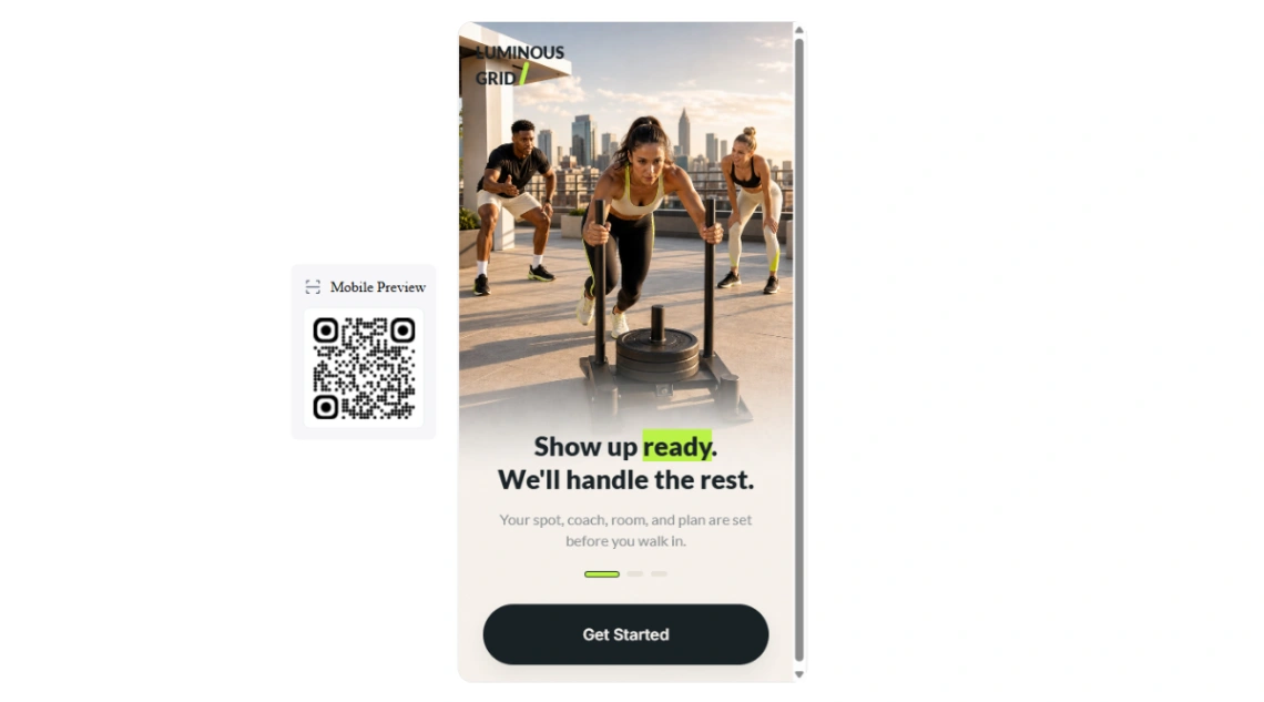
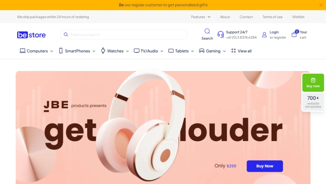
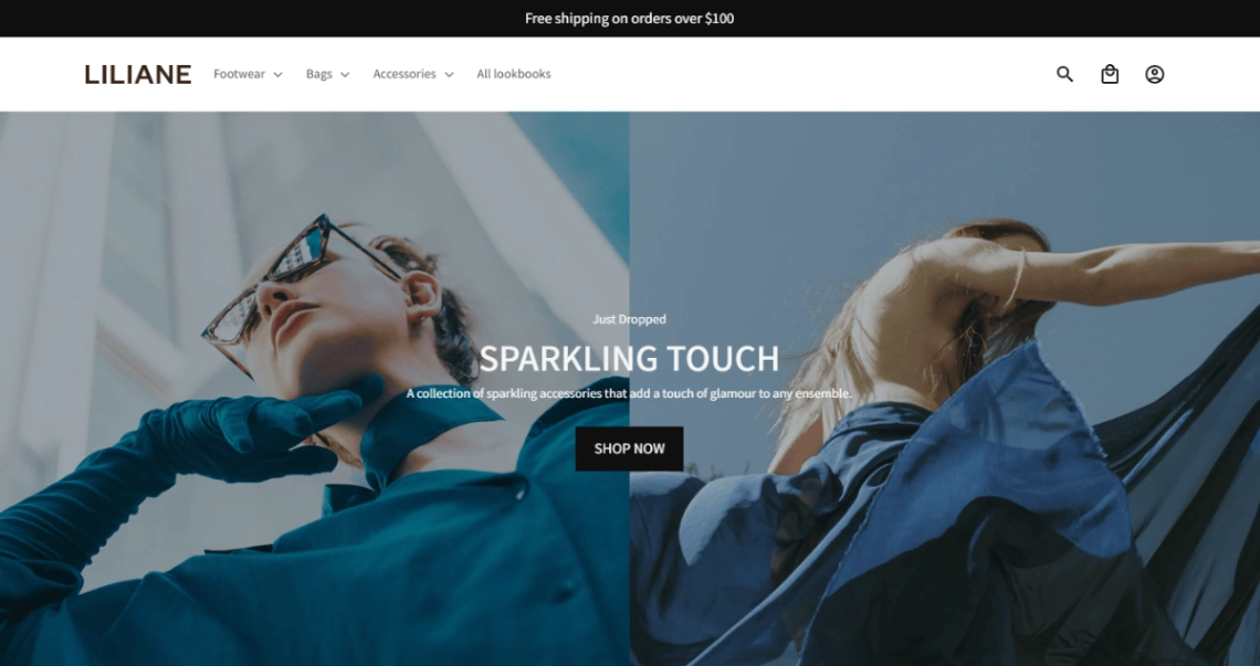
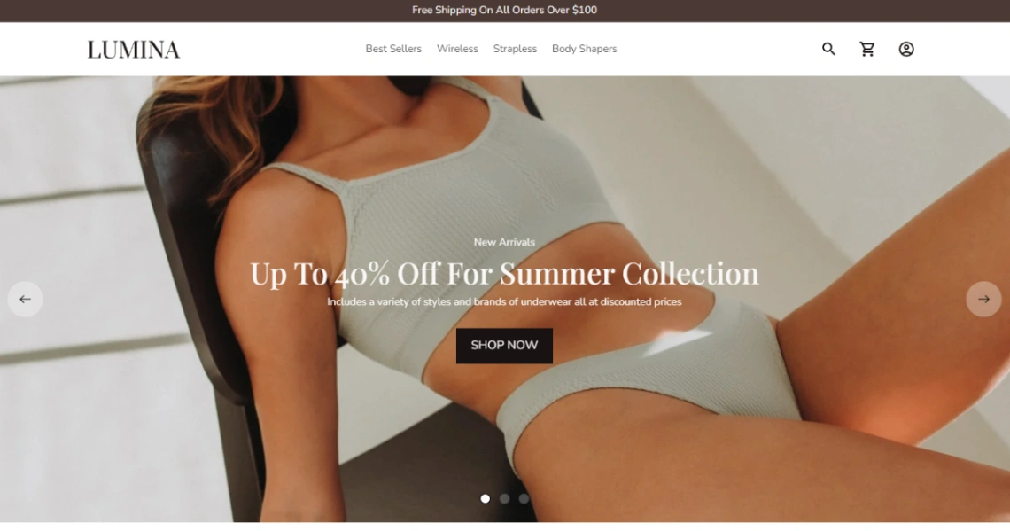
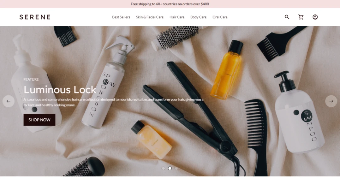
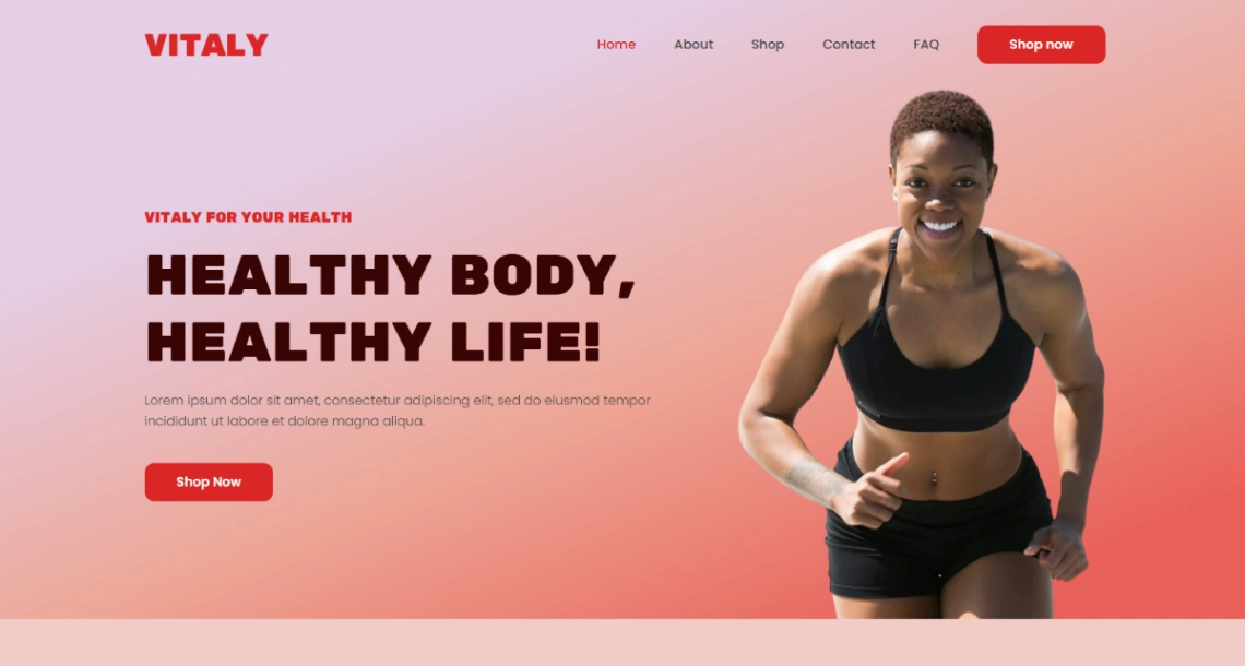
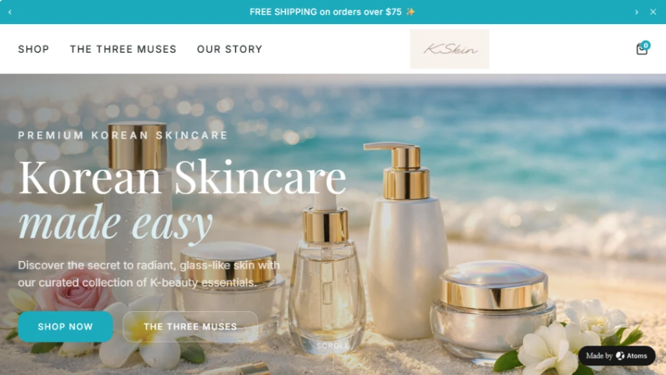
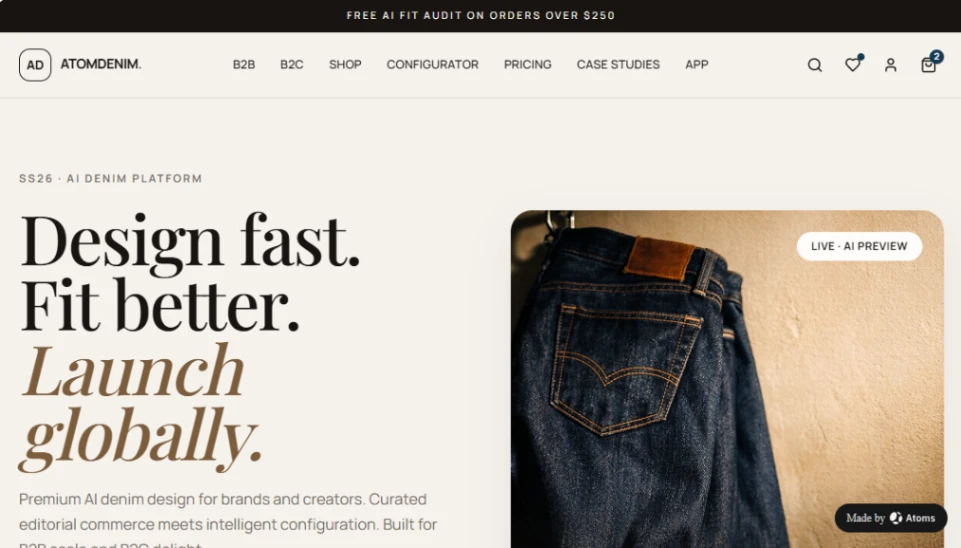
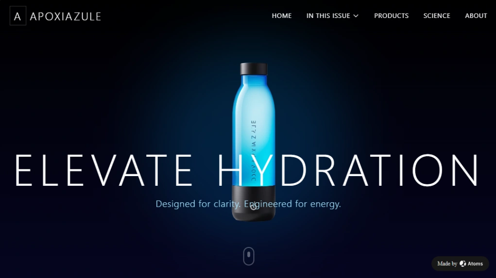
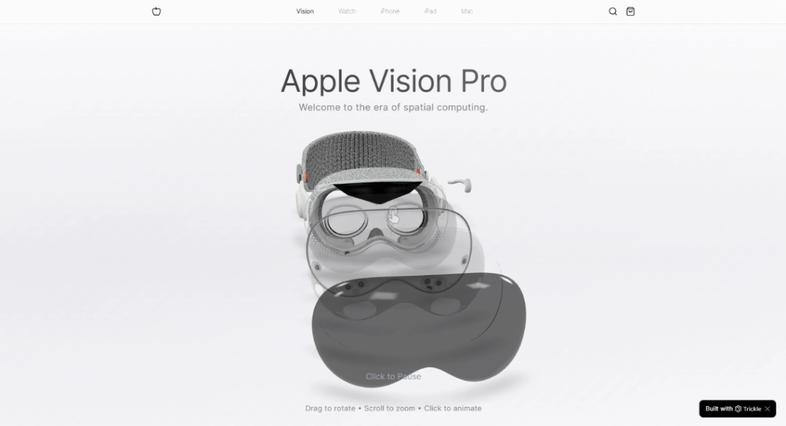
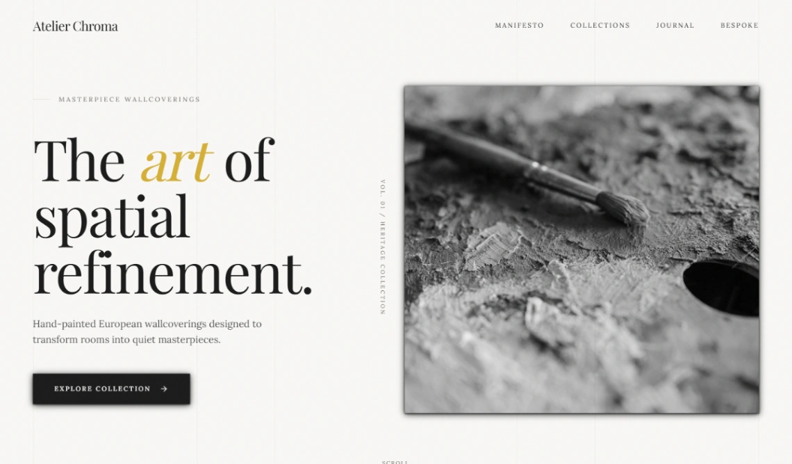
Unmistakability is a system, not a splash page — a typeface you own the feel of, one or two colors used with discipline, a voice that survives every page. That's what "brand site" means, and it inverts this collection's usual shopping logic: you're not looking for the template with the strongest personality, you're looking for the one that amplifies yours without arguing.
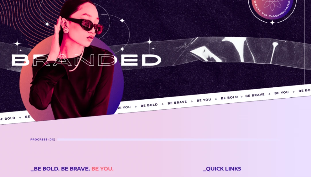
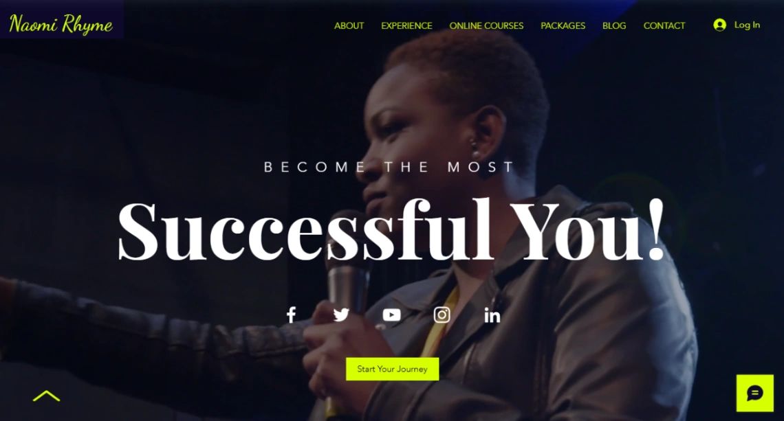
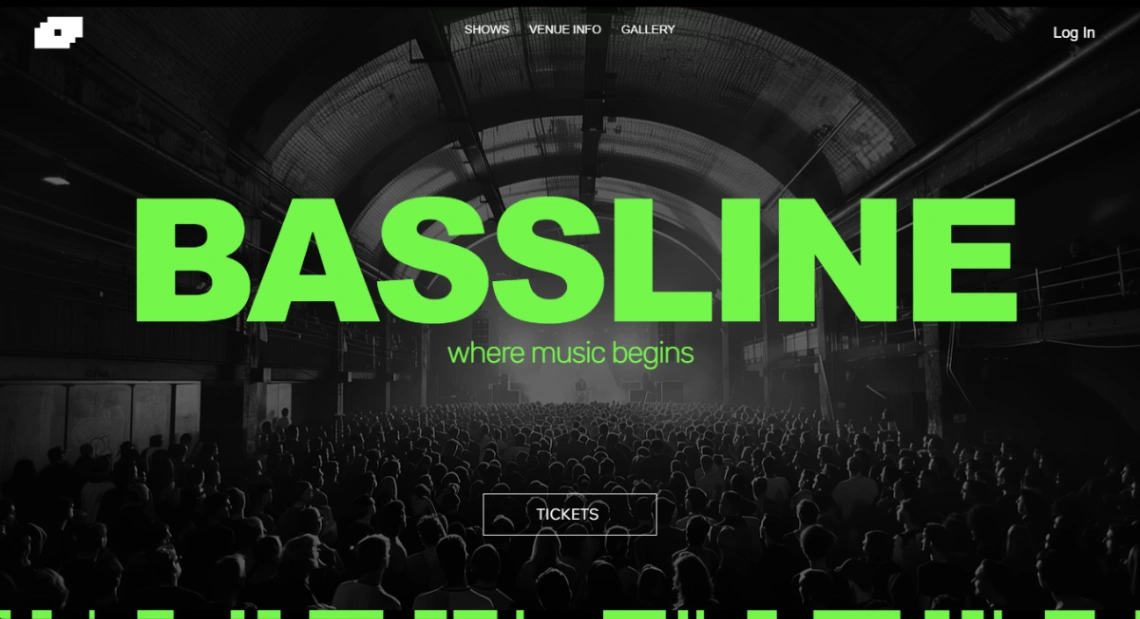
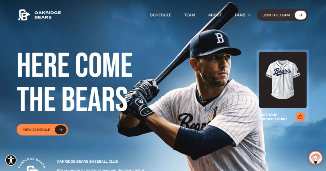
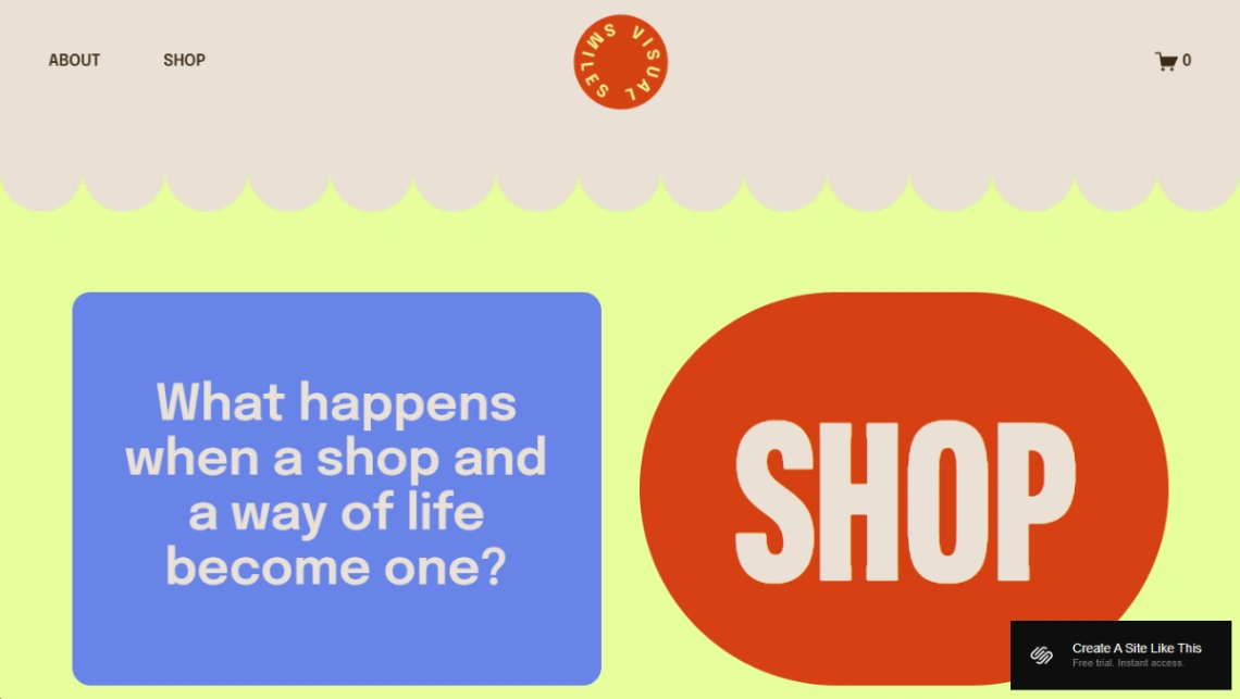
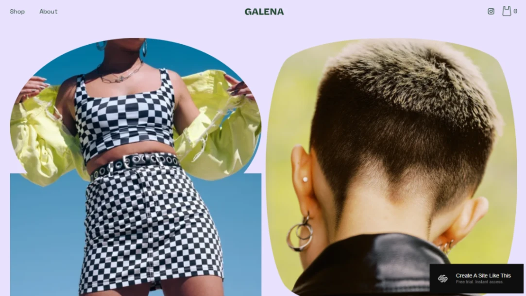
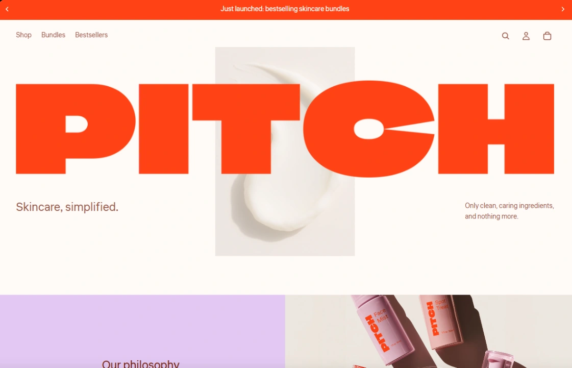
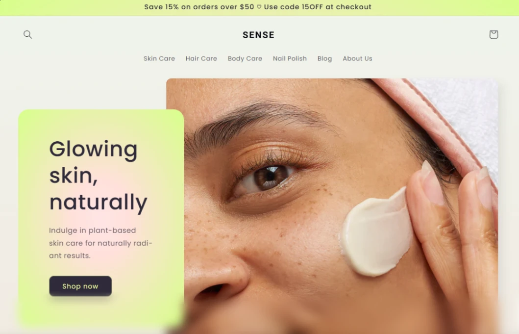
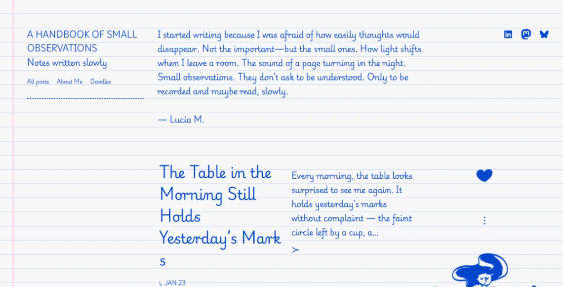
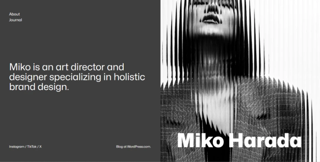
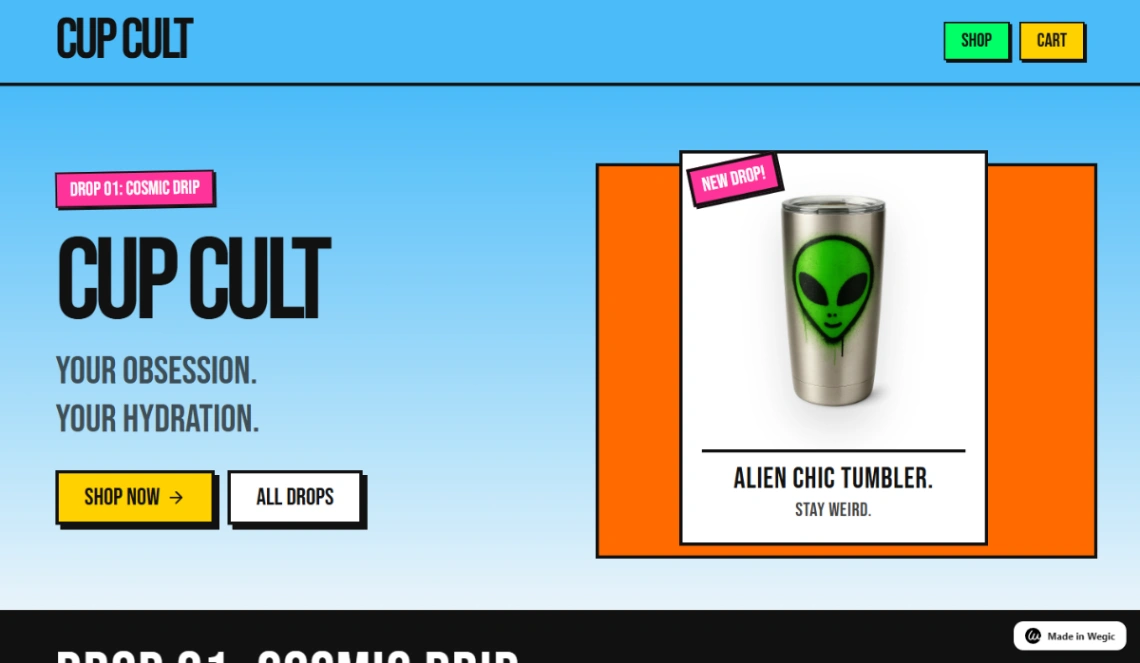
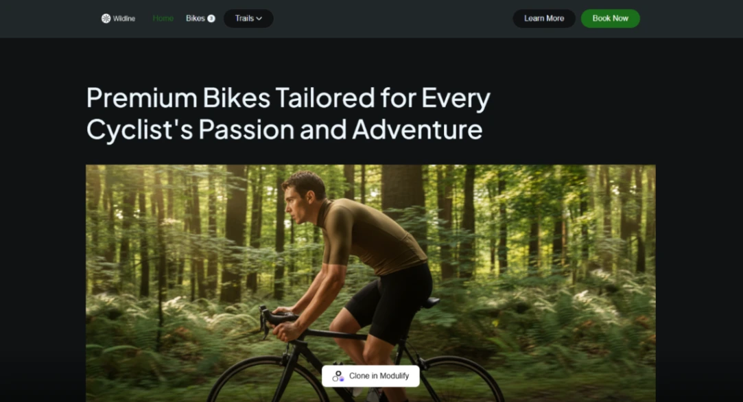
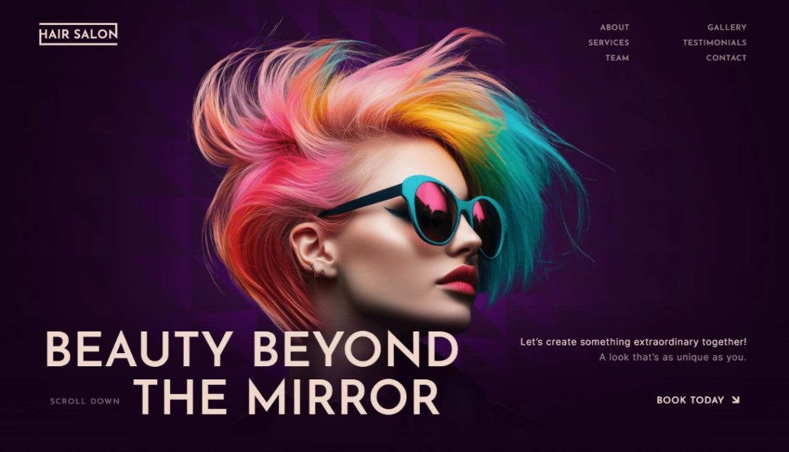
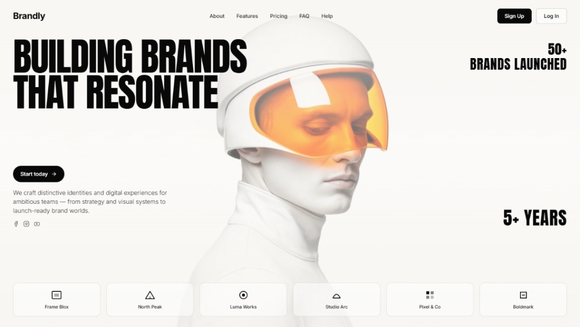
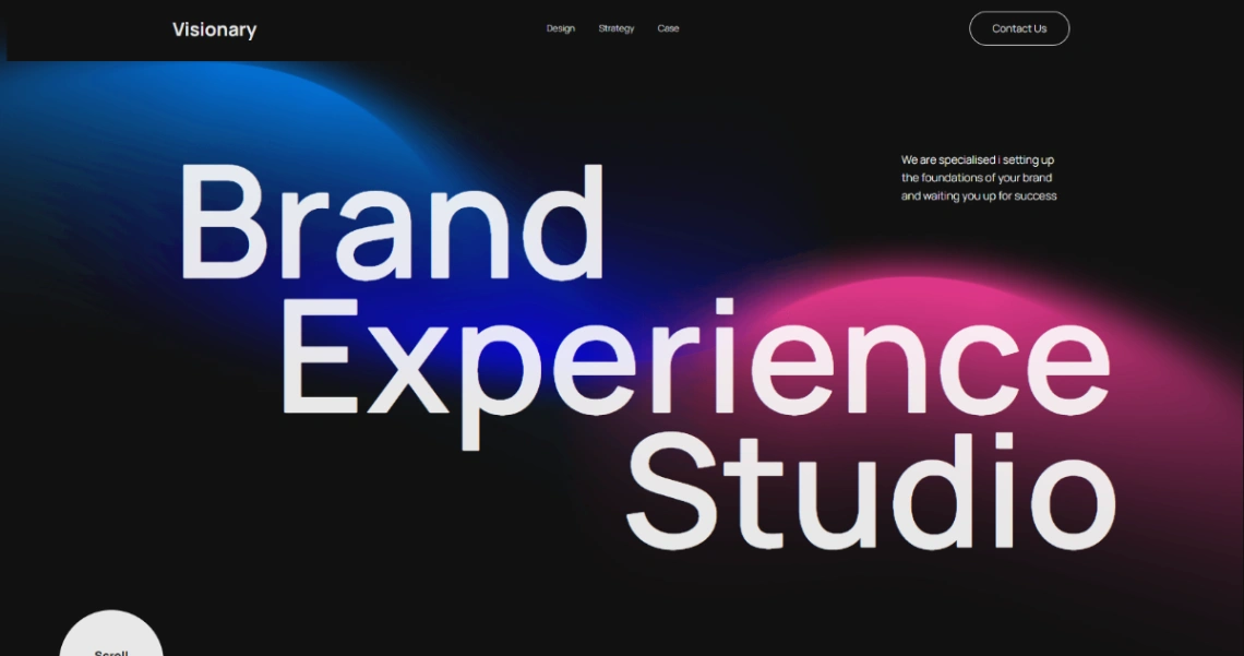
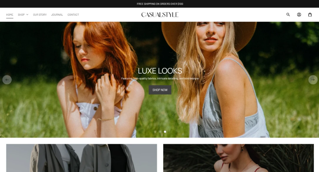
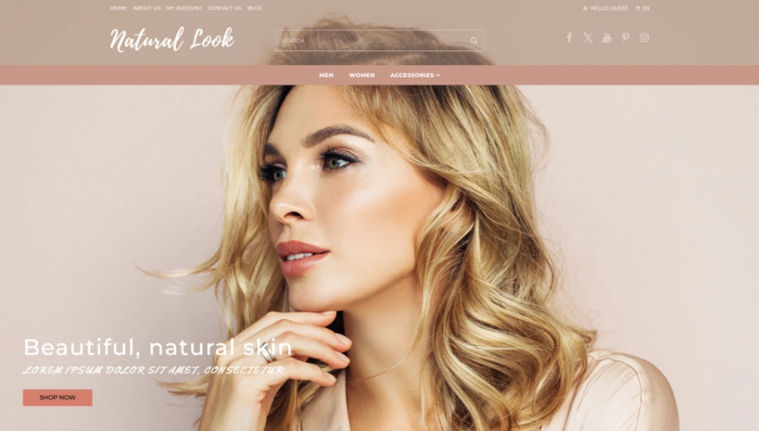
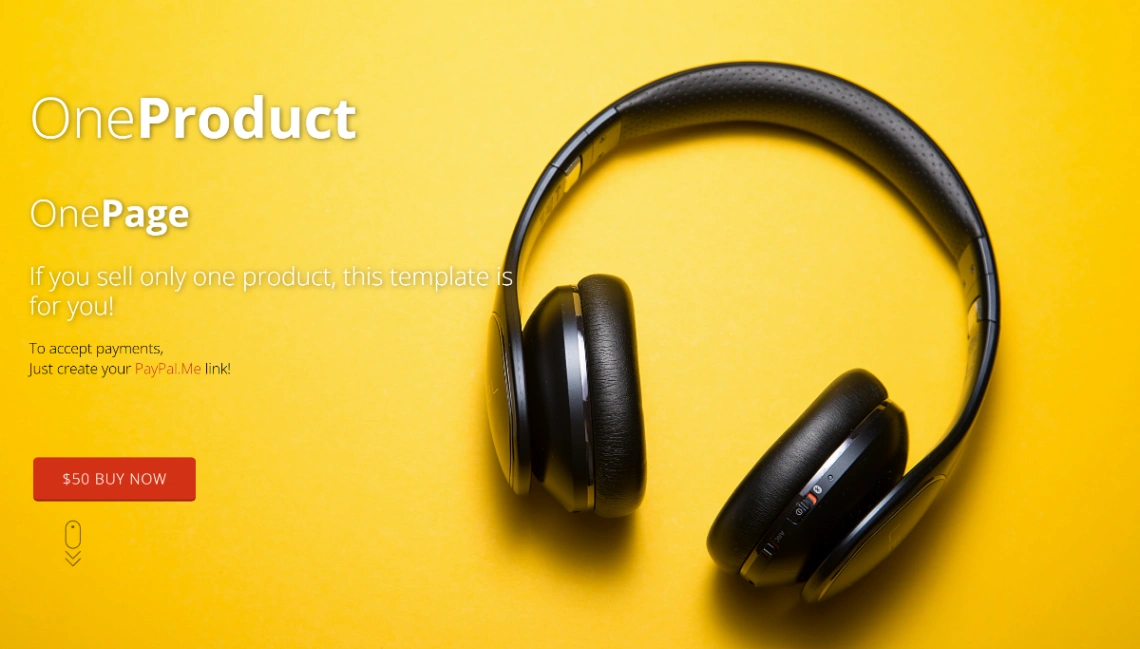
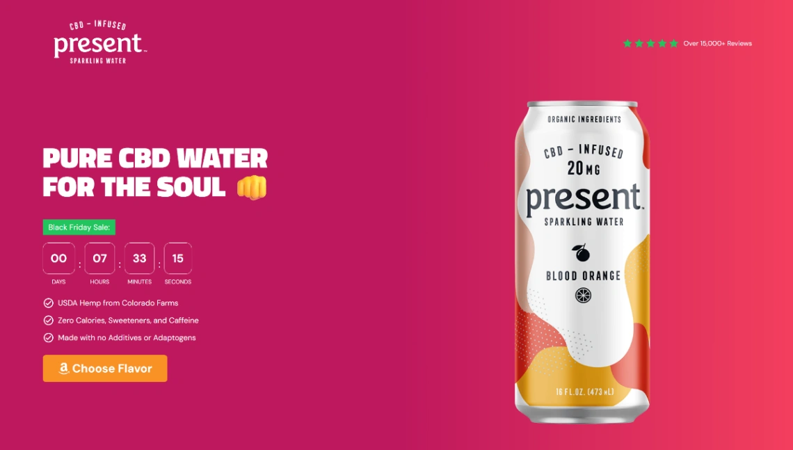
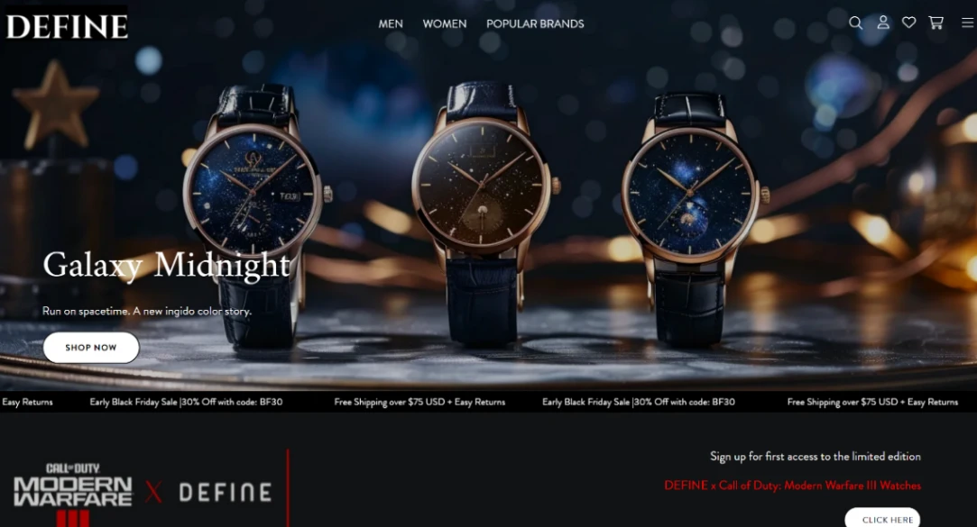
Which is the trap worth naming first: some templates here are so stylistically loud that they are the brand — distinctive type, signature motion, an attitude. Adopt one without equal-strength identity of your own and visitors remember the template's brand, not yours. The test before committing: swap in your logo, your colors, your product photography — if the page still feels like the demo, the template is wearing you.
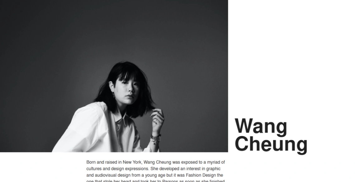
Structure the story as pages, not paragraphs. The brand sites that convert give the founding story a page that earns its length, the product philosophy a page that shows decisions (materials, process, what you refuse to do), and the proof — press, community, real customers — woven through rather than ghettoized. Bold type and full-screen imagery, the genre's signature moves, work when they're delivering that substance and posture when they aren't.
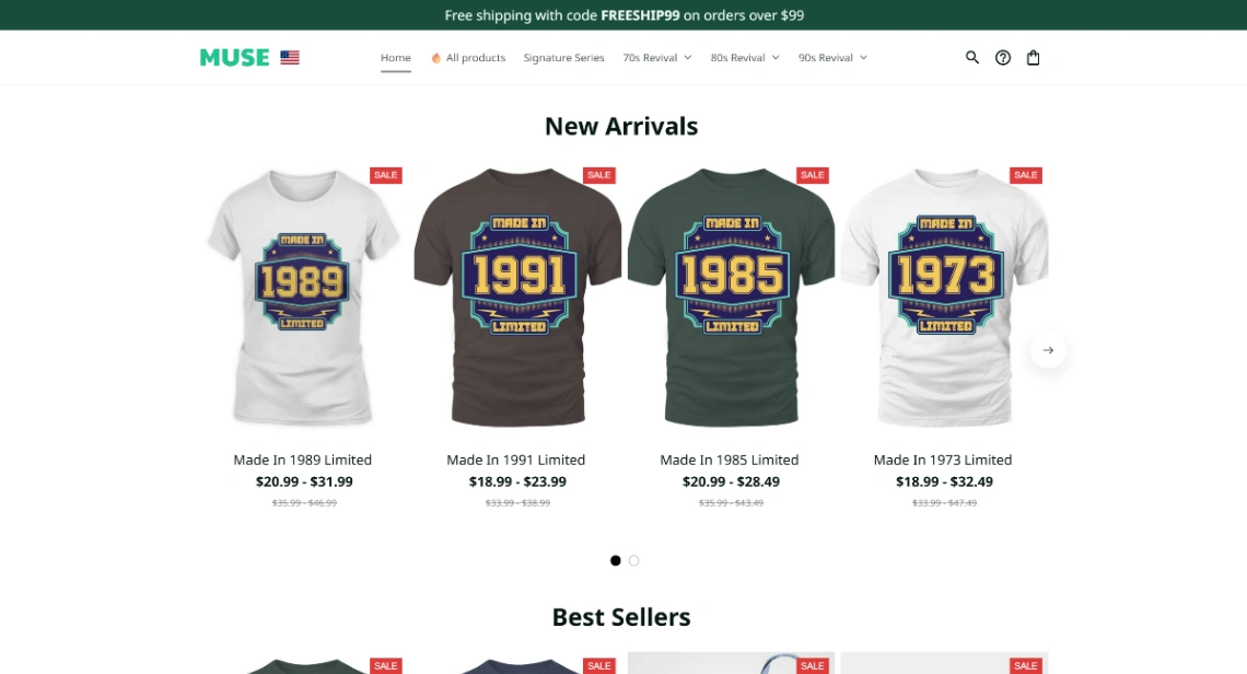
If the audience wants the merch, take the sale seriously: the storefront-attached designs in the pinned picks run real checkout, and a merch table with three excellent items extends the brand further than thirty logo-slapped ones. The product is the brand made physical — curate it like the homepage.
FAQ