












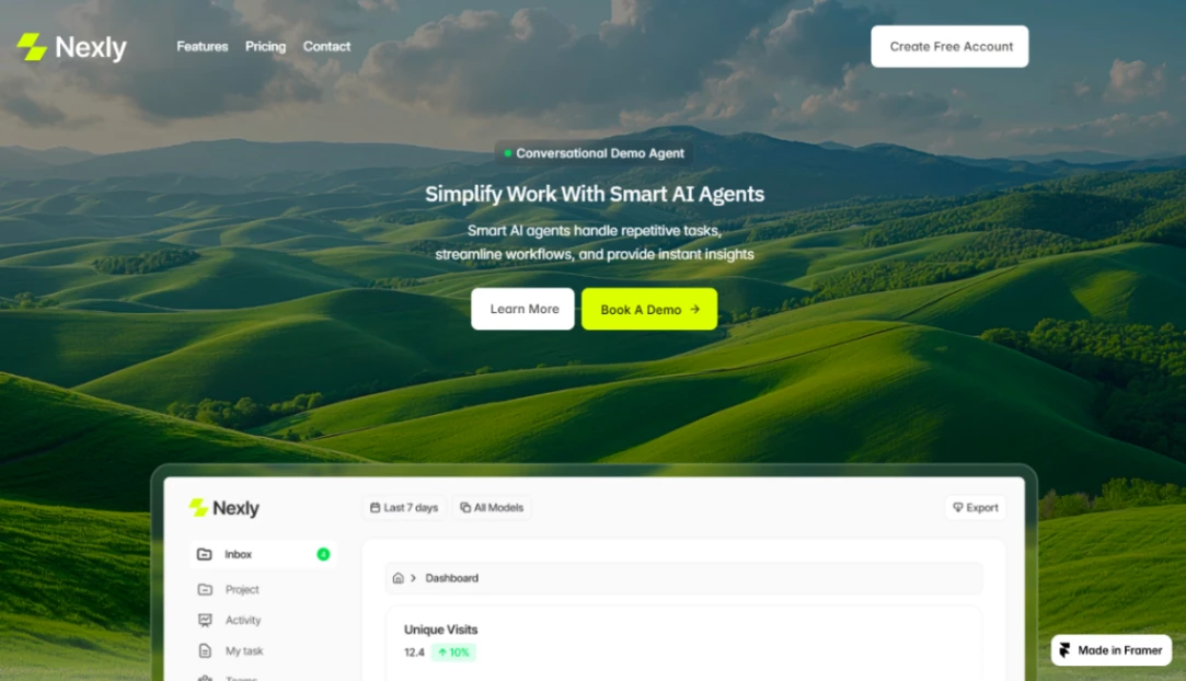
AI Agency










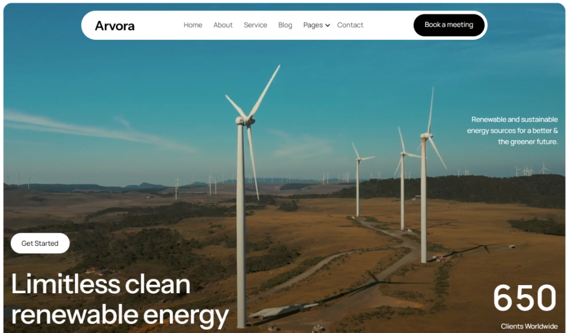



IT Company



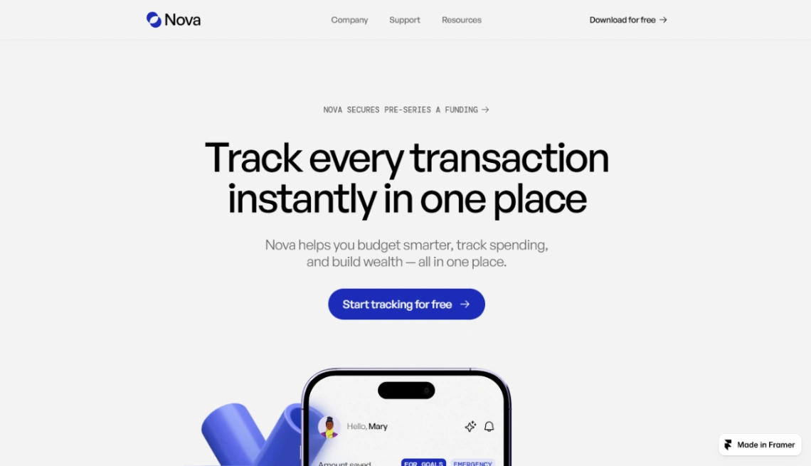
Finance App
Buyer's guide
How to choose a technology template
Complex products don't need impressive websites; they need lucid ones. That's the filter for this collection, because the ambient style of tech — dark gradients, glass cards, orbiting particles — has converged so hard that it now communicates nothing except membership. The templates worth shortlisting are the ones whose structure explains a product: what it does, what it plugs into, what it costs to adopt.
Check for the four structural sections a technical product eventually needs: feature pages that go one level deeper than the homepage, an integrations grid (often the most -searched page on a tech site), somewhere for docs to live or link, and a changelog — the quiet page that tells evaluators the product is alive. Templates with these scaffolded save weeks; templates without them are landing pages in a suit. Check the pricing structure too — usage-based tiers rarely fit a three-column table.
Write for the two readers who arrive together: the engineer evaluating honestly and the executive skimming for risk. The engineer wants specifics — what it's built on, limits, real screenshots; the executive wants proof of safety — logos, compliance, support terms. Good tech templates hold both without embarrassing either; the builders that handle this balance are pinned at the top of the page.
The differentiator nobody designs for: credibility surfaces. A security page, a public status link, honest benchmarks with methodology — these unglamorous pages close deals that animations never touch. If the template has no natural home for them, you'll be bolting trust onto a costume later.
FAQ