




































Buyer's guide
How to choose a gallery template
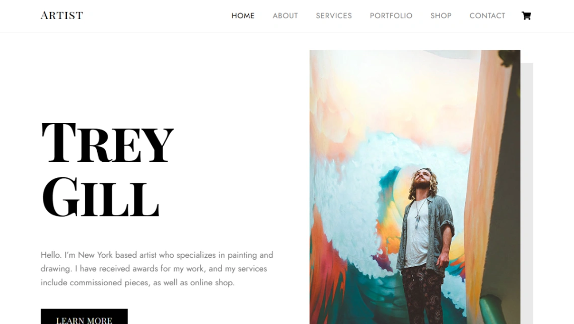
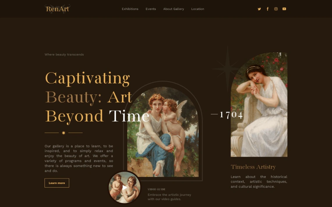
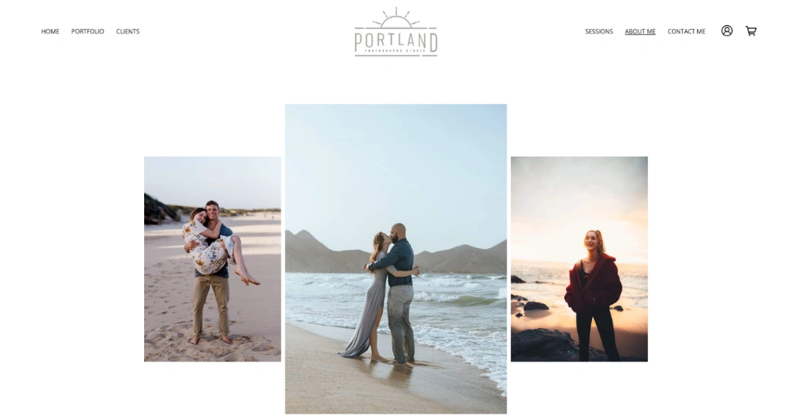
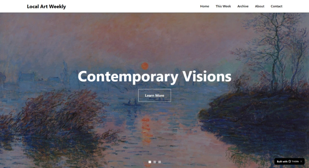
A gallery site curates other people's work, and that one fact changes the data model. Where a portfolio is a flat set of images, a gallery is artists, each with works, each possibly with editions — and the template must model that hierarchy or you'll fake it with naming conventions forever. Check for per-artist pages and per-work detail views first; they're the skeleton everything else hangs on. The platforms with real artwork structures are pinned at the top of this page.
Match the template to your exhibition rhythm. A gallery that mounts rotating shows needs venue-style structure — current exhibition up front, upcoming next, past shows archived, because the archive is your credibility. A permanent collection wants browsing instead: by artist, medium, size, price. The two structures don't convert into each other gracefully, so decide which gallery you are.
Selling art online has two distinct modes, and templates handle them differently. Originals are an inventory of one — the site must mark works sold, show provenance, and often route serious buyers to an inquiry rather than a cart. Editions and prints behave like products: quantities, sizes, fulfillment. On price display, pick a policy and hold it; "price on request" everywhere filters buyers hard, while listed prices sell more but anchor negotiations.
The mistake that flattens galleries online: two hundred works in one endless grid. Visitors need the wayfinding a physical space gives — rooms, walls, sequence. Use collections as rooms and lead people through, and if you have a physical space, keep hours, address and the current show one tap from anywhere.
FAQ