









Buyer's guide
How to choose a finance template
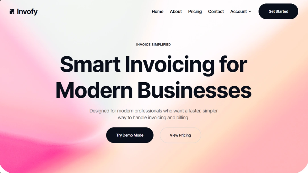
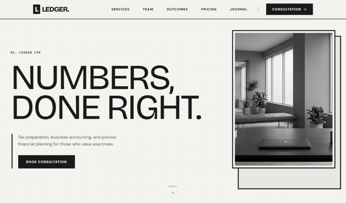
Money websites are read with one thumb on the back button. Every visitor arrives half-expecting to be sold something dubious, so the templates that work in this category work by restraint: plain claims, visible numbers, room for the boring paragraphs that prove you're allowed to do this. Flash reads as risk here — the opposite of every other category.
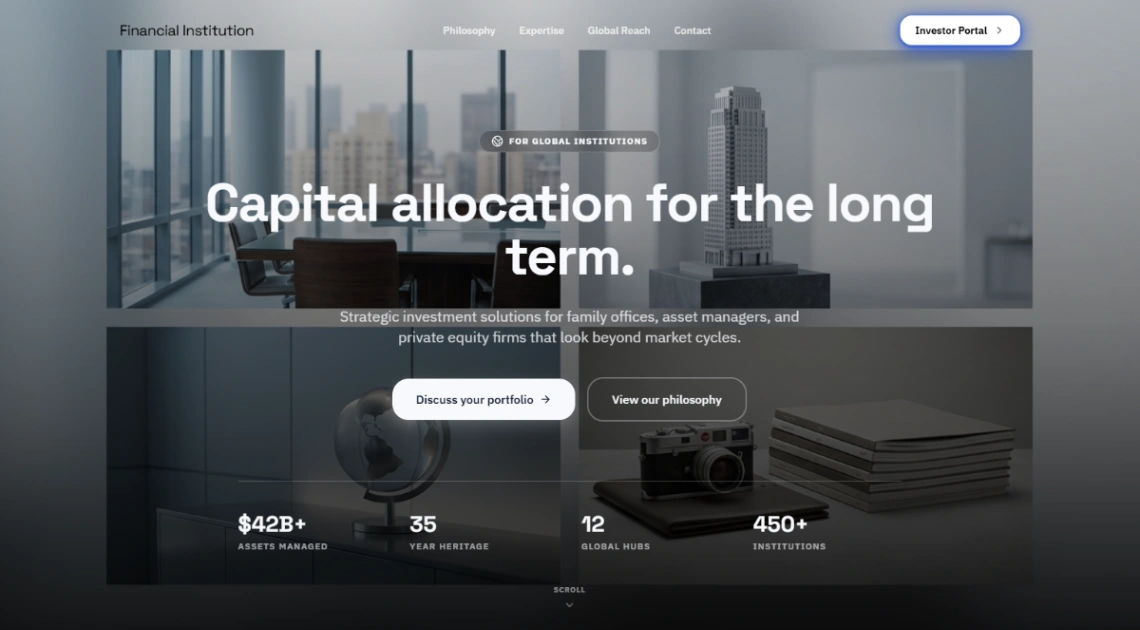
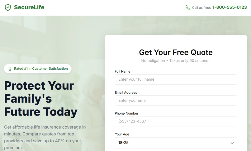
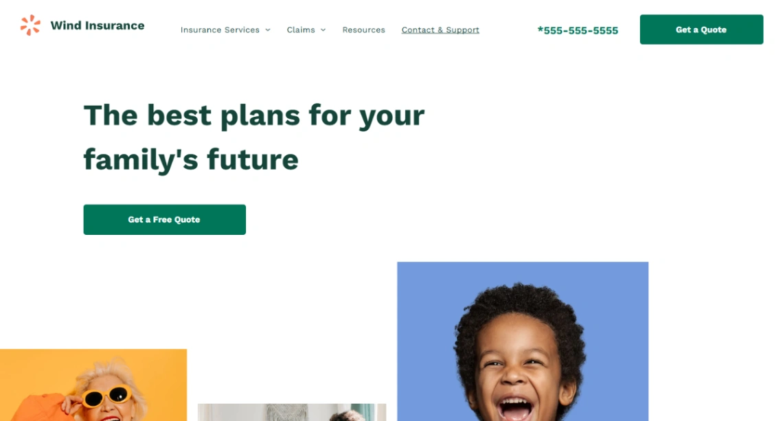
If you're regulated — advisor, broker, anything licensed — check the template for disclosure room before anything else: a footer that holds registration numbers and required text without breaking, space for risk warnings near claims, and a compliance page that isn't an afterthought. Retrofitting disclosures into a design that never planned for them produces exactly the cramped fine print that makes readers nervous.
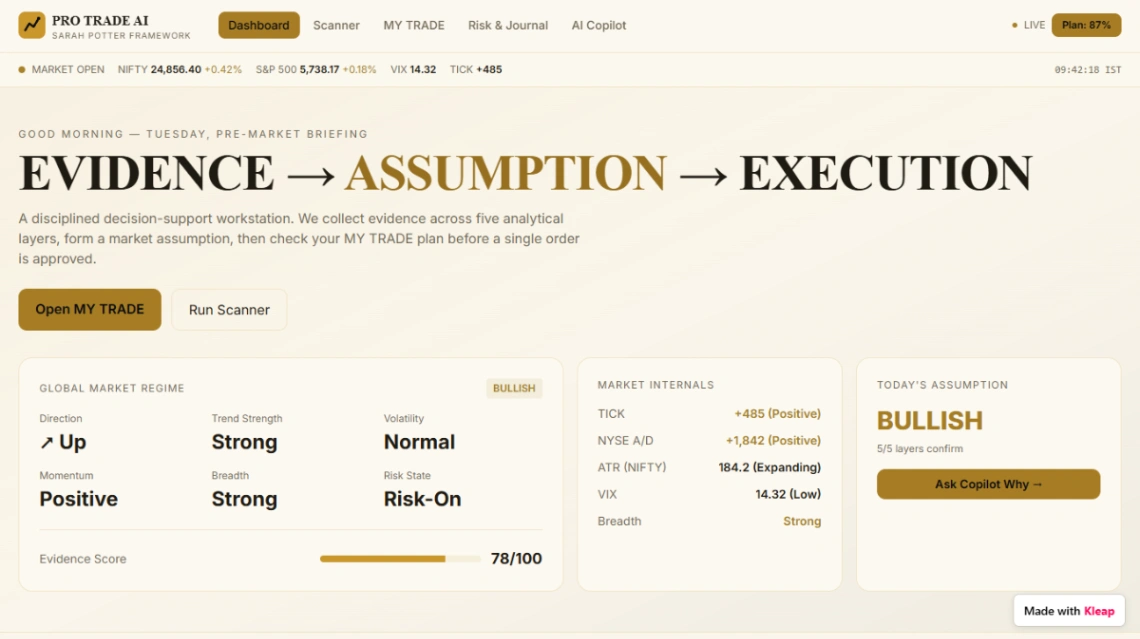
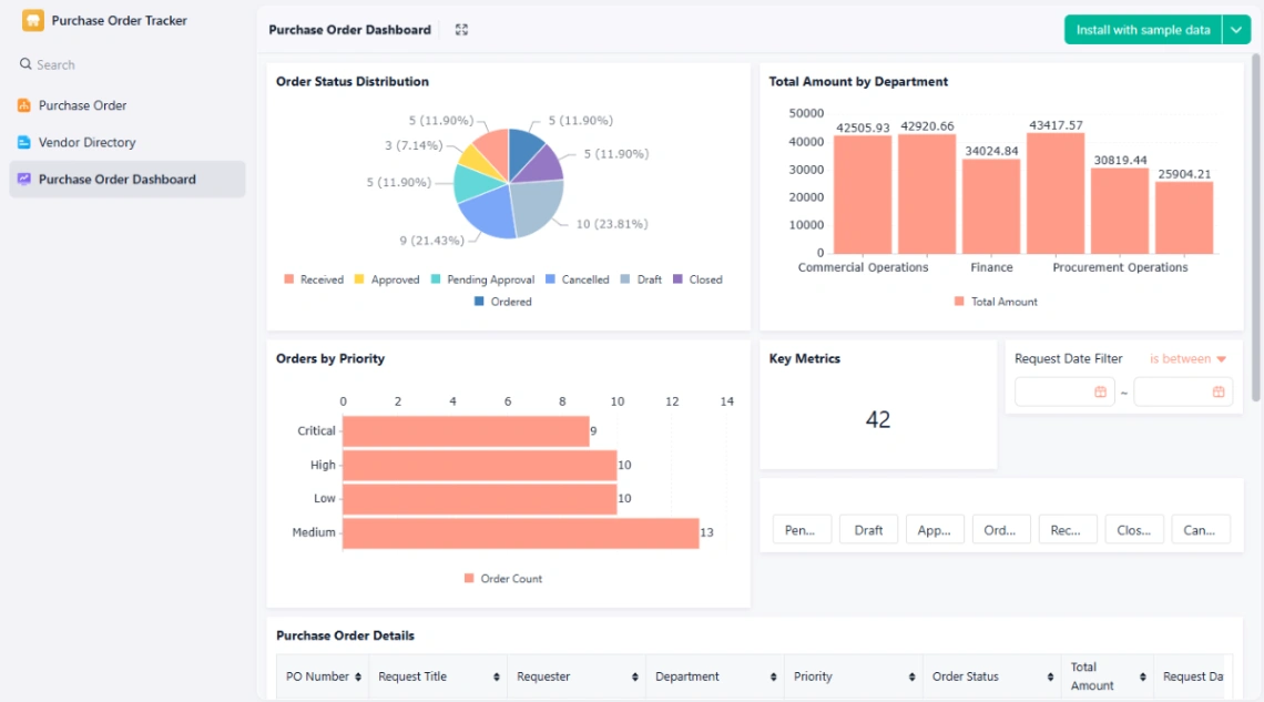
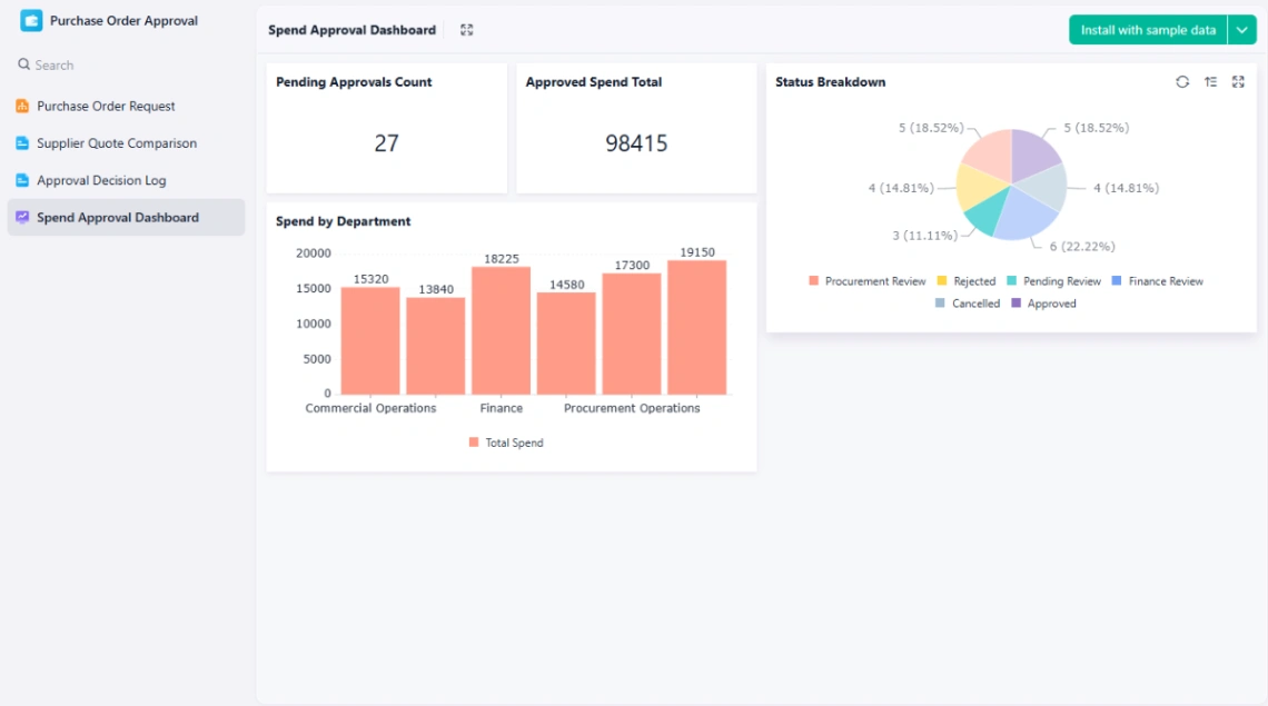
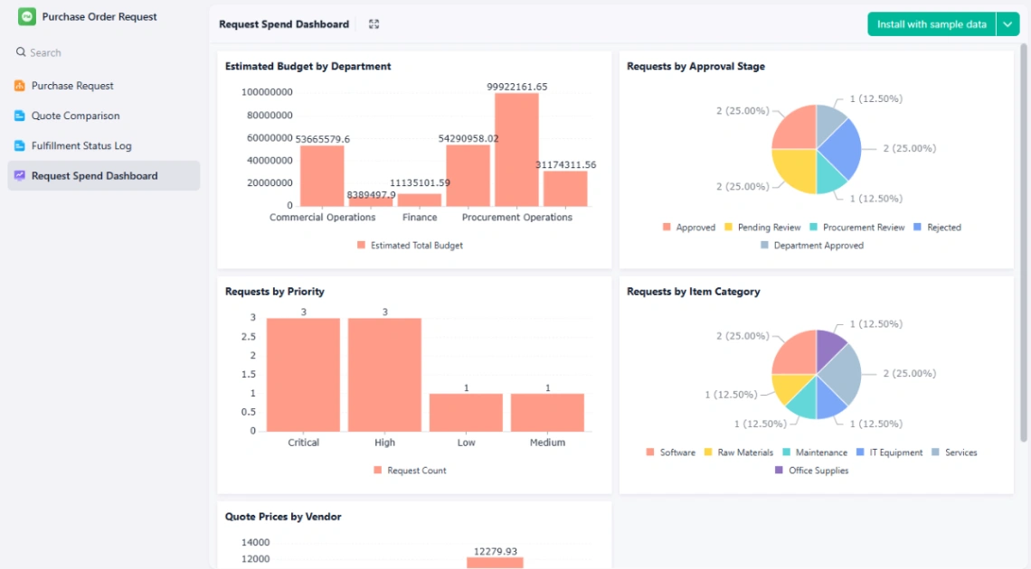
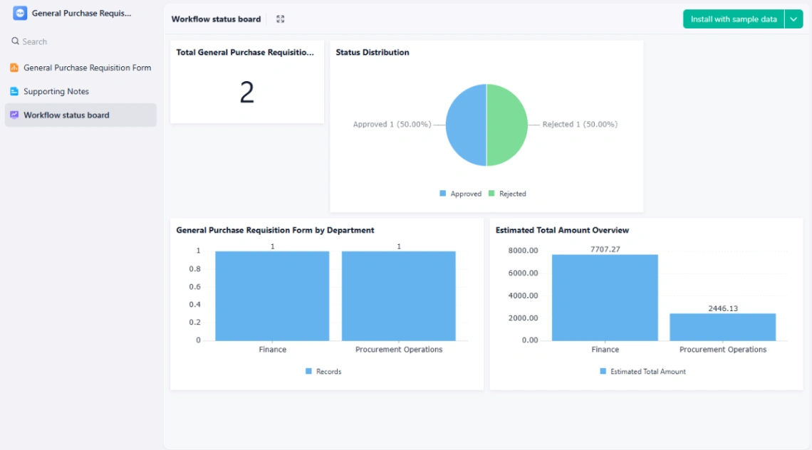
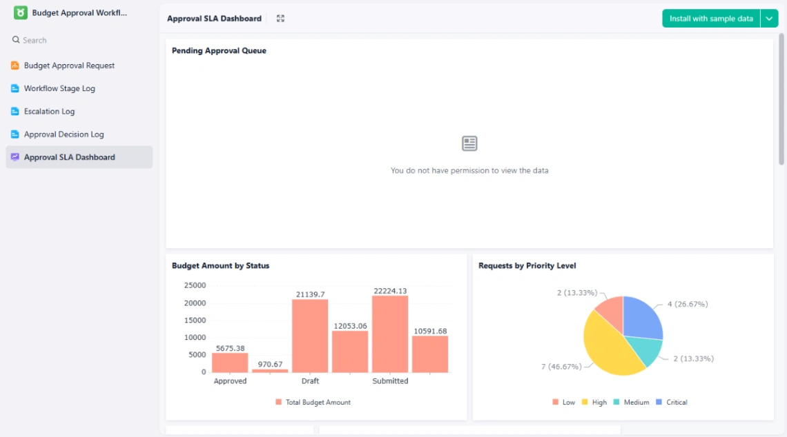
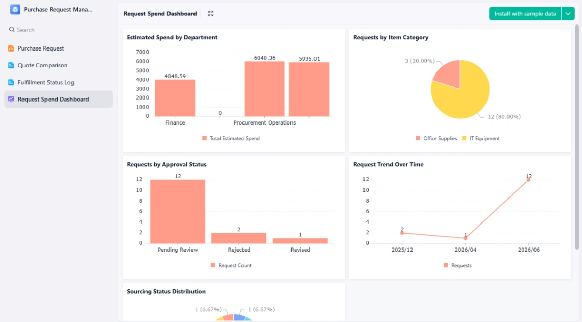
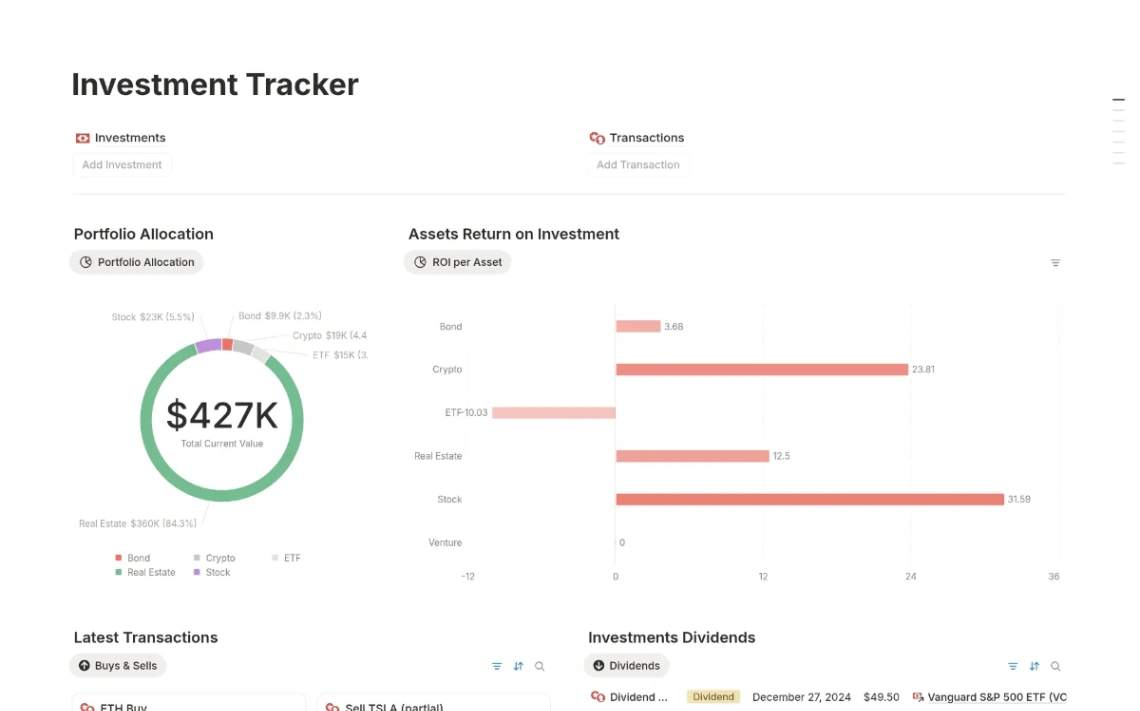
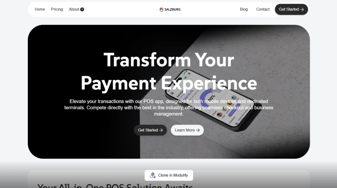
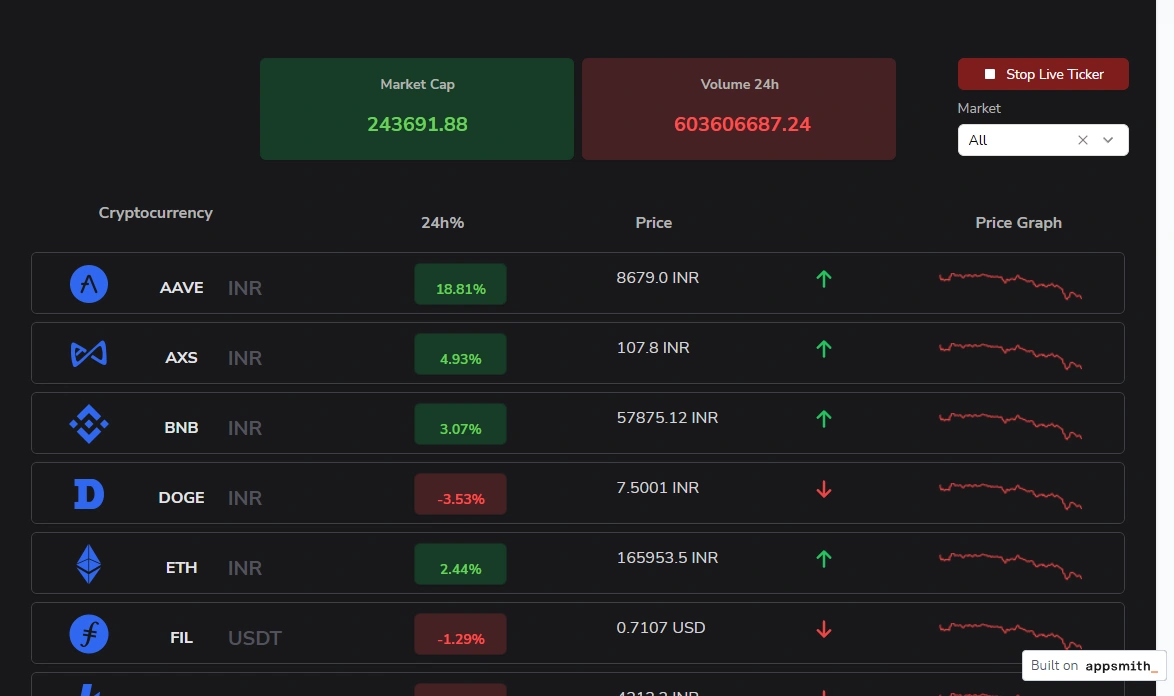
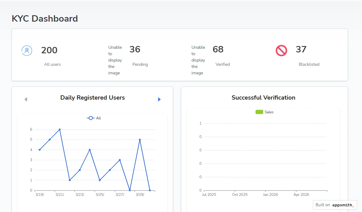
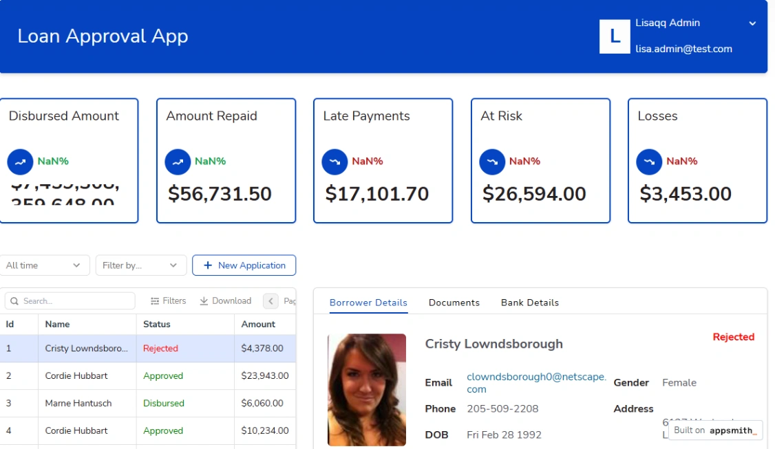
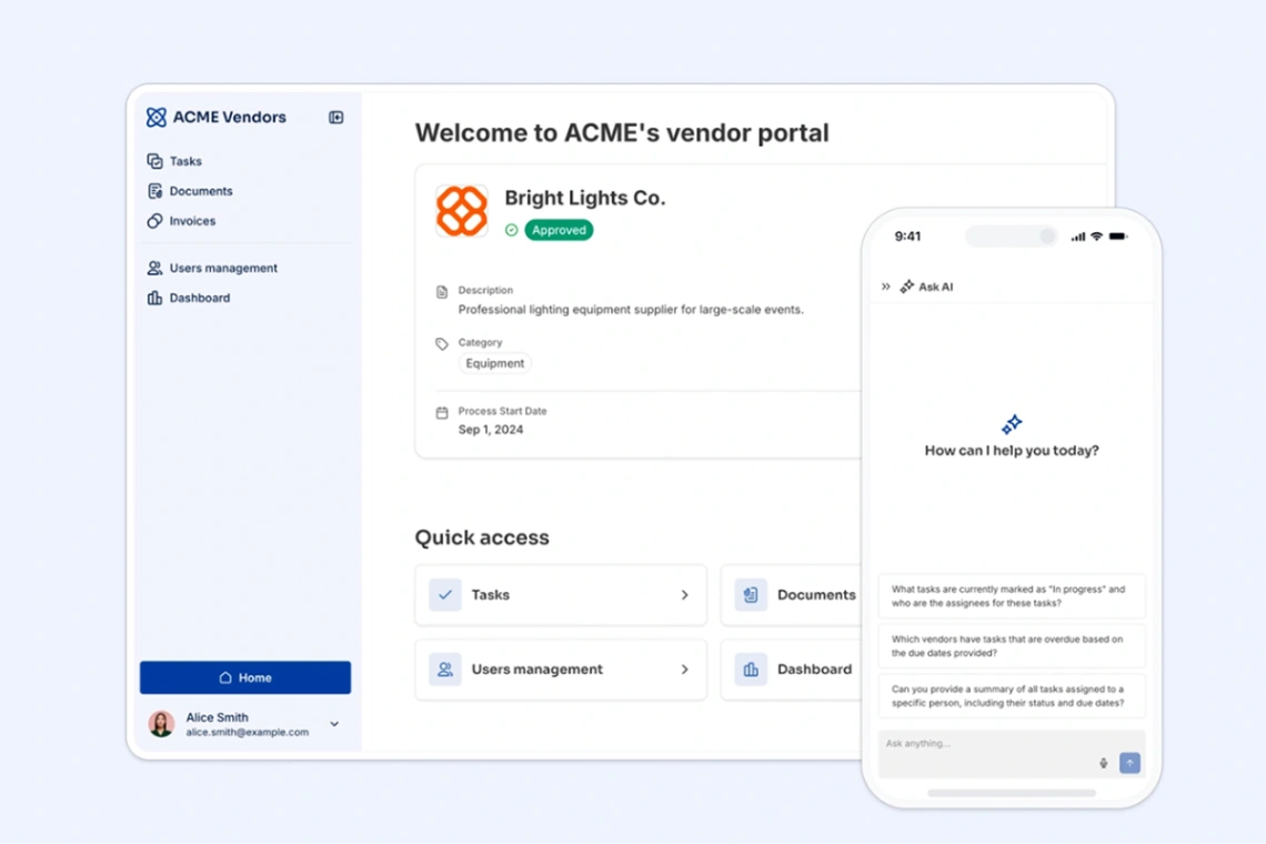
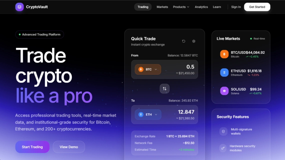
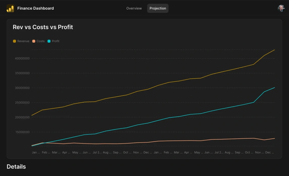
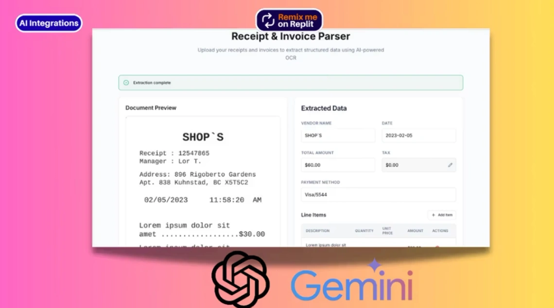
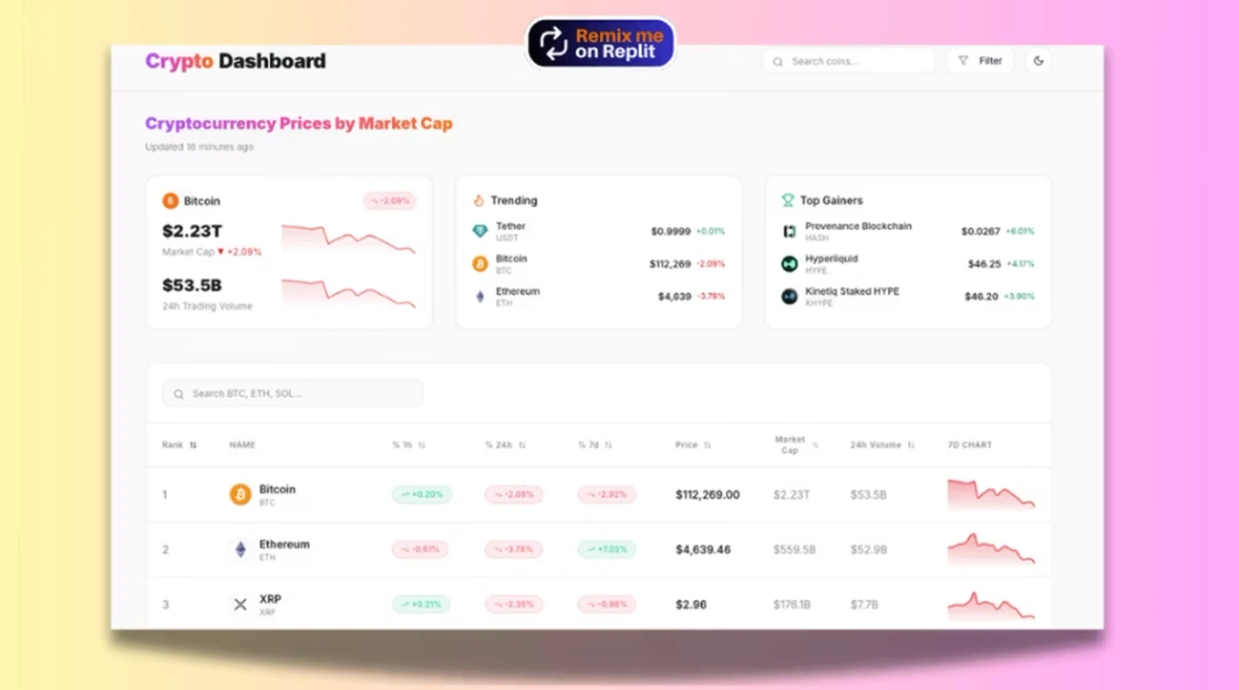
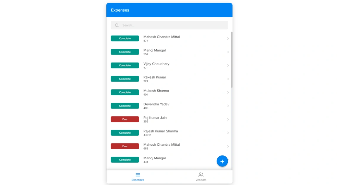
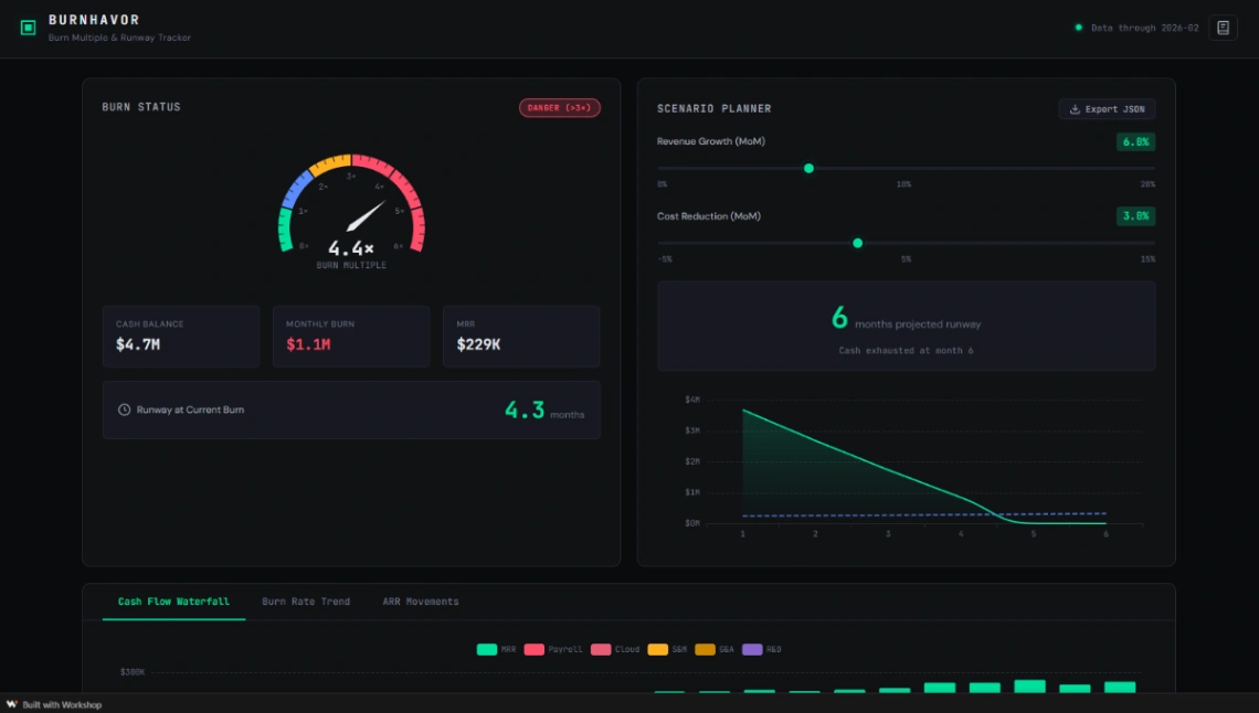
Show numbers the way you'd want them shown to you: fees in currency not just percentages, a worked example with real figures, rates with their conditions attached. Templates with calculator and comparison blocks — the app-builder side of the pinned picks — let the visitor run their own numbers, which converts the skeptical better than any testimonial. In finance, interactivity is credibility. Label every example as illustrative; precision without honesty is its own red flag.
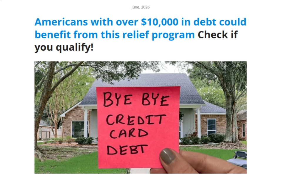
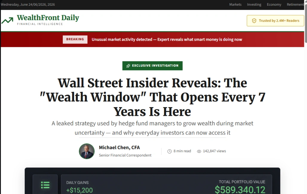
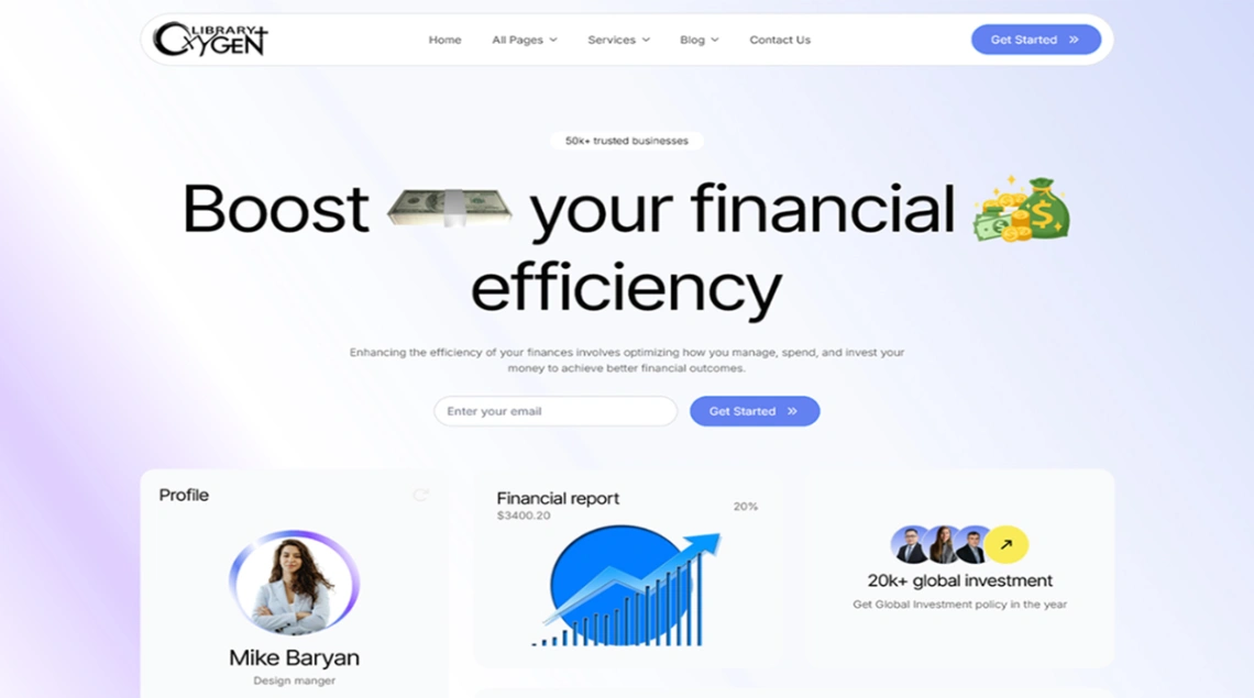
And earn trust with checkable facts, not theater. Padlock icons, stock handshakes and "bank-level security" badges are the costume of every scam the visitor has ever seen; a named human with a verifiable registration, honest fees and a real address is the uniform of the firms that last. The template should make those facts prominent — that's the entire design brief.
FAQ