

Buyer's guide
How to choose a nonprofit template
A donor decides twice: whether to give, and whether to give here. Stories win the first decision; the second is won by trust and lost by friction, and the template controls both. Judge every design in this collection the way a first-time donor would — land on it, decide to help, and count what stands between that impulse and a completed gift.
Friction first: the strongest templates carry a built-in donation flow with preset amounts, a monthly toggle, and a form that asks for nothing it doesn't need. Every extra step sheds real donors. And that monthly toggle deserves more attention than the button color gets — recurring givers are the difference between a budget and a hope, so make monthly the visible, suggested default rather than a checkbox afterthought. Then test the whole path on a phone with a real card; you'll find friction your desktop never shows you.
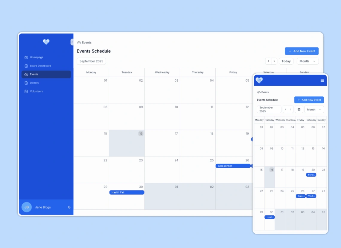
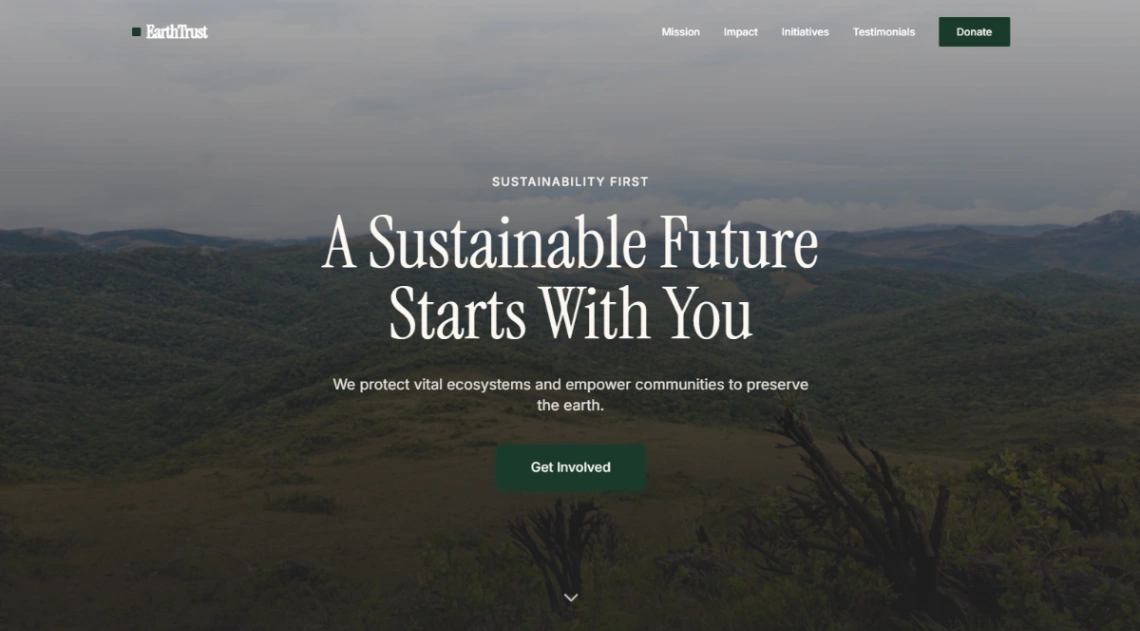
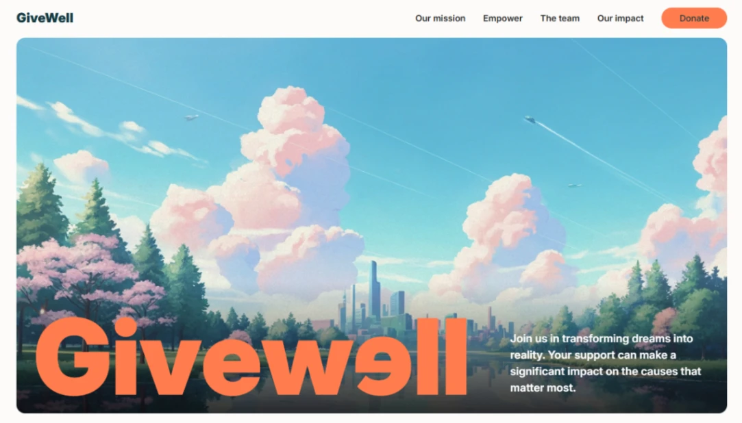
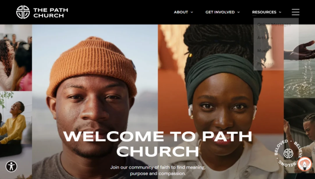
Trust is built from blocks, not adjectives: impact numbers that feel counted rather than rounded, a plain where-the-money-goes breakdown, photographs from your actual work, and the charity registration number where a skeptic will look for it. The builders with real donation machinery are pinned at the top of this page.
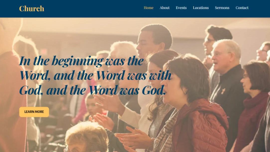
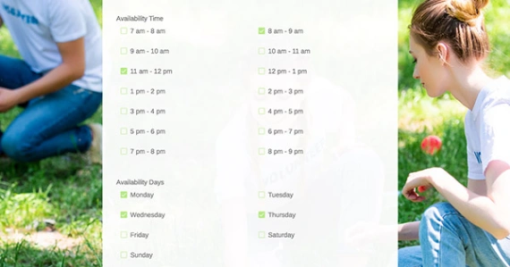
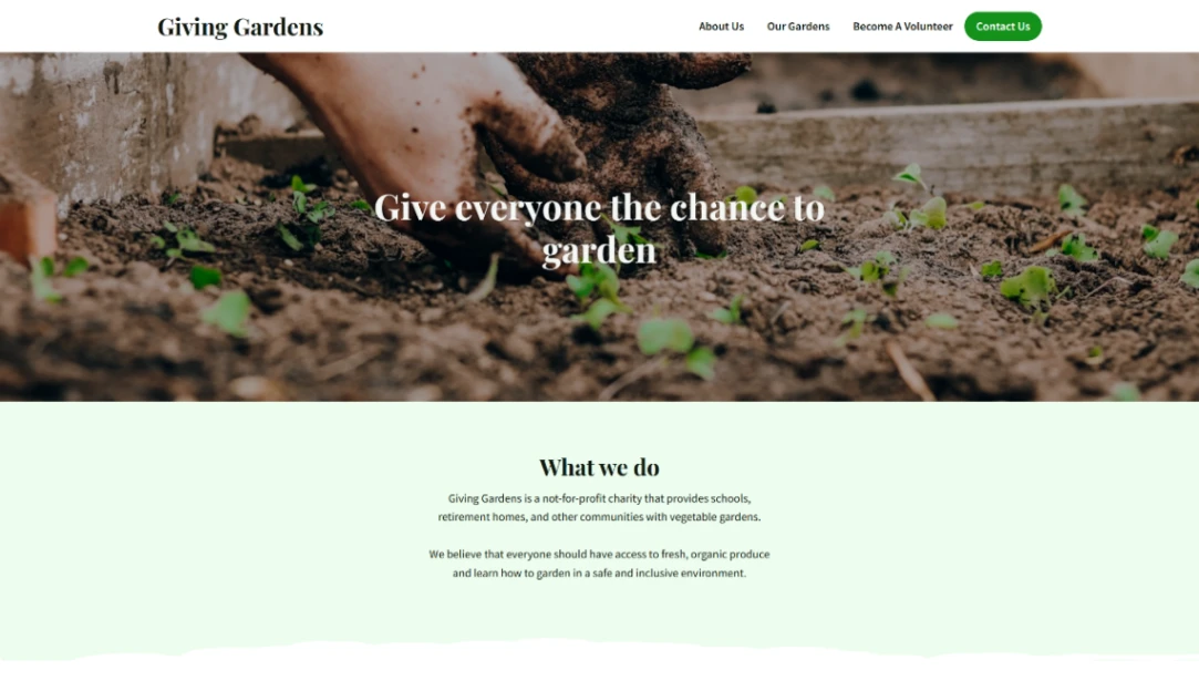
Finally, design the second ask. Most visitors won't give today — offer the one alternative that matches your need most (volunteer signup or the newsletter), not a menu of six ways to engage. And the layout mistake this category repeats: the mission essay homepage. Tell the story generously, but the donate button never leaves the screen while it's being read.
FAQ