Plant Shop
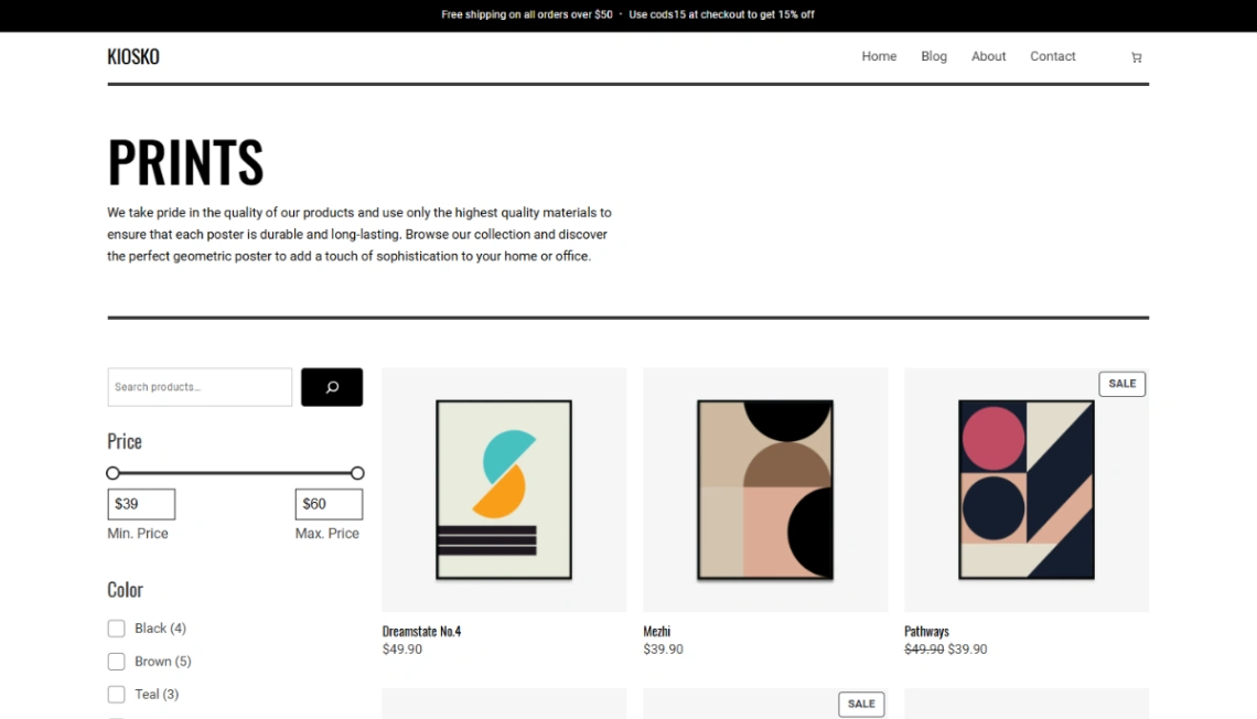
Art Store





Buyer's guide
How to choose a product template
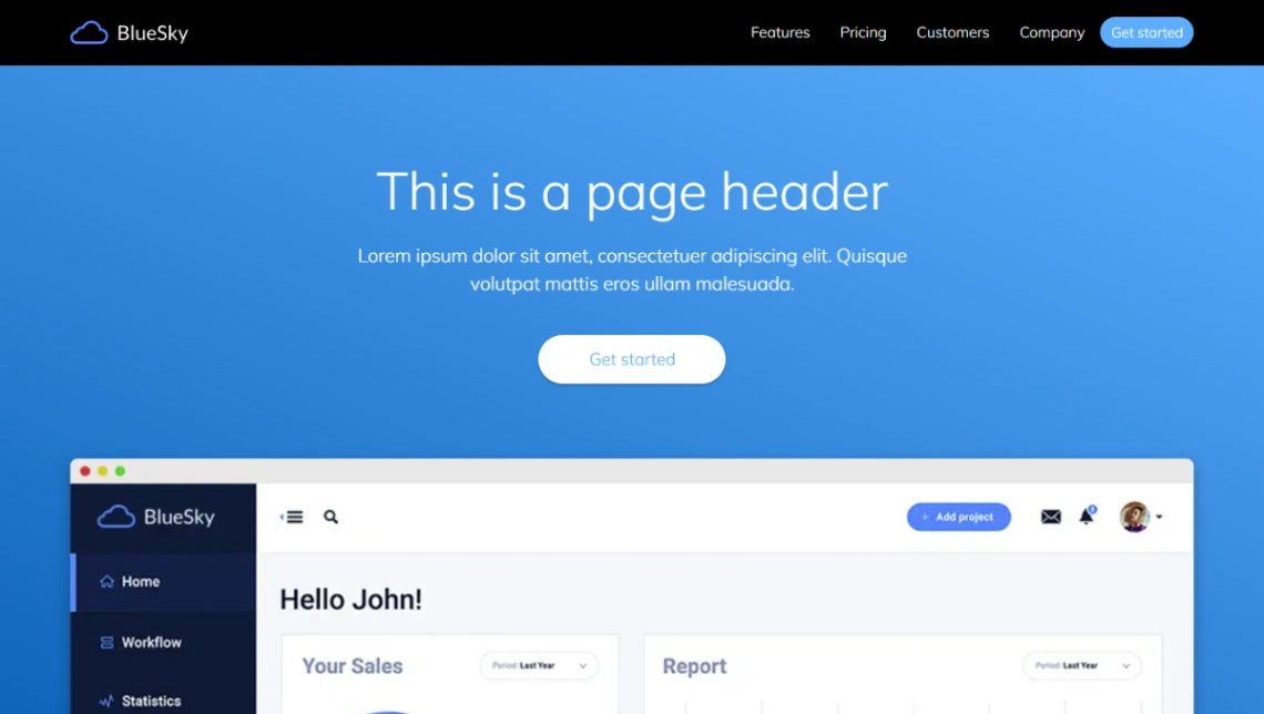
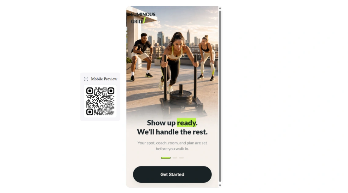
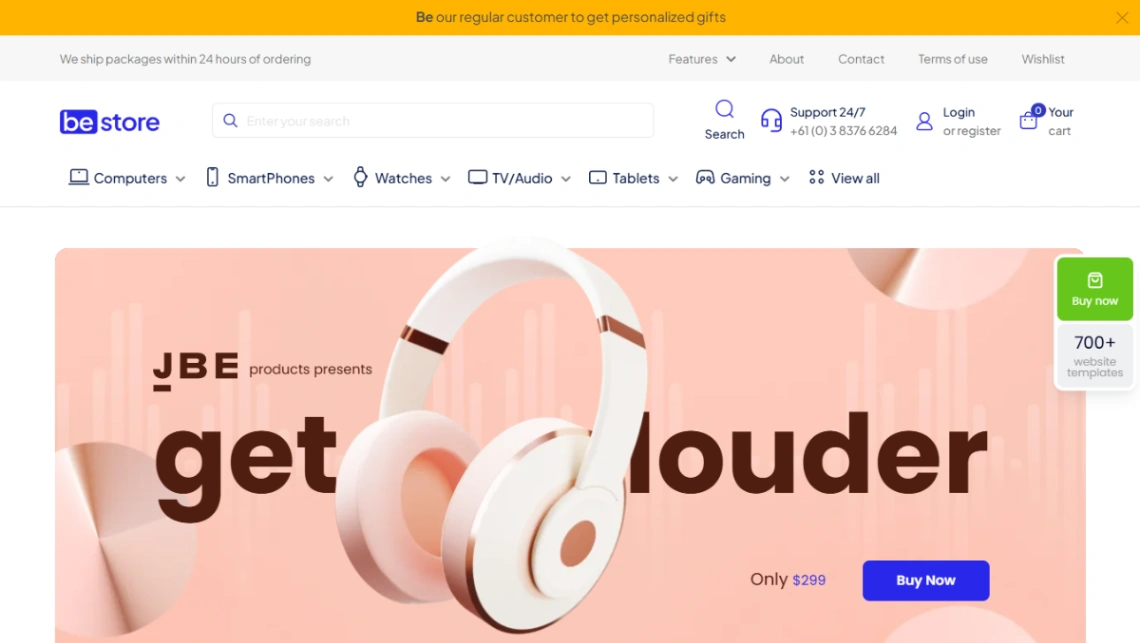
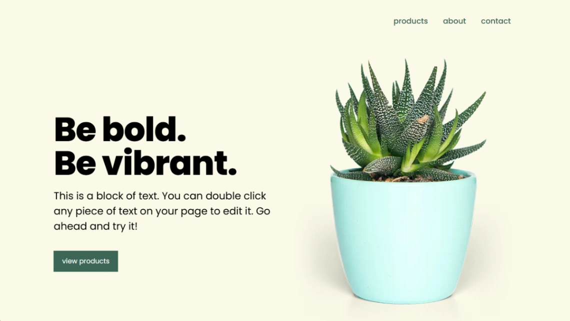
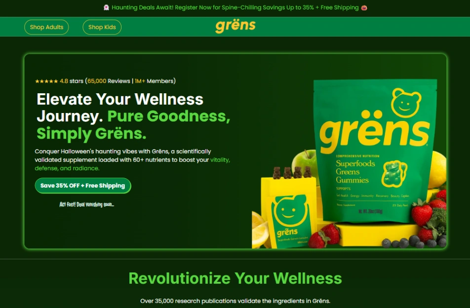
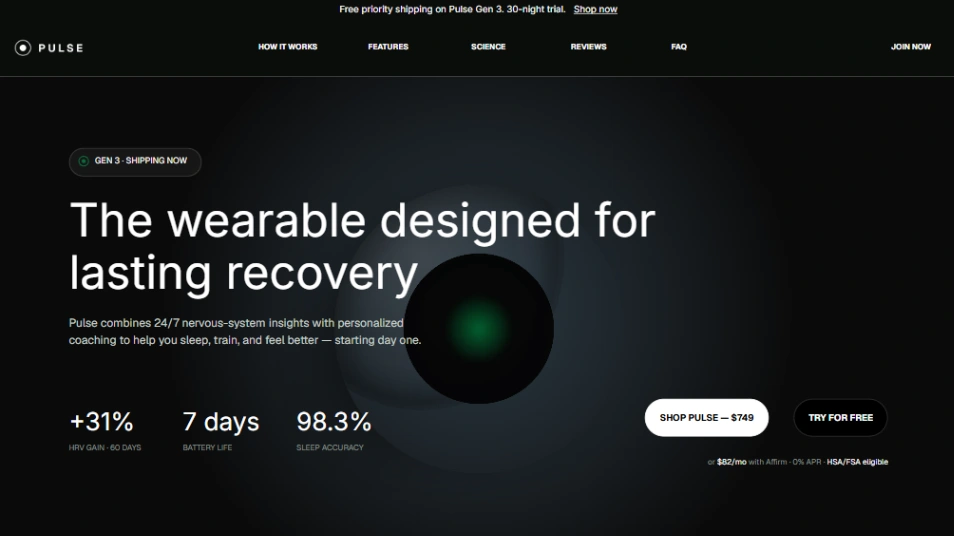
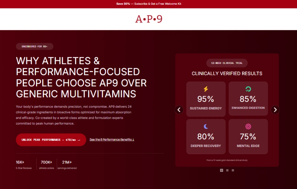
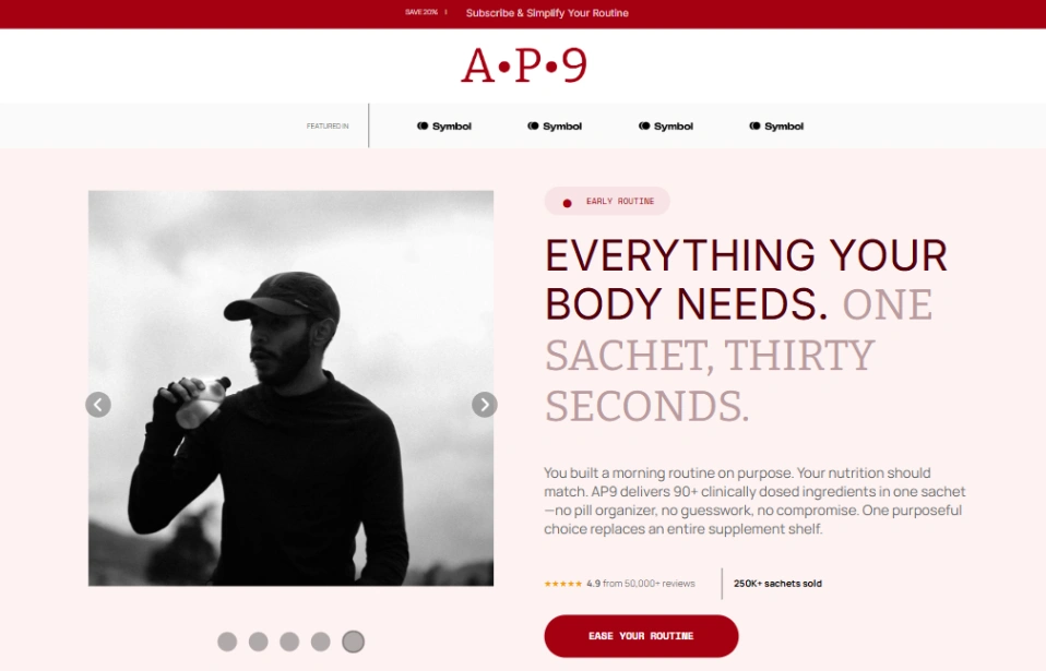
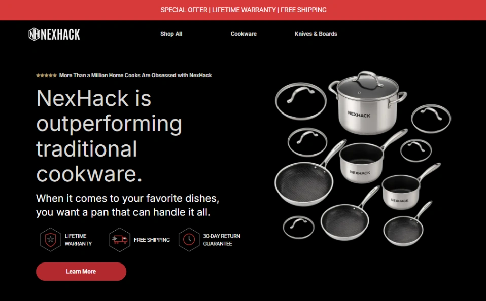
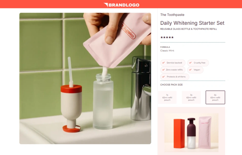
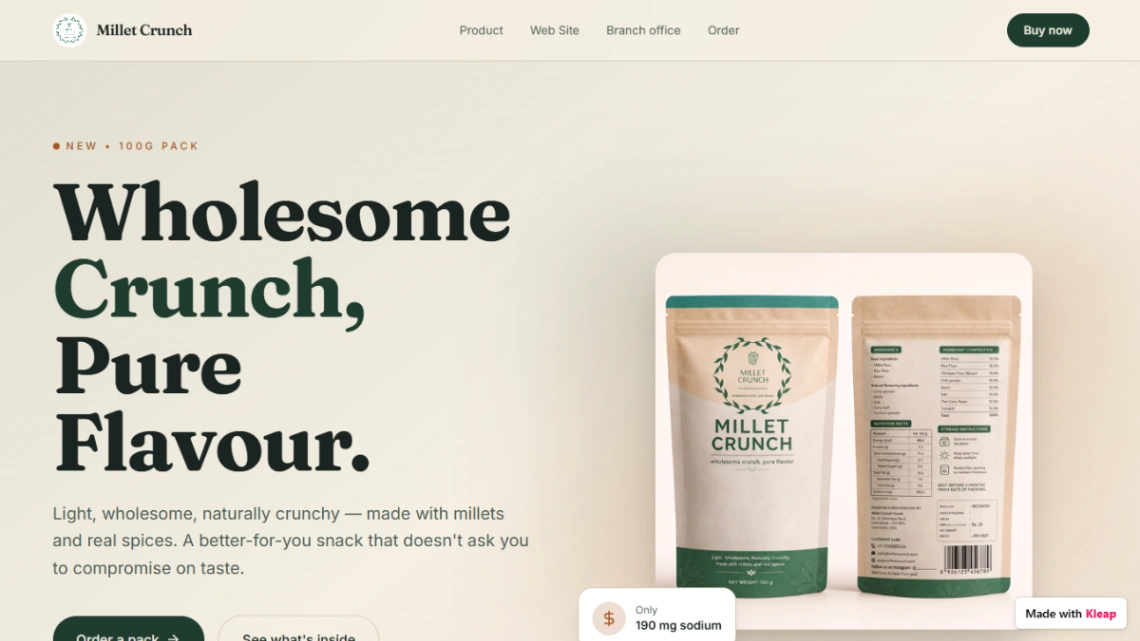
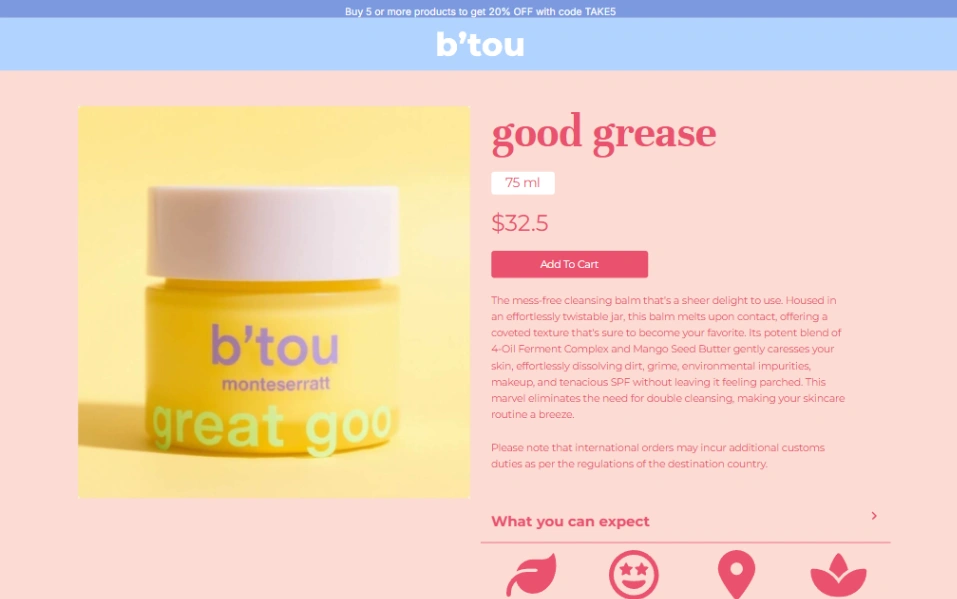
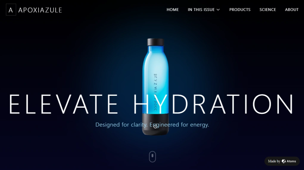
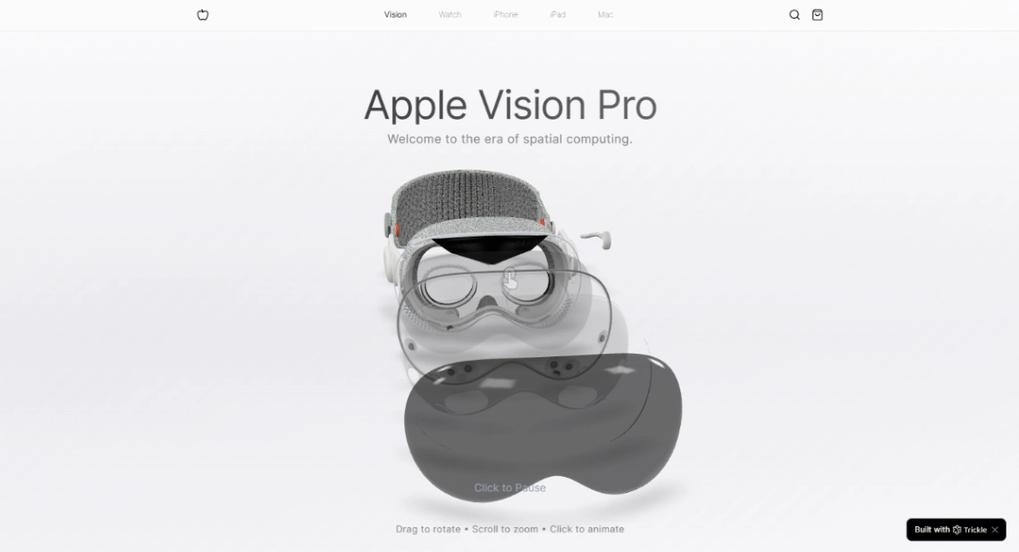
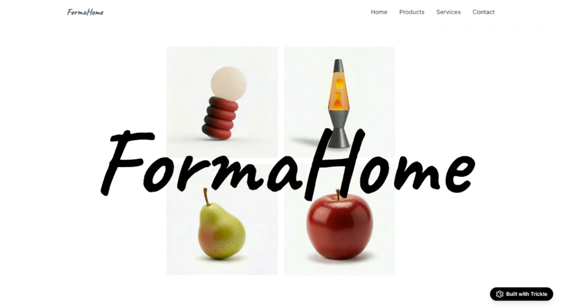
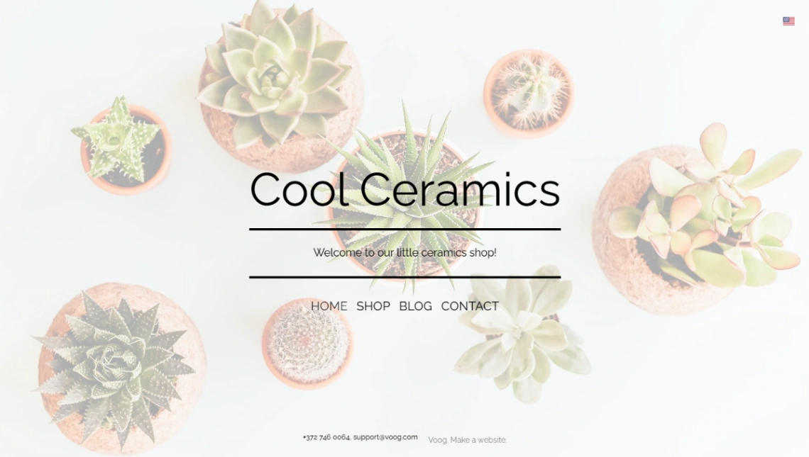
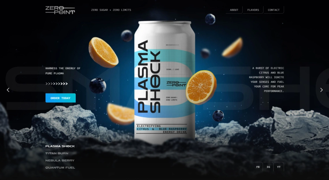
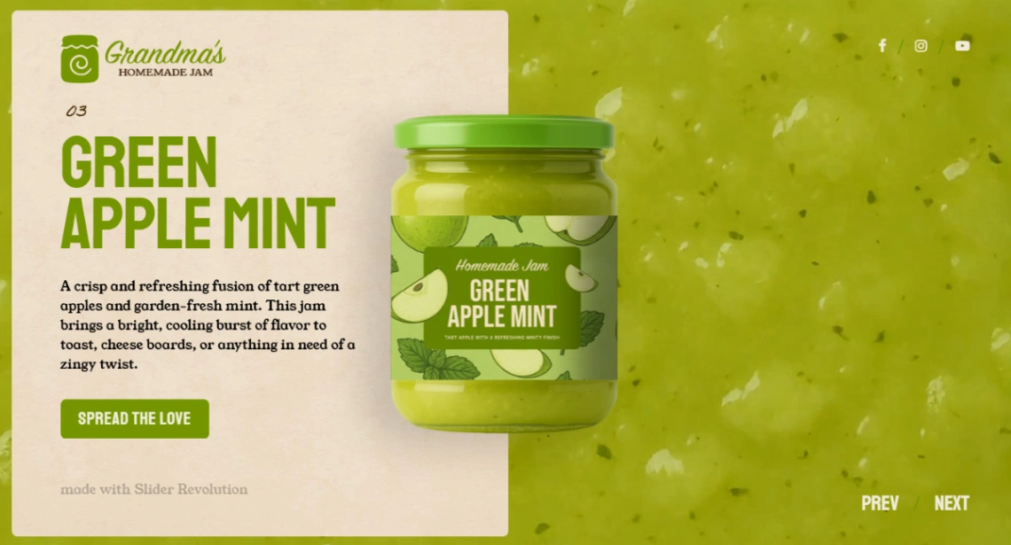
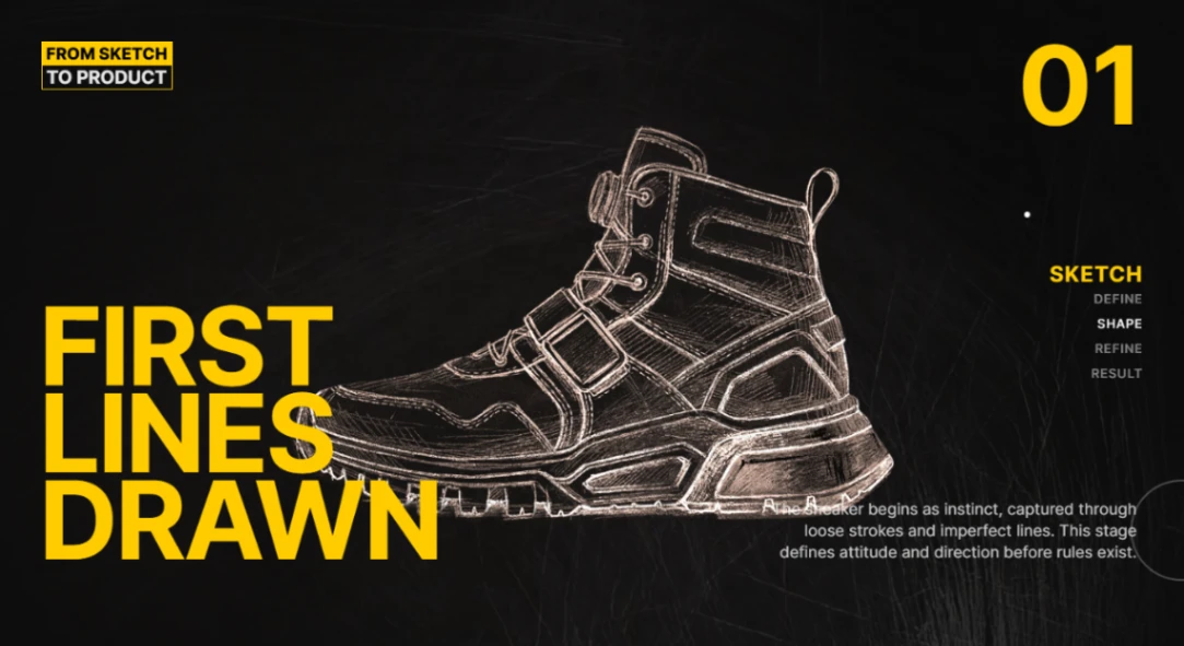
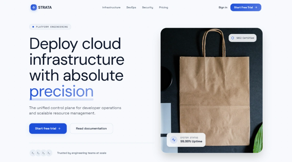
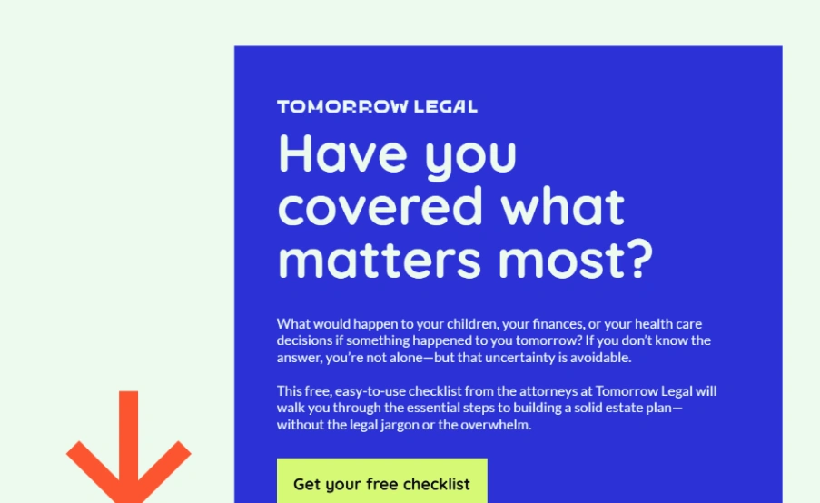
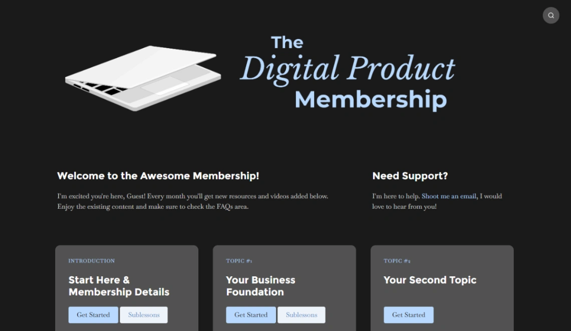
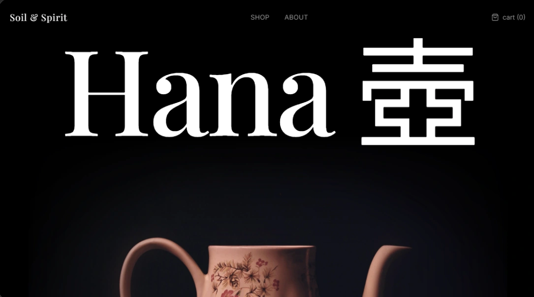
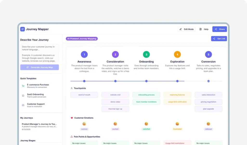
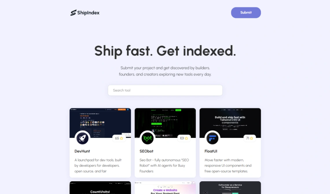
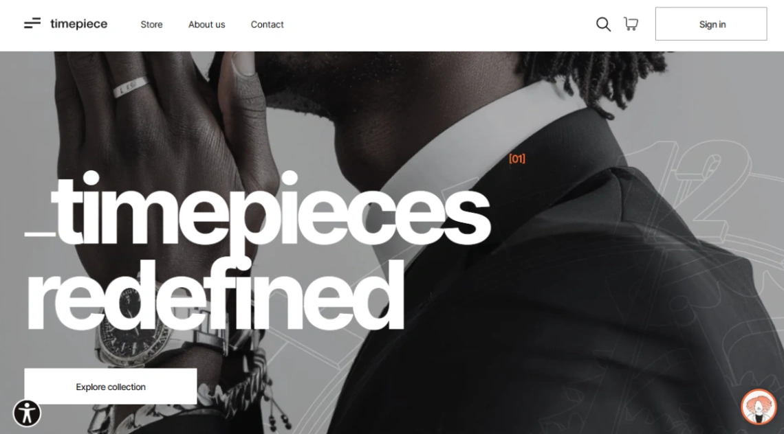
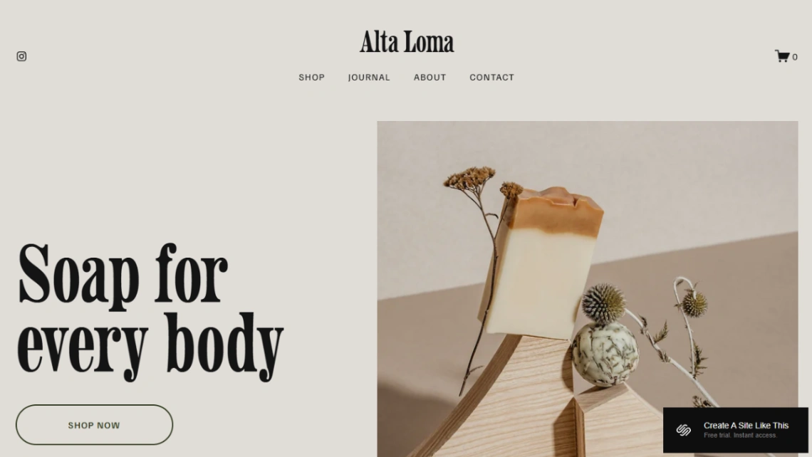
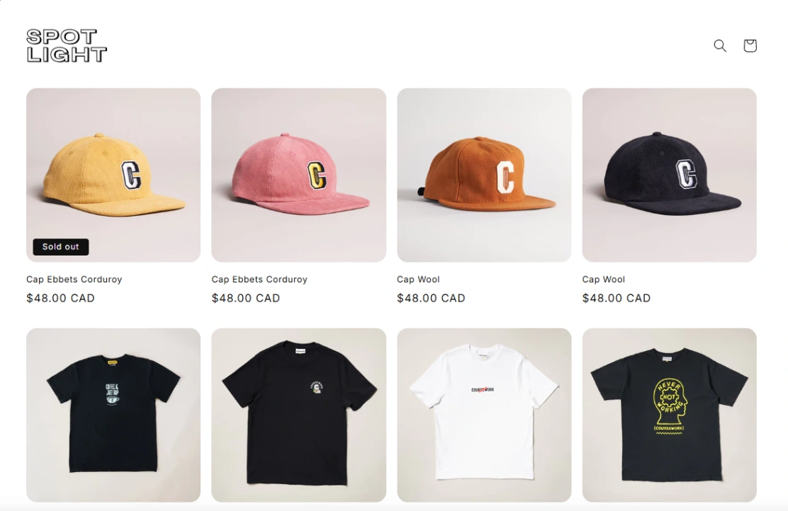
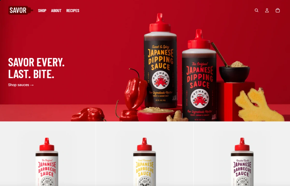
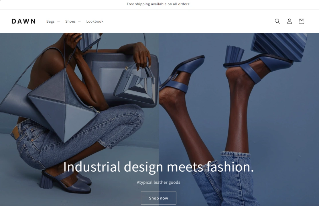
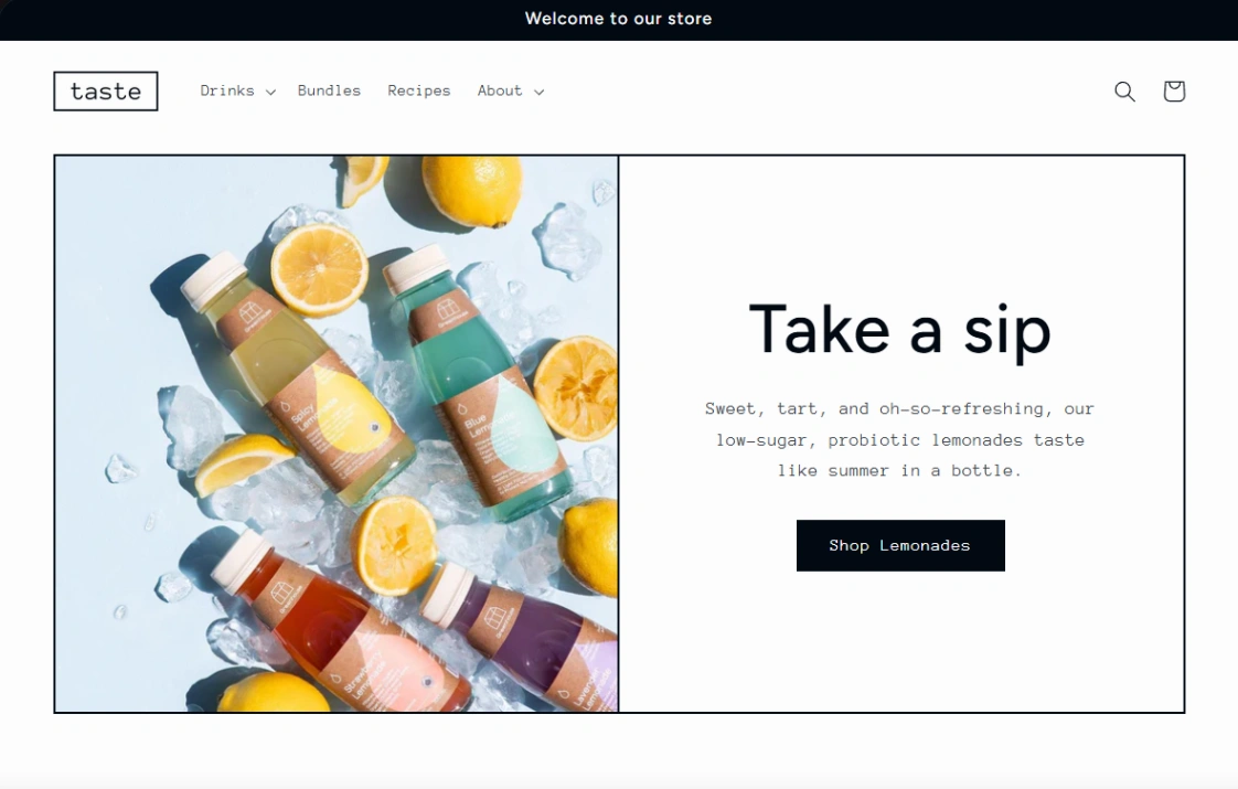
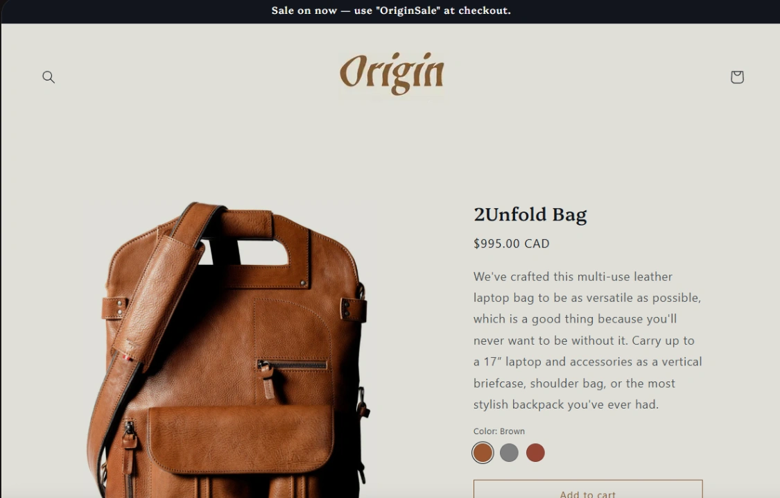
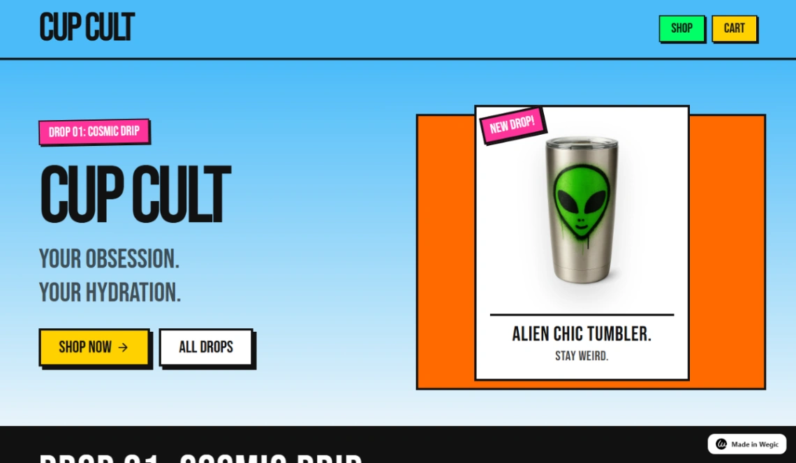
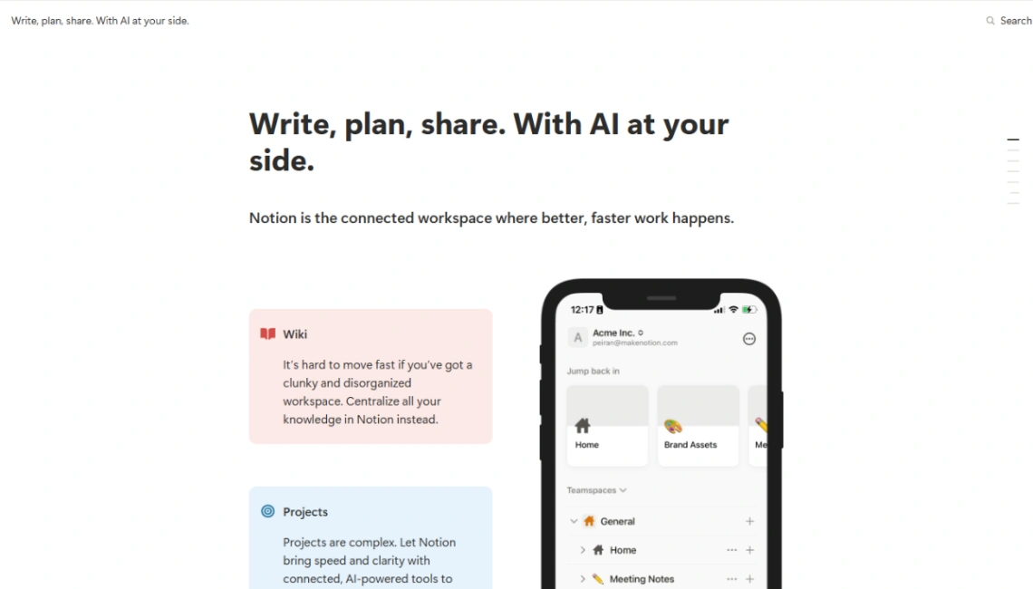
A single product deserves a single page that does everything a good salesperson would: demonstrate, answer, reassure, and ask for the sale more than once. That's what this collection is — long, persuasive pages — and the way to judge one is to scroll the demo asking a salesperson's questions: where's the demonstration, where do objections get answered, where's the ask?
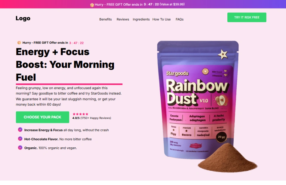
The architecture that converts has a known order: the product shown working within the first screen, the problem it kills stated in the buyer's words, proof (reviews with faces, numbers, press), the comparison table for shoppers who arrive mid-research, the objection section — shipping, compatibility, "will it work for me" — and the guarantee stated like you mean it. Templates here scaffold this arc; what varies is how much proof density each supports. Match that to your evidence, not your ambitions: empty review slots convert worse than none. Write the objections from real customer questions — invented ones answer nobody.
The buy button has a rhythm — after the demonstration, after the proof, after the objections die, and floating for the ready. Count the demo's asks: fewer than three on a long page means scrollers finish the story without ever meeting the price, which is the category's classic self-sabotage.
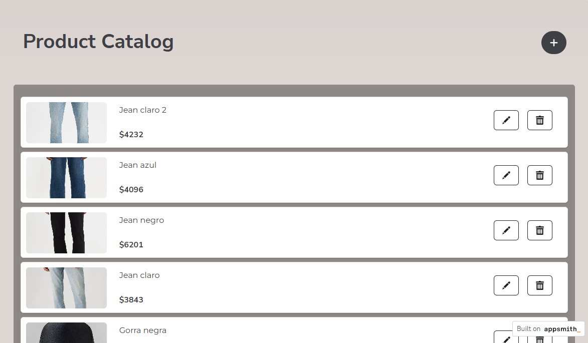
One structural choice remains: checkout on the page (storefront-backed designs, real cart) or a launch page that hands off to a marketplace or pre-order flow. The pinned builders cover both; owning the checkout owns the customer, and that data compounds into the second product.
FAQ