

Plant Shop


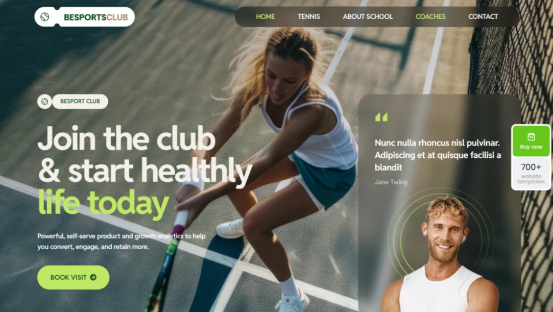
Tennis Club


Strength Gym
Beauty Salon
Buyer's guide
How to choose a landing page template
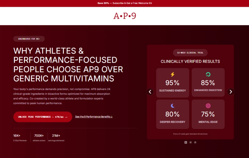
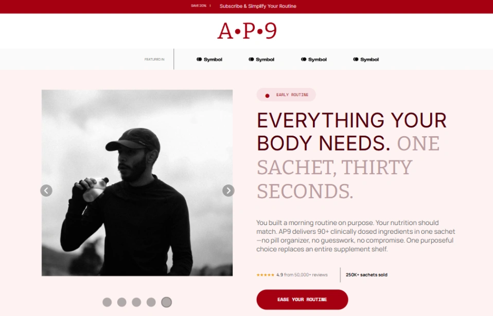
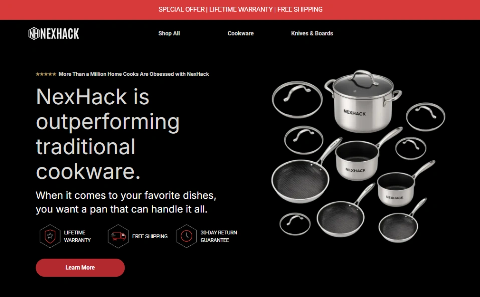
A landing page has one job, and the right template makes that job unavoidable. Before comparing designs, name the single action you're optimizing for — demo bookings, waitlist signups, quote requests, or a direct sale — because templates here are built around one of those and stretch badly across the others. A demo page needs a calendar and social proof; a waitlist needs one email field and a reason; a sales page needs room for objections, testimonials and guarantees.
Where the traffic comes from decides the features that matter. If you're buying clicks, load speed and message match are everything — the headline should repeat the promise of the ad that was clicked — and templates from conversion-first builders come with A/B testing and per-variant analytics built in, which you will want by week two. If the page just catches organic and bio-link traffic, a lighter one-pager you can publish tonight is the better trade.
The classic mistake is dressing a landing page up as a small website. Navigation menus, footer link lists and secondary buttons all leak visitors you paid to acquire; strong landing templates are deliberately dead-ended, repeating one action down the page. If you feel the urge to add links, that's a sign you need a site, not a landing page.
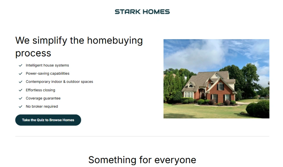
For offers that need qualifying — consultations, quotes, anything with a budget conversation — look at templates built around multi-step forms, which ask one question per screen and reliably finish more submissions than one long form. And check where visitors land after submitting: a proper thank-you step is where conversion tracking lives. The builders best suited to each of these jobs are pinned at the top of this page.
FAQ