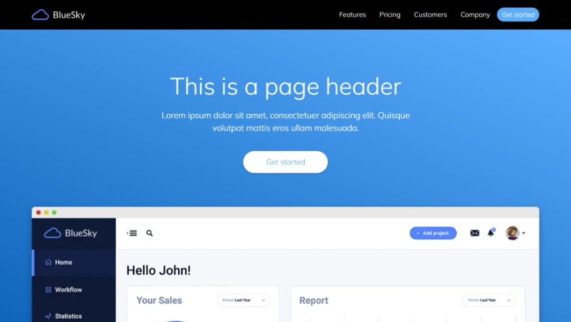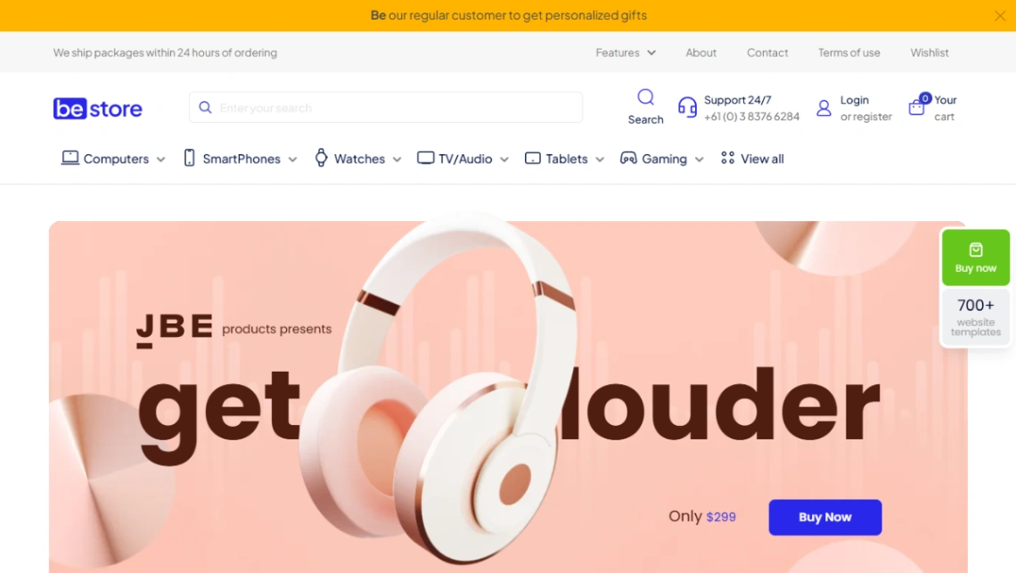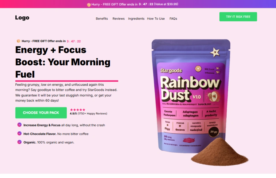

Strength Gym
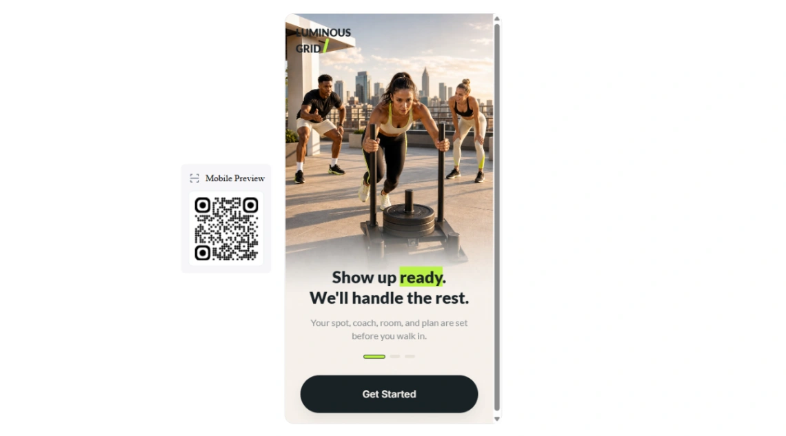



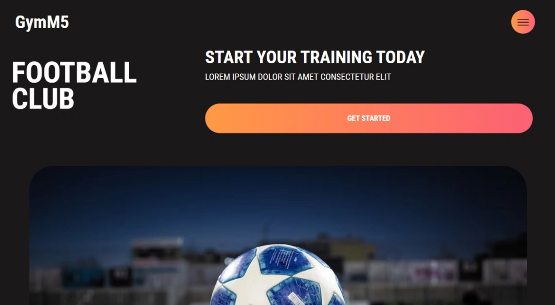
Sports Club
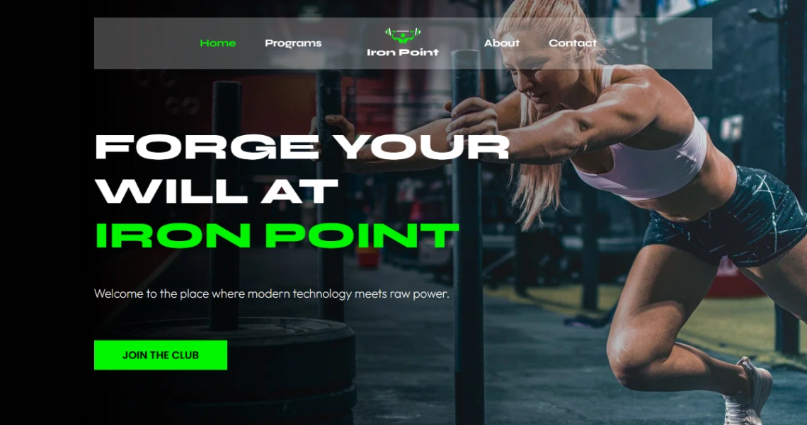
Fitness Club




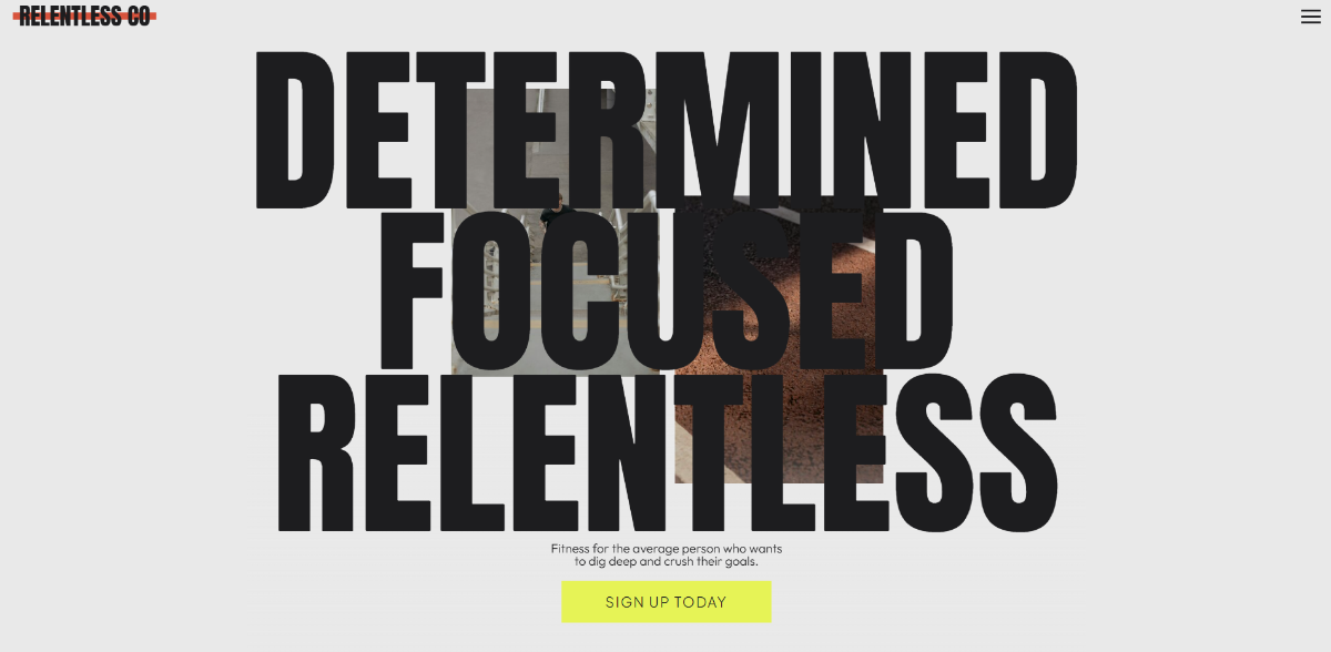
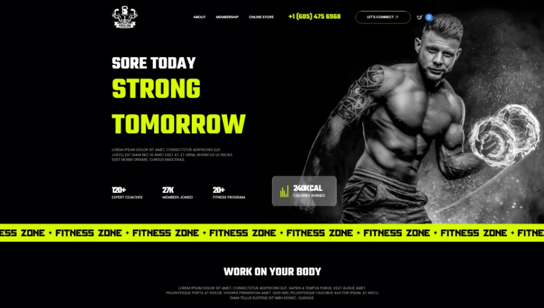
Fitness Zone

Fitness Gym

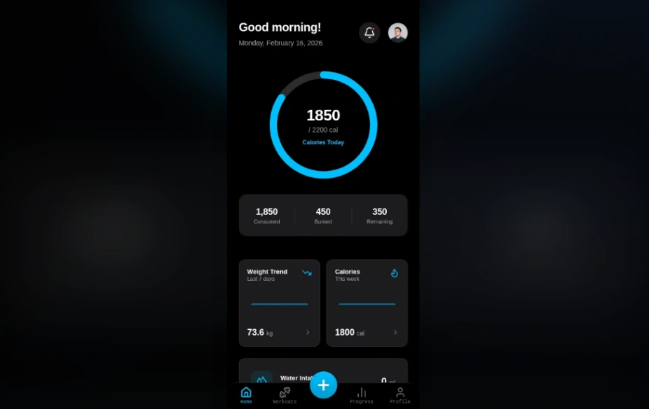



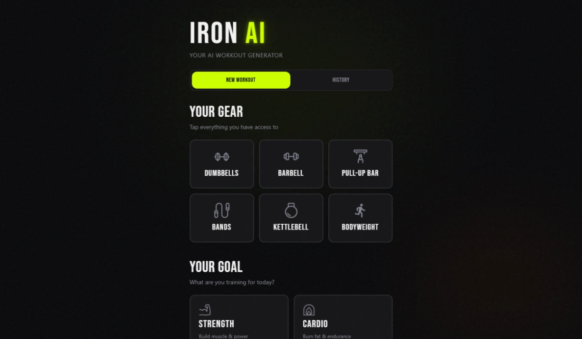
Gym Website


Gym Fitness


Gym Trainer


Buyer's guide
How to choose a gym template
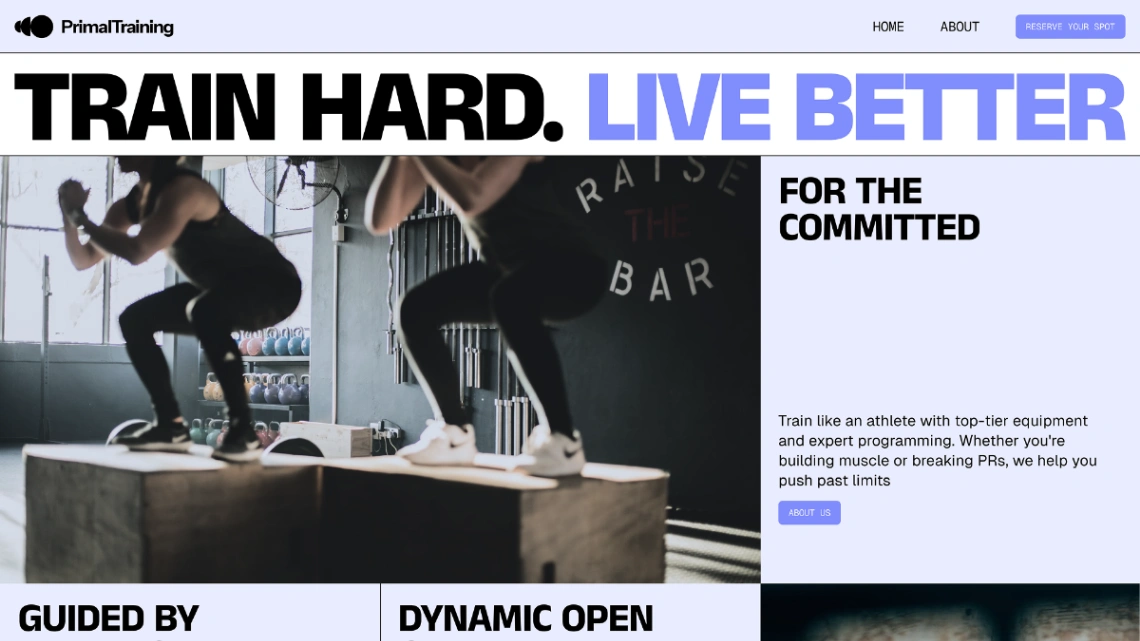
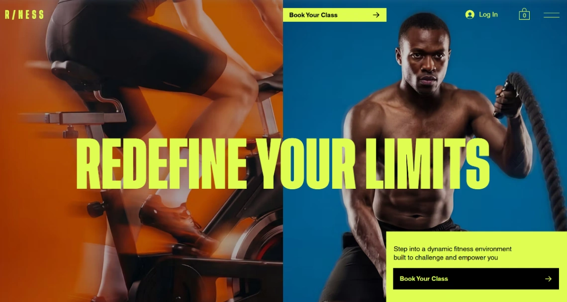
A gym website serves two visitors on different errands: the prospect deciding whether to join, and the member checking tonight's timetable — and the second visitor comes back two hundred times a year. Design for both or the site fails quietly: the timetable must load instantly on a phone (it's the most-requested page by an order of magnitude), while the join path stays one obvious tap from anywhere.
Let joining finish online. Tiers compared plainly, prices visible, contract terms in sentences, payment taken — the whole membership, signed up at 11pm when the motivation struck. The enquiry-wall pattern ("contact us for pricing") belongs to the era of sales tours; the modern joiner comparing three gyms simply closes the tab. The membership-capable builders in the pinned picks run this full flow, direct debits included.
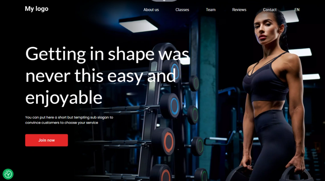
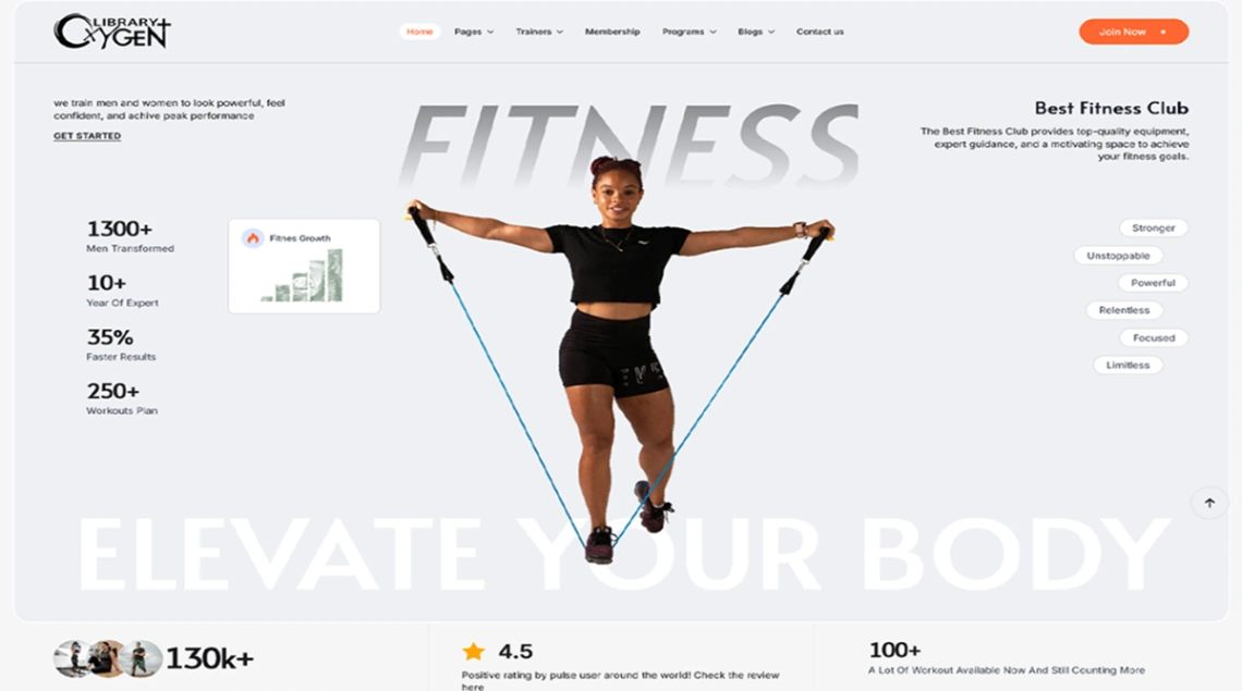
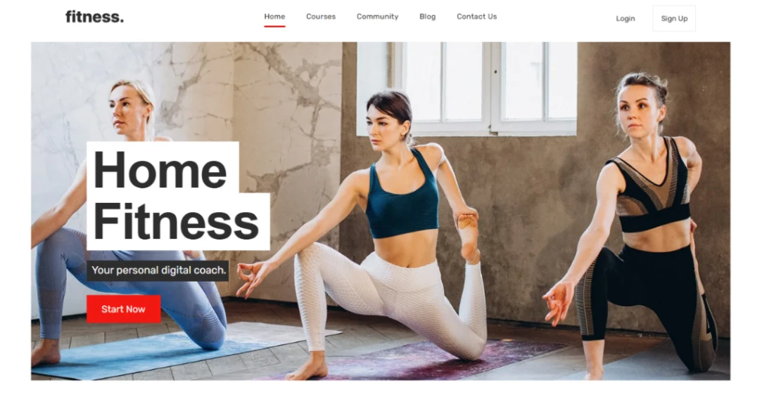
Show the facility like you'd show a flat: honestly. Real photos of the actual floor, at realistic capacity, equipment as it stands — because every joiner visits once before committing, and the gap between website and walkthrough is where signups die. Coach bios with credentials and faces do more than any equipment list; people join rooms they can imagine being welcomed in.
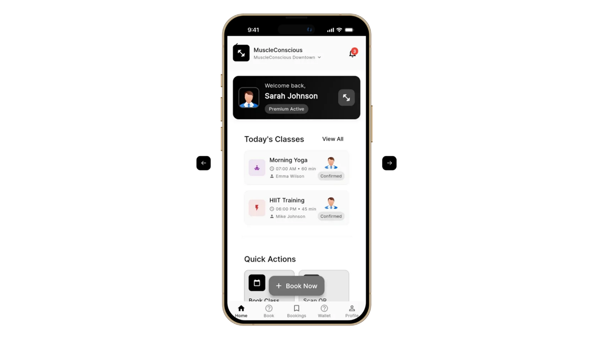
The template earns long-term keep on retention surfaces: class booking with caps and waitlists, timetable updates you can make from the front desk in seconds, and a members' noticeboard for the programming that changes weekly. A gym site that only recruits is half a site — the other half is making the two-hundredth visit frictionless.
FAQ