










IT Company







Tech Company








Buyer's guide
How to choose a company template
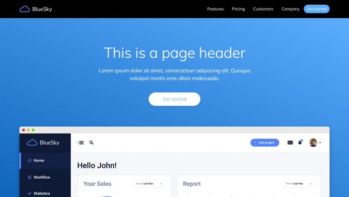
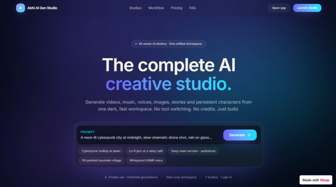
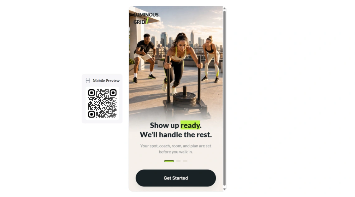
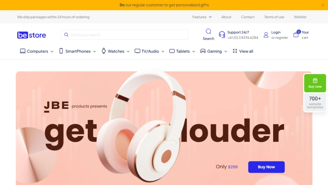
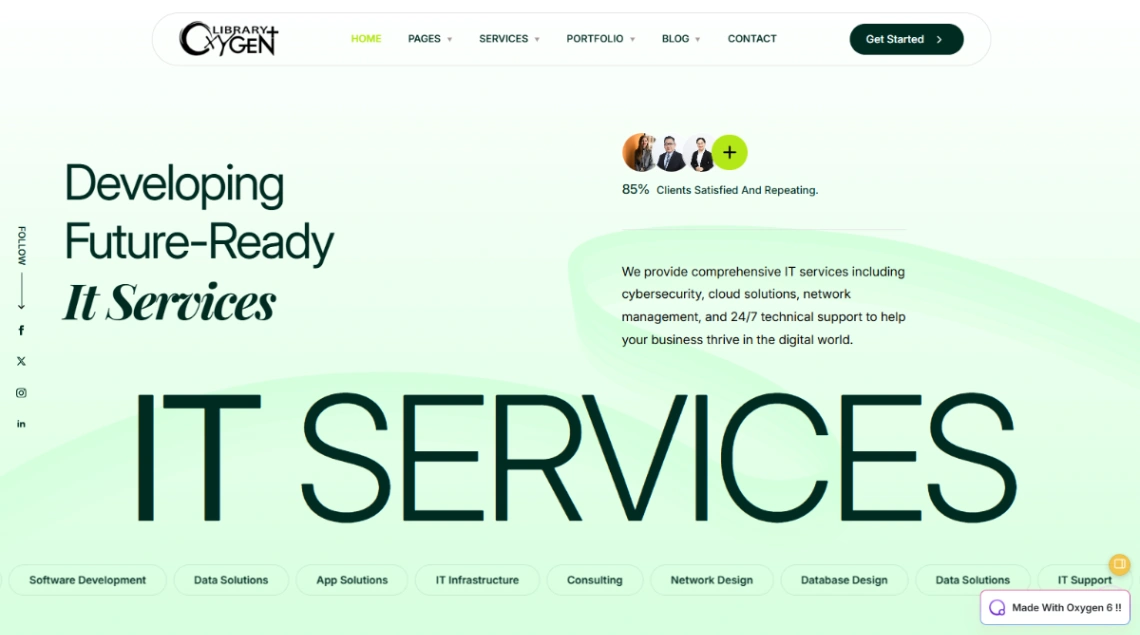
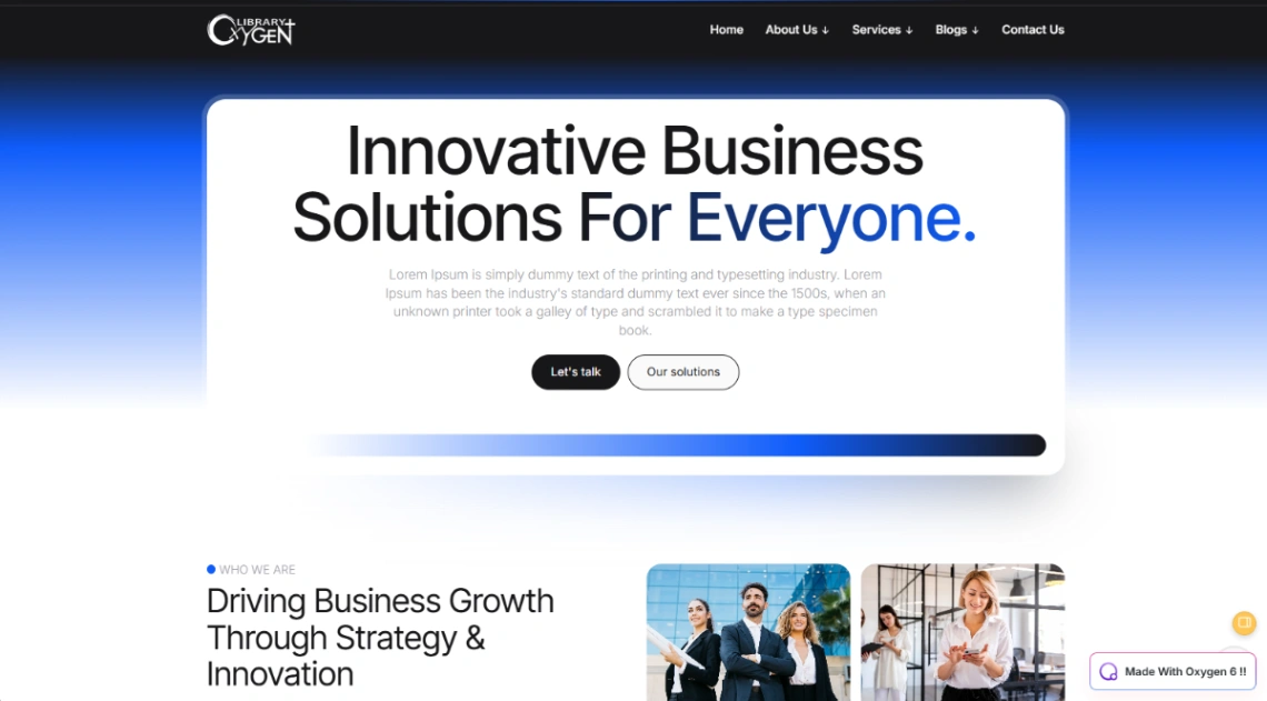
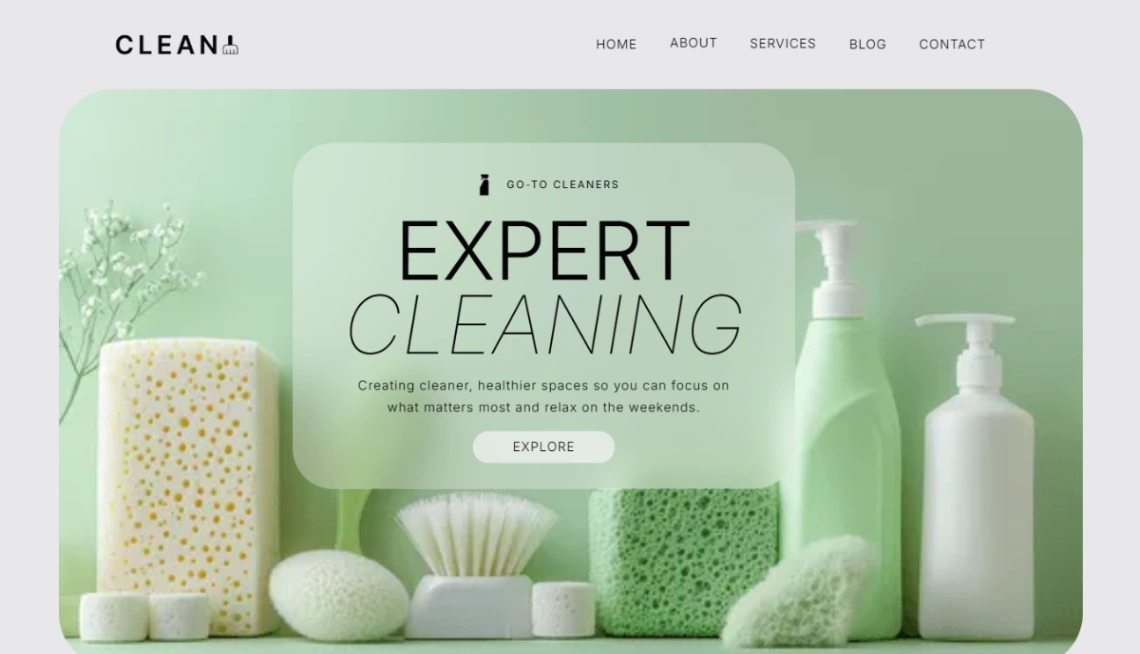
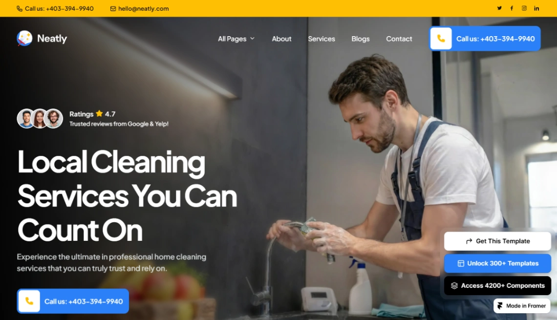
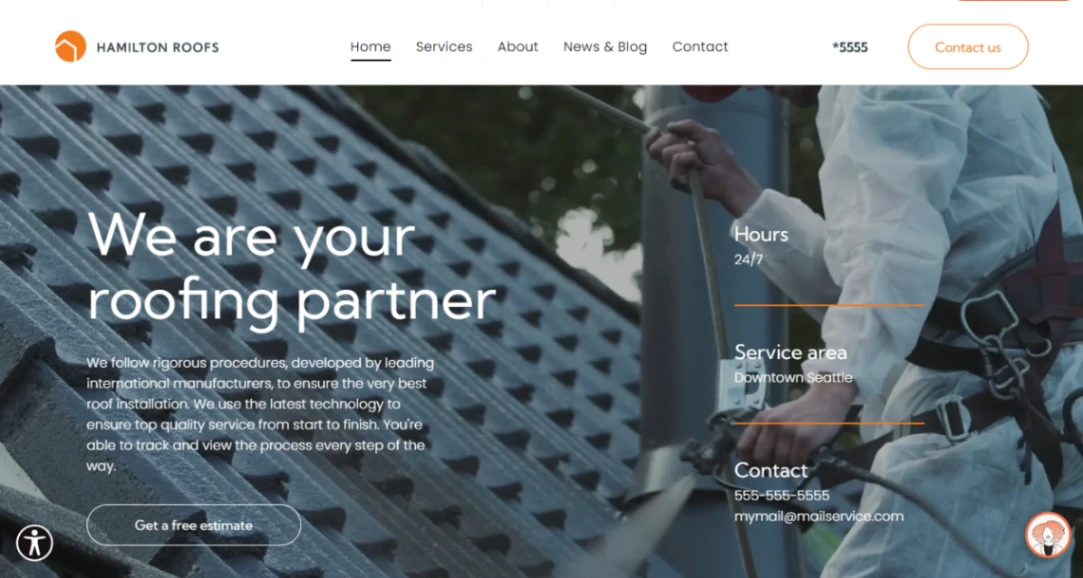
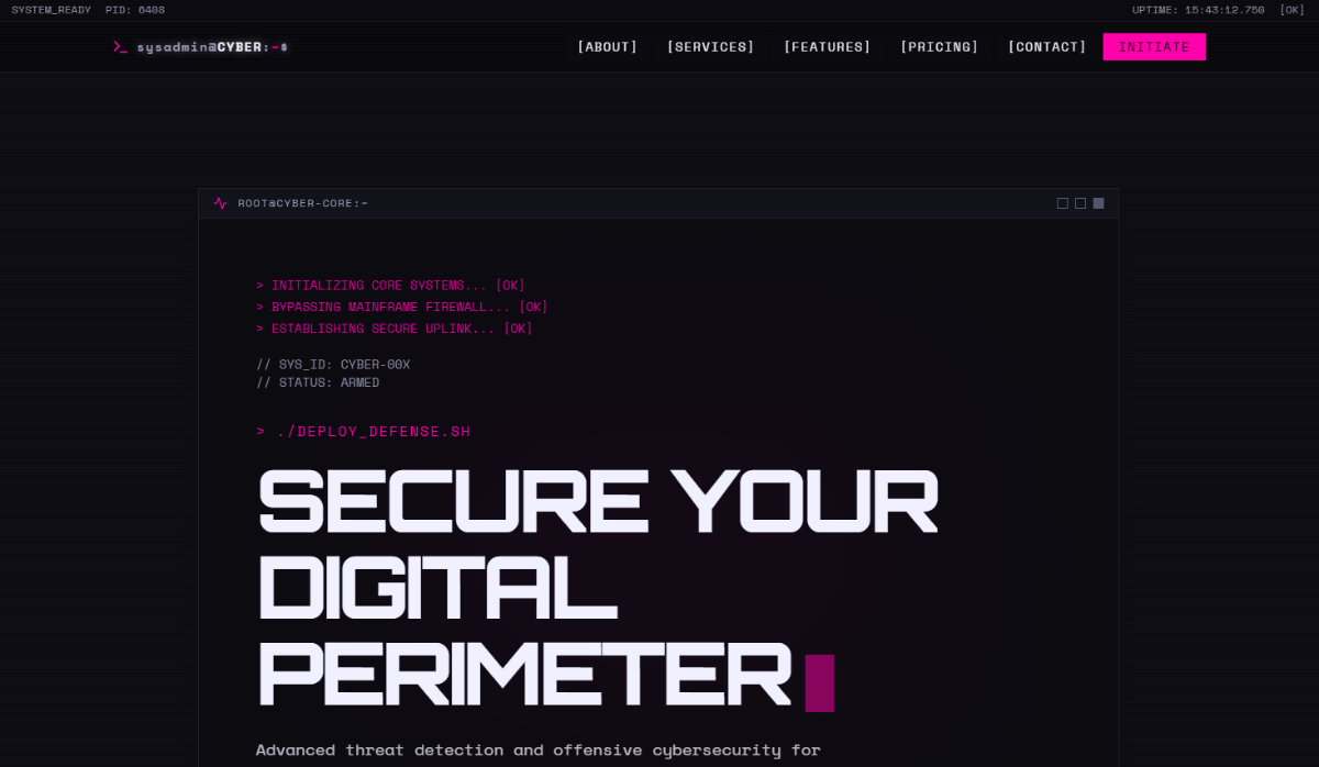
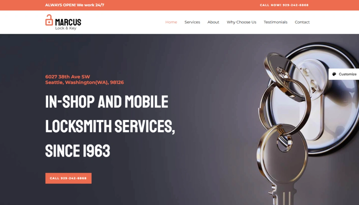
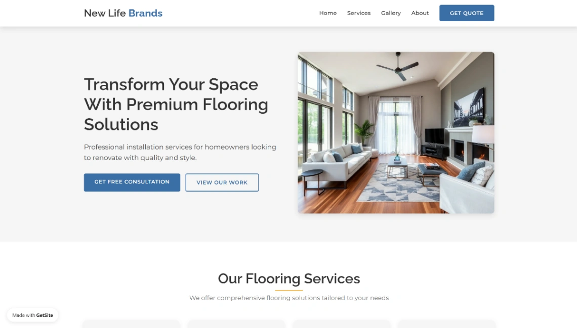
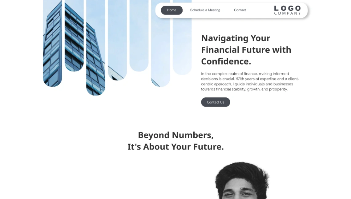
A company site is furniture: it should be solid, useful, and quiet. Nobody browses one for pleasure — prospects, candidates and partners arrive to verify something specific — so this collection's clean, undramatic templates are correct, not boring. The design goal is credibility without effort, and the maintenance goal is a site that stays presentable untouched for months.
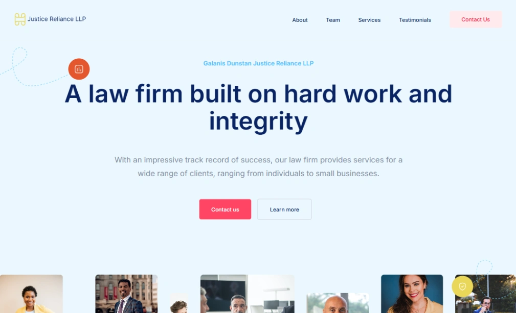
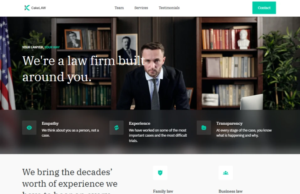
Two pages do the persuading, and they deserve nearly all your customization time. The work page (projects, clients, outcomes — whatever proof your industry trades in) is what prospects actually read; the team page is what everyone reads, because people verify people. Real photographs of real staff, names and roles, a sentence of humanity each — this single page outperforms any amount of values copy, and the CMS-backed builders pinned above make both pages editable without a developer.
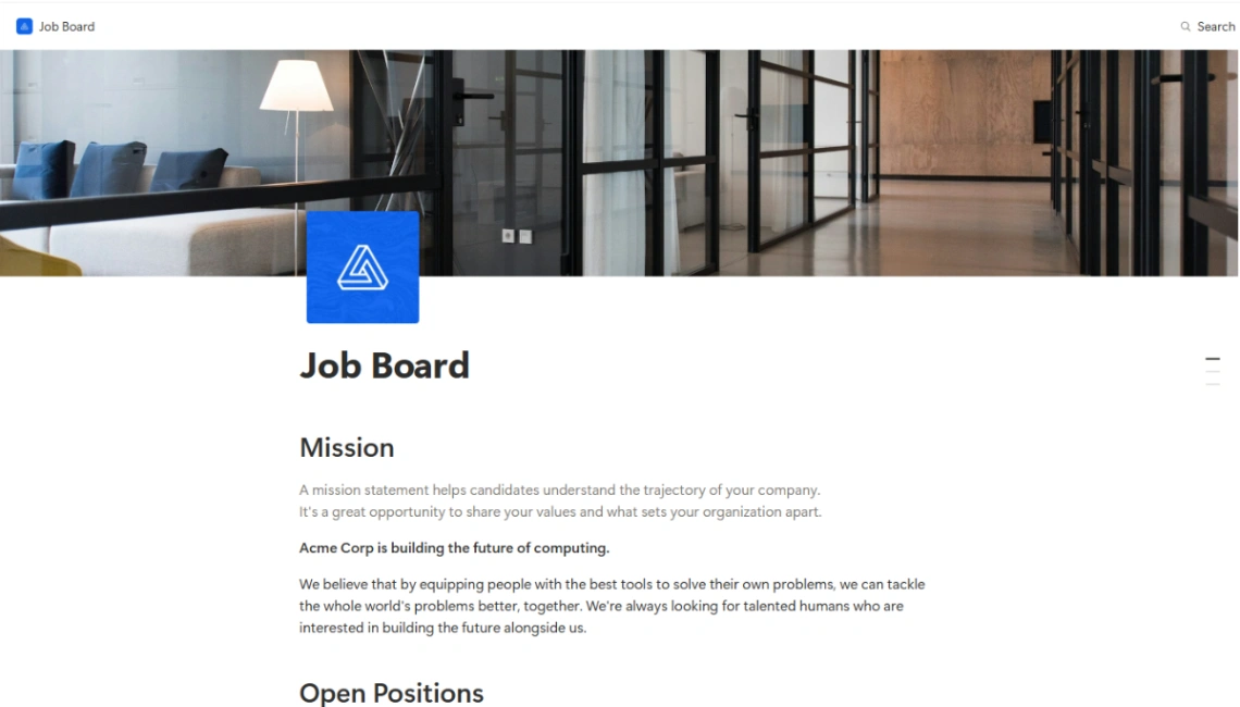
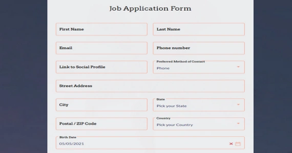
Treat candidates as the second audience, because for many companies the site converts more hires than customers. A careers page with actual open roles, what working there is like in concrete terms, and a application path that isn't an email address — that's the difference between recruiting and hoping.
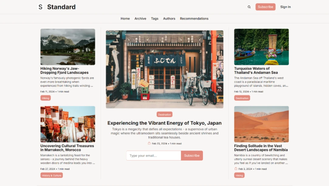
Then design for neglect, honestly. The classic company-site failure is the news section with two posts from 2024 — a freshness promise the organization couldn't keep, aging publicly. Prefer evergreen structure: no dated content unless someone owns it, hours and addresses in one editable place, and a template whose small updates (a new hire, a new client) take five minutes. Quiet and current beats ambitious and stale.
FAQ