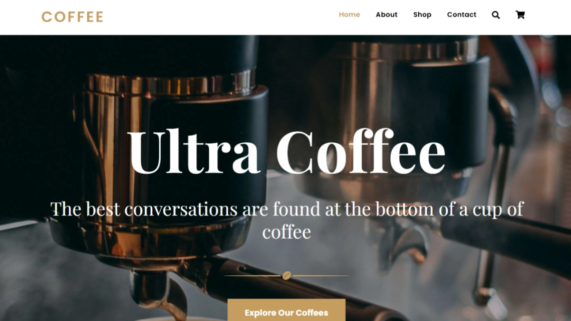
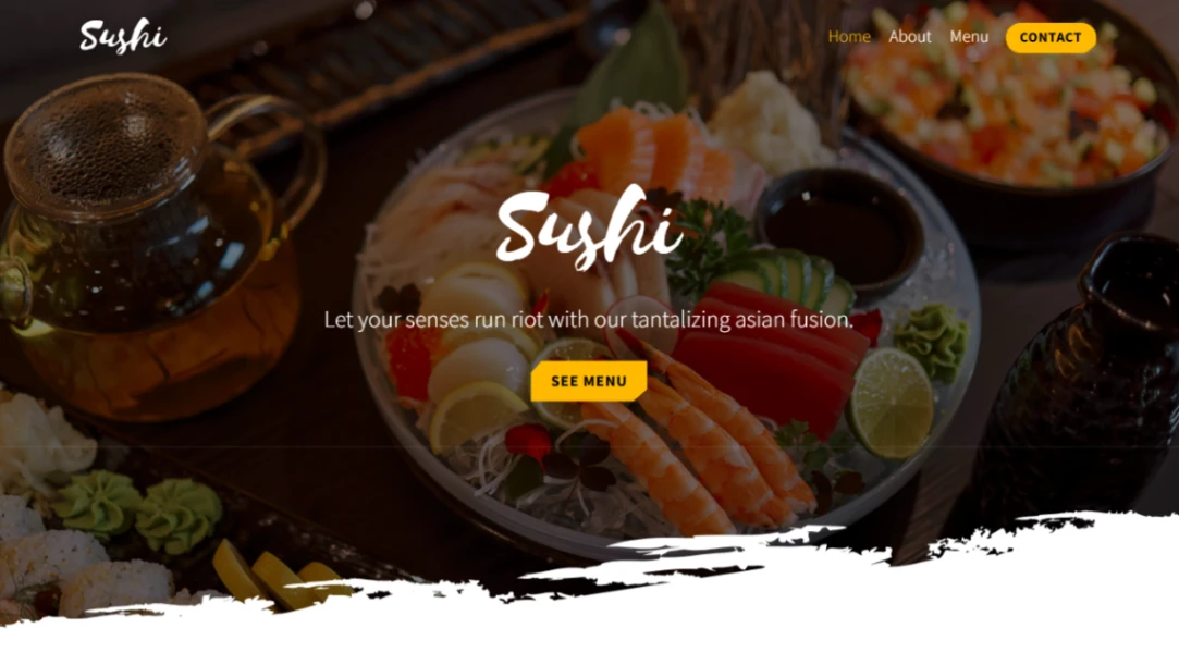
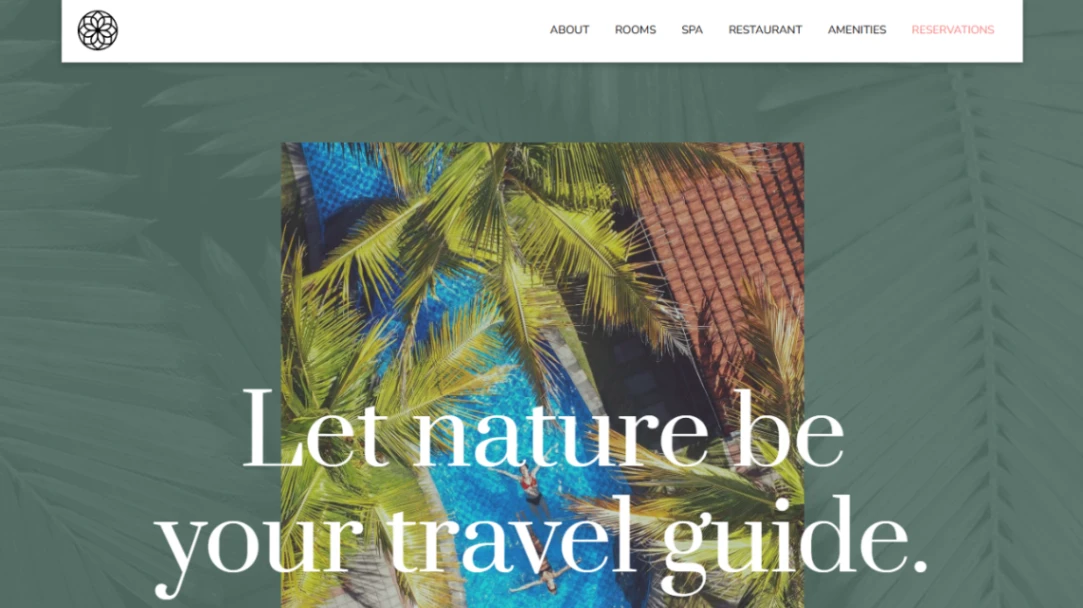
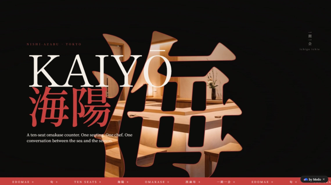
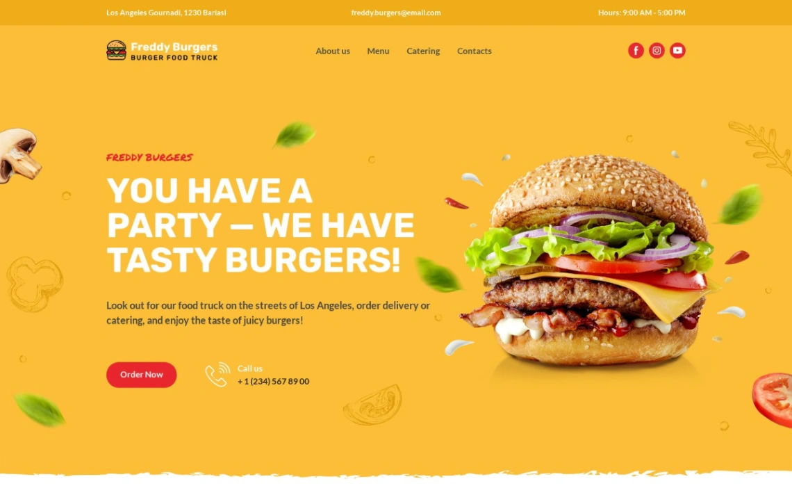
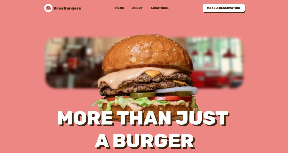
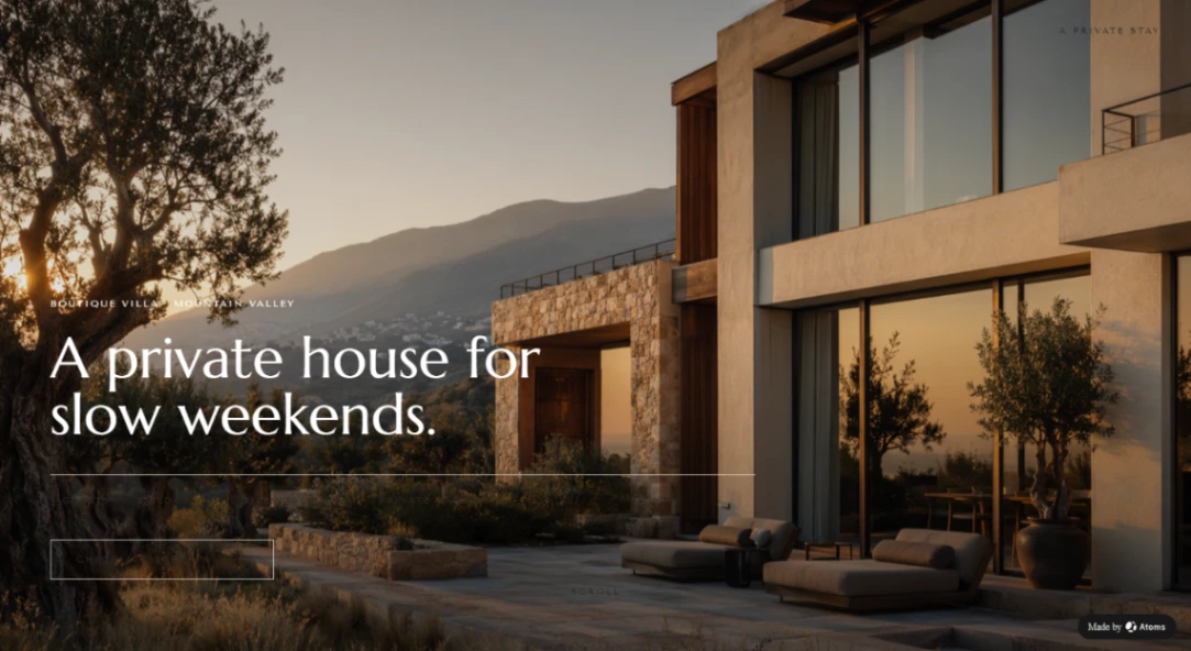
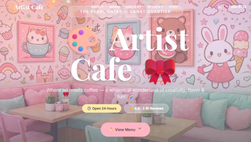
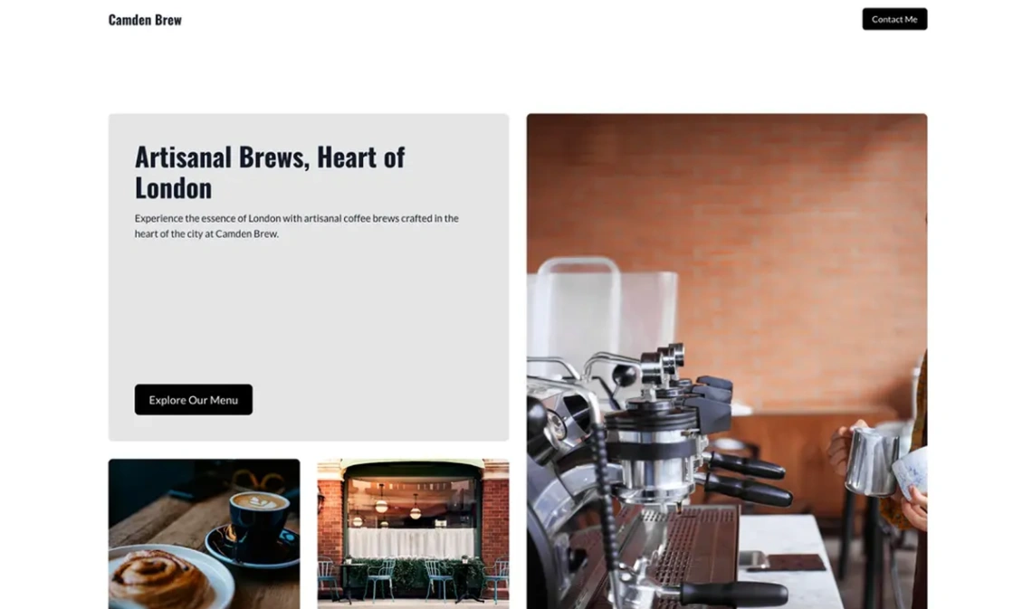
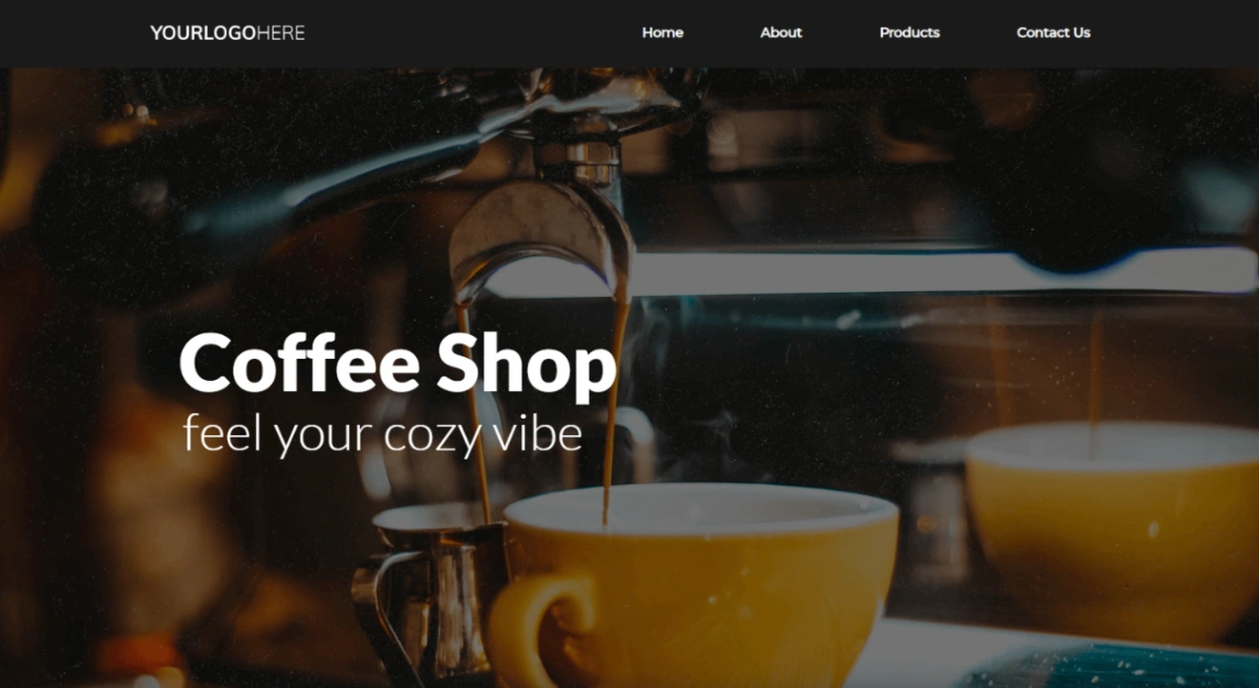
Coffee Shop
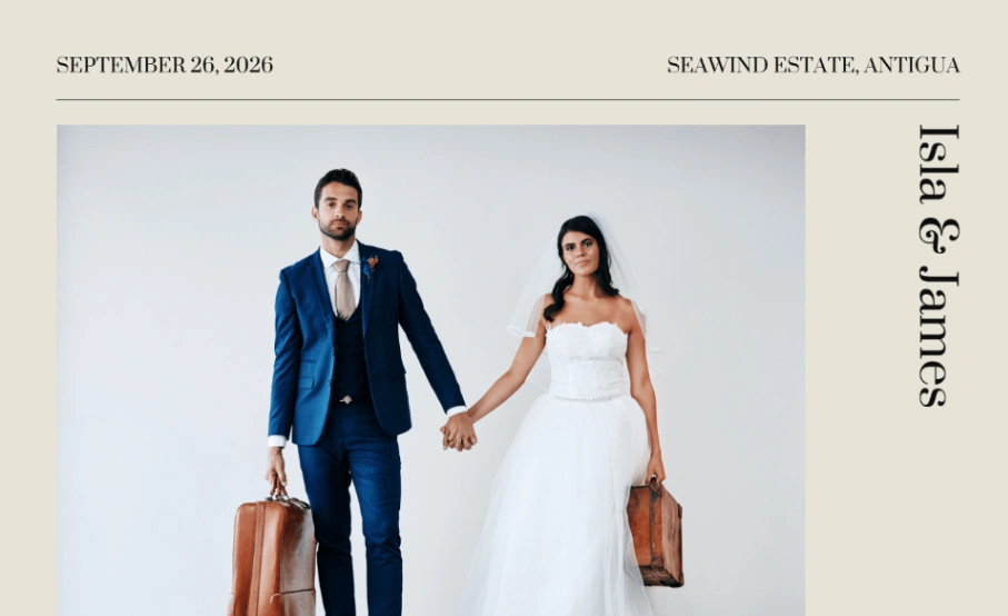

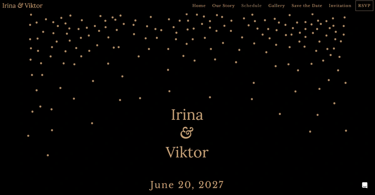
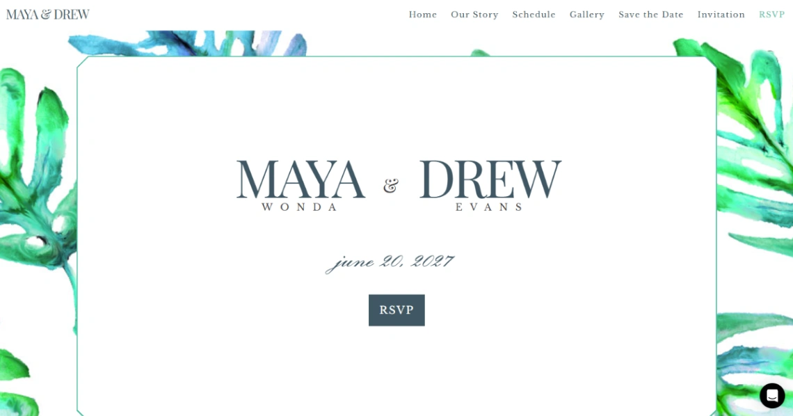
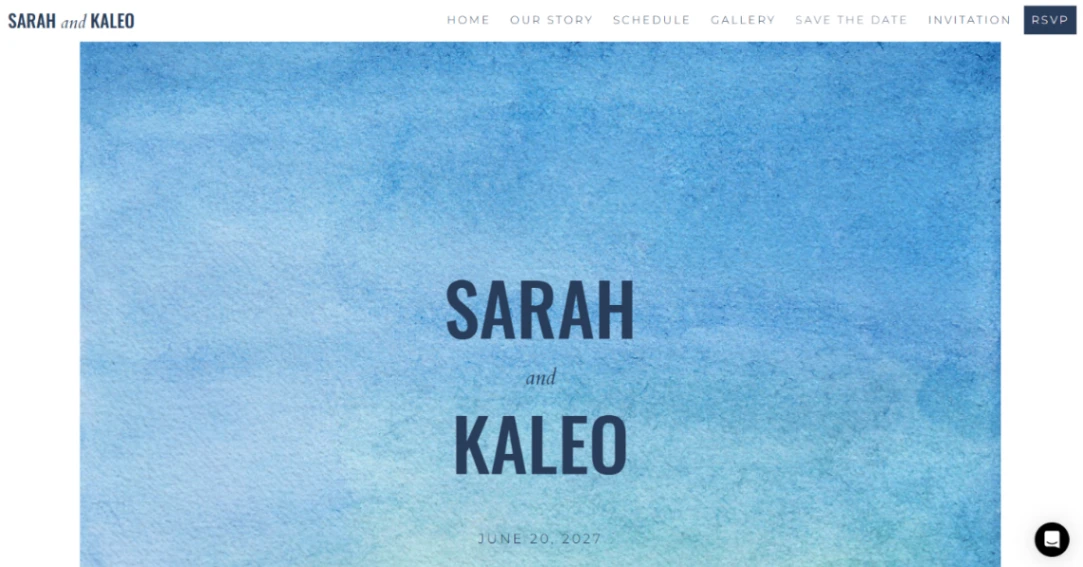
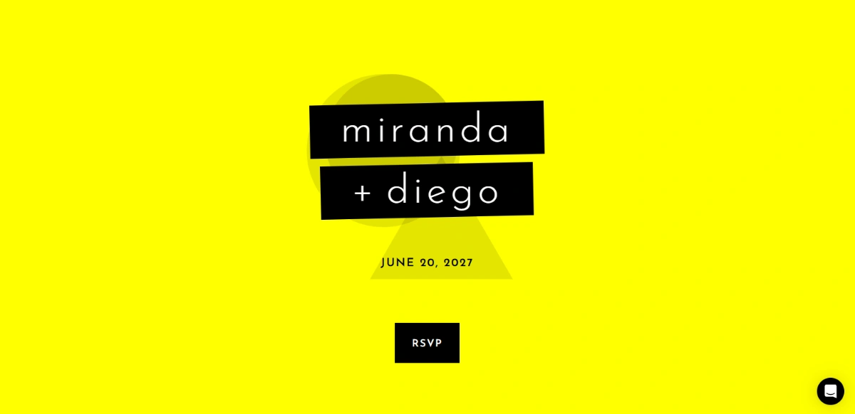
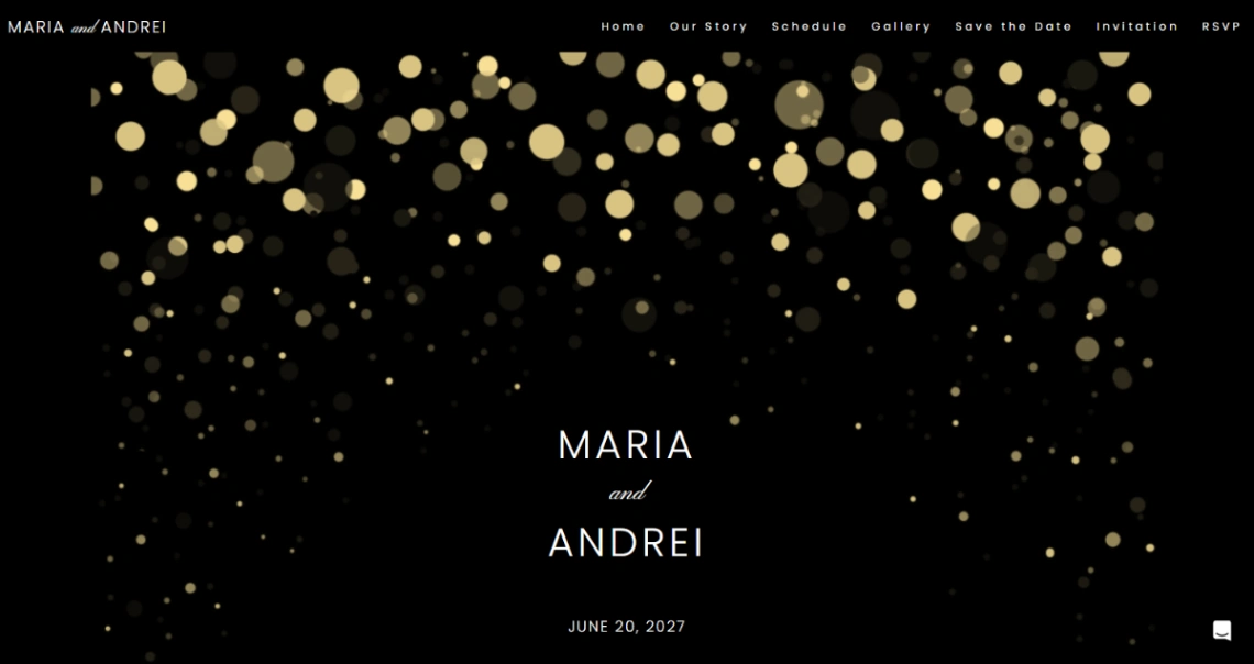
Neon Wedding
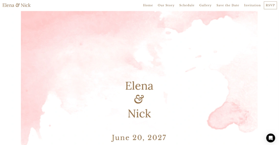
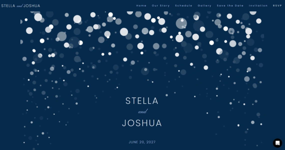
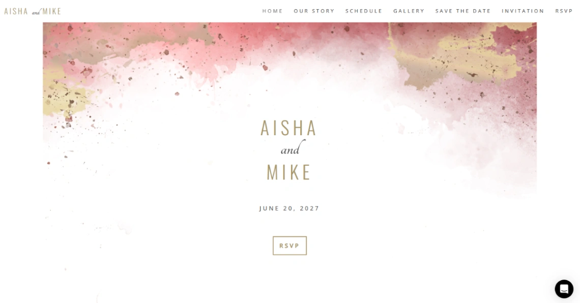
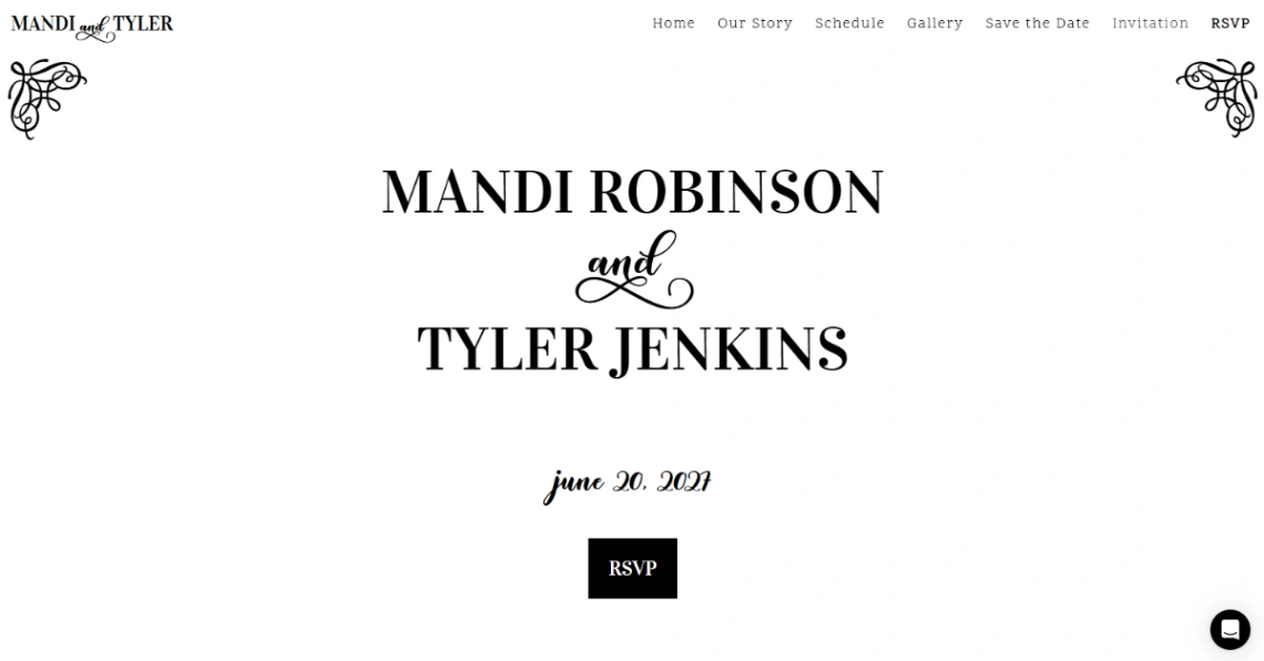
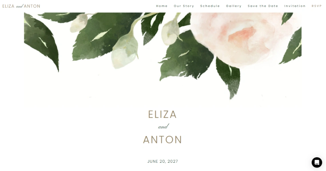
Buyer's guide
How to choose a hospitality template
Hospitality is bought sight-unseen: on photographs, and on how confidently the site answers the guest's quiet anxieties. Nobody books a stay or a venue without a version of the same checklist — will it look like the pictures, what's included, how hard is arriving — so judge every template here by how naturally it houses those answers, not by how the demo's infinity pool looks.
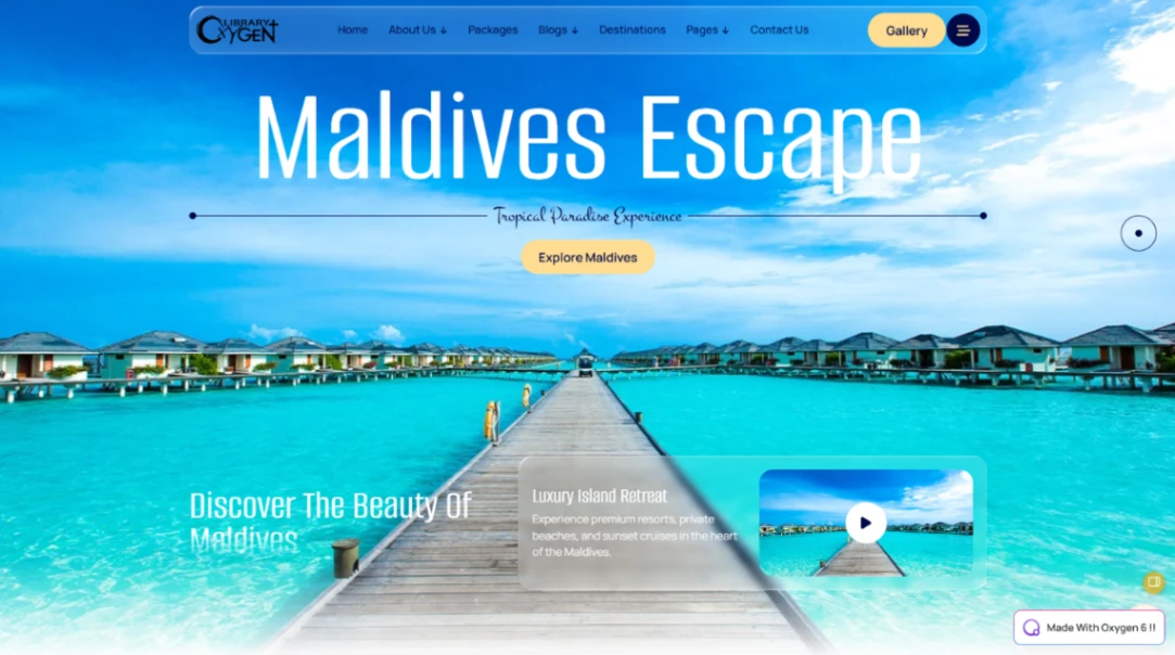
Photography is the product, so match the template's gallery architecture to the space you actually have. Full-bleed layouts flatter grand rooms and gardens; smaller properties read better in detail-led grids — textures, breakfasts, corners — than in wide shots that reveal the modest square footage. The honest rule: shoot what the guest will actually get, because the gap between the gallery and the arrival is where reviews are written.
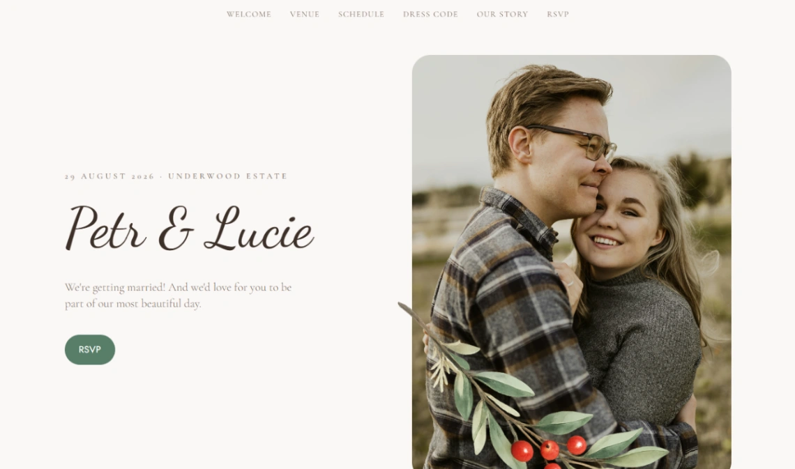
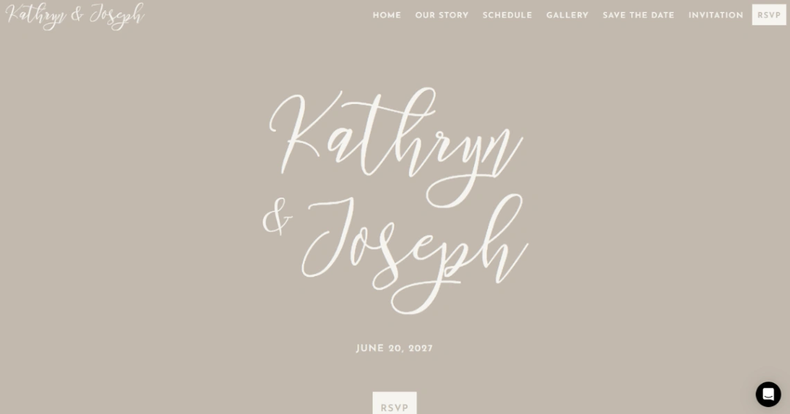
This collection splits by transaction. Room businesses want rate calendars and a booking engine; venues and the deep wedding sub-collection convert through inquiry — capacity, dates, packages, then a conversation. The builders behind each kind are pinned at the top of the page. For rooms, the direct-booking case is margin: the site must offer something the portals can't — best-rate promise, flexible terms, a human on the phone — stated plainly next to the booking widget.
And everywhere, the unglamorous blocks guests actually reread: check-in times, parking, what's included, cancellation terms. A property that answers these before being asked feels run by adults — which is, in the end, what's being sold. Answer them once, well, and the inbox quiets.
FAQ